Look sharp.
Here comes a new website visitor.
You only have a few seconds to win them over. Say the right things, and you’ll convince them to stick around. Bore or confuse them with a poor design, and they’ll leave before you know it.
That is the harsh reality we do business in today.
First impressions matter. Even if you offer the best product at the best price, you’ll still miss opportunities if the way your website looks puts off visitors.
But most of us aren’t designers by trade. We don’t have piles of money lying around to hire someone to help either.
How can you make your design as persuasive as possible?
Photo credit: Deathtostock
Why Are So Many Business Websites Confusing and Full of Clutter?
A lot of businesses struggle with what to do with their websites. Maybe they read a few copywriting books, throw up a website and try their best to apply those tips. Or maybe they take a page from their competitors’ playbooks and model their websites after others in their industry.
The result?
Lots of confusing and cluttered website designs.
It’s understandable why this happens. You read all those tips to make your website persuasive, so you’re eager to squeeze them all into your homepage. Without a way to separate all the different elements or prioritize them, overwhelmed visitors quickly bounce from the website.
Copying your competitors – or doing everything the opposite just to be different – can have the same effect. A lot of your competitors might be doing well in spite of, not because of, their websites. Without their conversion data, you’re taking a tremendous risk copying their websites and assuming they’re successful.
Your Visitors Still Prefer Simple Designs
Even as technology evolves and people get more familiar interacting online, one principle holds true: we prefer simple business websites. Browsing a website that’s easy to navigate – where you can find the information you need quickly and easily – makes for a much better experience than browsing a high-tech design with animations firing all over the place.
A simple layout, structure, and homepage make it easy for visitors to make their way around your website… and stick around long enough for you to start making offers.
But “simplify your website” sounds a bit unclear.
How do you do it?
Which elements do you keep around, and which ones do you get rid of?
How to Simplify Your Website
If you’re ready to revamp your website to boost conversions, keep these key principles in mind:
Match the Layout to Visitor Expectations
Here’s a question to ask yourself:
Does your website feel like the type of website you’re presenting it as?
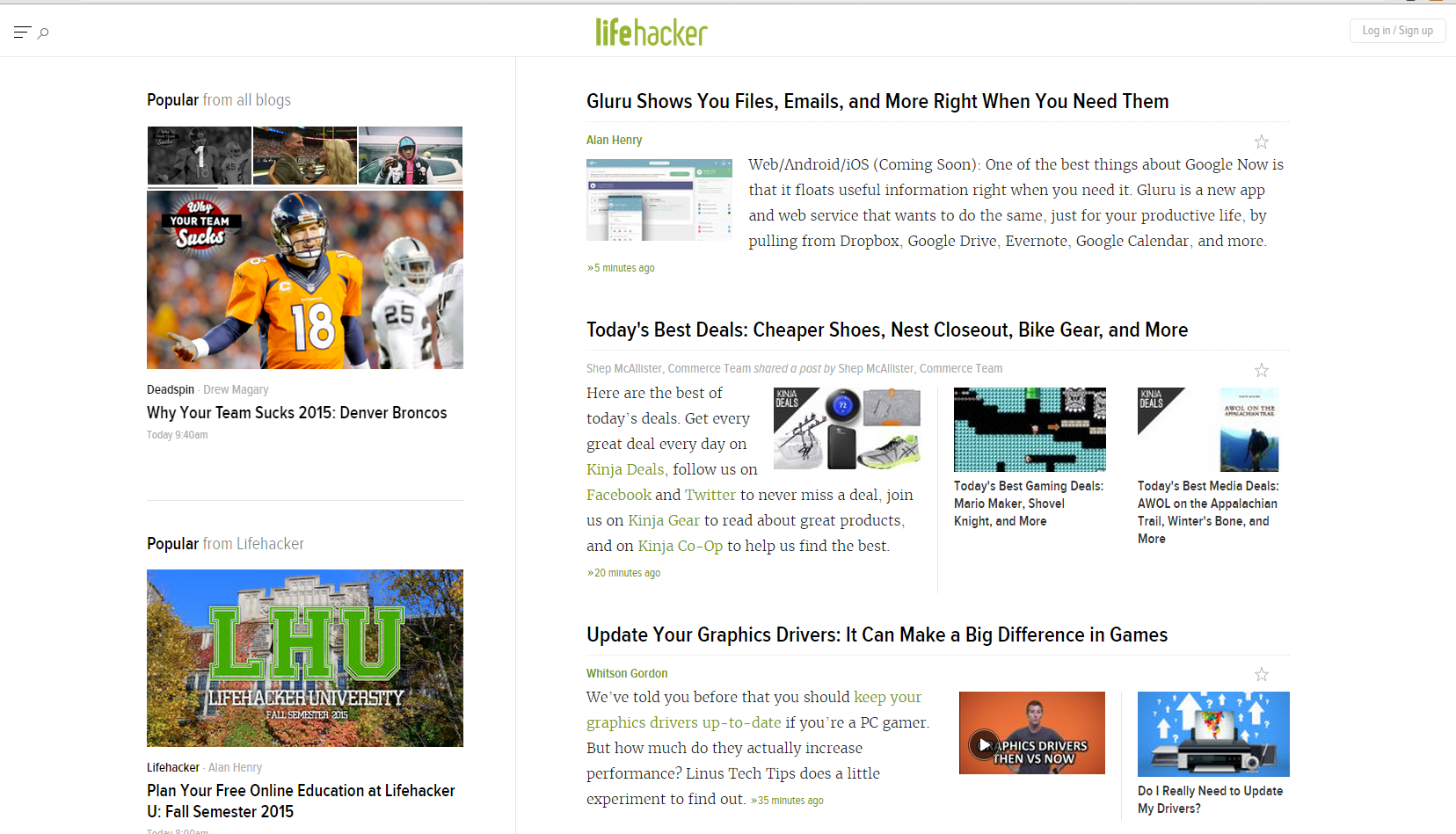
Over time, different types of websites have developed unique characteristics and layouts. Go to a website like Gap, and it feels like a major e-commerce retailer.
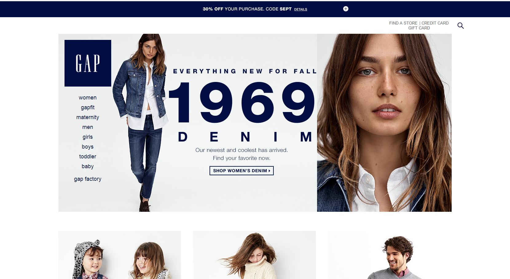
But Lifehacker feels entirely different. You pick up it’s a blog – not a retailer – right away.
You’re making these kinds of split-second judgments about websites whether you realize it or not. And the same goes for your target customers. They don’t come to your website as “blank slates.” They’re bringing all of their experiences and expectations with them.
When your website doesn’t fit those expectations, this can create issues. If you have an e-commerce website selling shoes, but it feels like a blog or news website, people get confused. They won’t stick around long in that unfamiliar territory when expectations don’t match reality.
That’s why doing whatever you can just to be different can backfire. You can inject your personality and values without straying outside the conventions for your type of website. Apple’s website is sleek (and different than other technology retailers), but it still feels like a retail site.
It’s worth the trouble to study some industry-leading websites in your niche. Which elements do they include on their homepages? Which ones do they leave out? You might not have ever considered these things on a conscious level.
Once you’ve analyzed the conventions for your website type, you have a basic structure to help guide your design. You don’t have to copy competitors mindlessly – a lot of them don’t know what they’re doing. But you do have to meet visitor expectations.
Do that, and visitors land on your website and immediately recognize it for what it is. They don’t have to work or waste time to figure things out, which is a crucial part of convincing them to stick around.
Ruthlessly Eliminate Non-Essential Content
You’re excited about the products or services you’re offering. You understand just how valuable they could be for customers and clients.
Naturally, you want to share all of this with visitors right away. A lot of businesses try to squeeze too many things onto their homepage, pitching to visitors from every possible angle.
What happens?
Homepages read more like novels than sales tools – complete with a maze of buttons and links. The clutter and sheer amount of information are enough to drive away even the most interested visitors.
Effective designs save 95% of that stuff for later. They hit visitors with a focused appeal that’s simple enough for everyone to understand. Then they persuade people to navigate to other pages – or sign up to email lists or product demos – to find out more.
Take a look how When I Work, a scheduling program, does this on their website:
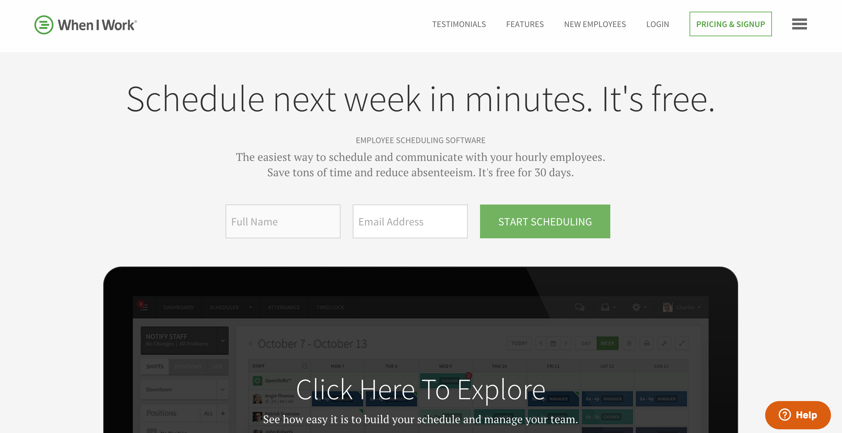
Their appeal focuses on how the program can help and what interested people should do next: start a free trial. Of course, there’s a ton of other content on the website (everything from a press room, support, and blog pages). But it isn’t featured because it isn’t essential to the website’s main purpose: signing up new users. Visitors can find this other content if they want to via a subtle navigation menu.
A simple, focused appeal is a lot less likely to confuse first-time visitors. It takes a lot of pressure off because you aren’t trying to close the sale on your homepage alone. You’re just attempting to convince people to stick around a little while longer and hear you out.
You don’t need paragraphs of copy and lengthy explanations to explain your business philosophy or what makes you unique. Every element you’re already using – from your color scheme to your typeface and logo – is already communicating subtle messages about your brand. Instead of rushing to add more content, you can tweak what you already have to make a great impression without overwhelming anyone.
Check out your website – your homepage in particular – and take inventory of any elements that aren’t with 100% certainty adding to your value proposition.
Is that slick animation of your office space convincing people to try your product? Do people need a widget to share your homepage with friends on social media? Now’s the time to get a little ruthless.
A headline, offer, and call to action are all it takes to build the foundation of a simple (and persuasive) website design.
Direct Visitors to a Single, Clear Goal
Ever land on a site that tries to get you to do a dozen things at once?
You probably didn’t do any of those things. Instead, you probably just clicked “back” on your web browser and found another website that made more sense.
Cluttered websites waste valuable opportunities because they don’t take visitors’ brief bursts of attention and direct them towards a focused goal. They throw up a lot of different balls in the air all at once – balls that come crashing down when people can’t juggle them.
One of the easiest ways to simplify your website design: break down each web page and assign it a single goal. You give visitors one concrete action to take if they’re interested instead of a dozen, and they’re much more likely to follow through.
If you aren’t sure how to do this, start with your ultimate goal (probably selling your premium products or services) and work backward. If you sell consulting packages, for instance, don’t pitch those right away, or you’ll scare off first-time visitors. Instead, request a smaller commitment and gradually ask for more as people get deeper into your website.
Take a look how FreshBooks does this:
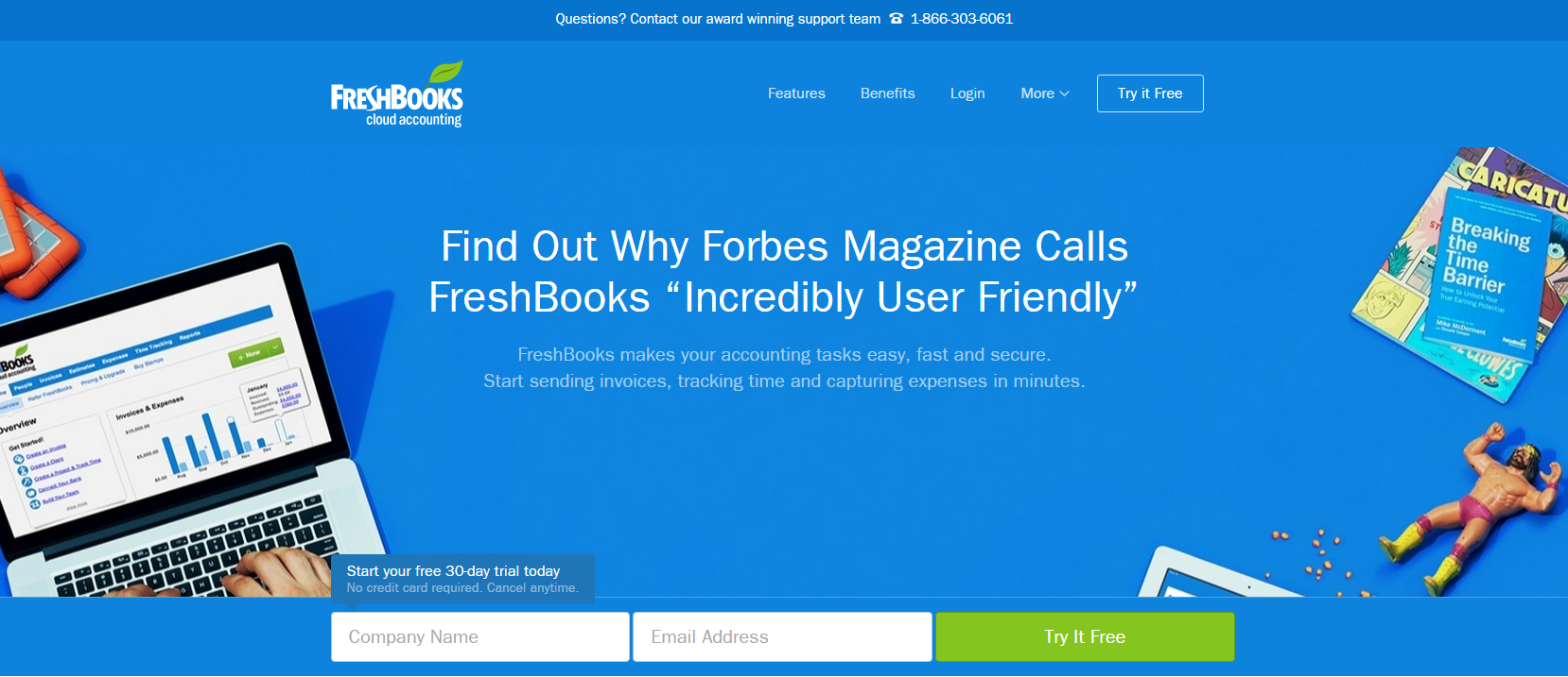
FreshBooks sells access to their accounting software, but they don’t push it aggressively on their homepage. Instead, they’re laser-focused on another goal: getting visitors to sign up for a free 30-day trial. That’s all the homepage copy is trying to convince people to do. Once the visitor does that, then FreshBooks asks for more commitment.
If your website isn’t converting, maybe you’re asking new visitors to do too many things at once. Streamline your website by breaking down one goal per page, and ask them to act. A lot more people will follow through.
Use Above the Fold Space Wisely
Your “above the fold” space – the top of your web page that displays without the user having to scroll – is the most valuable space of your entire website.
This is the one area that everyone (whether they’re first-time visitors or long-time customers) will see. It’s incredible how many businesses aren’t taking advantage of it.
It might seem tempting to engage visitors with a cool landscape photo you took when you went hiking or a silly video of your team. But resist the temptation! You’ll just end up chasing away interested visitors. People won’t scroll when they’re confused about your above the fold content. They’ll just leave your website instead.
Above-the-fold space is the perfect opportunity to share your value proposition, make an offer, and ask visitors for concrete action. If your product or service offers multiple benefits, use this space to distil your business down to its most important ones.
Take a look how BambooHr, a cloud-based software business, does this on their homepage:
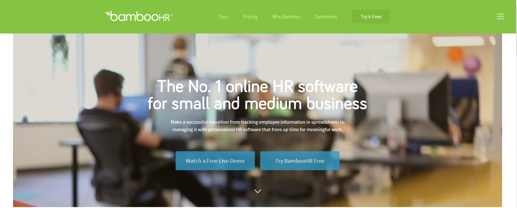
They do an outstanding job of summarizing what their business is all about in a confined space. BambooHr is clear about what they do (HR software) and whom they serve (small and medium businesses). They also lay out key benefits: no more spreadsheets and more free time. And they even ask interested visitors for specific actions: watching a demo or agreeing to a free trial.
You don’t have to perfect how you use your above-the-fold space right away. Like everything else on your website, you can test different versions and optimize over time. Above-the-fold content (especially on your homepage) is an excellent starting point for systematic testing because 1) everyone sees it and 2) it has such a huge impact on your conversions.
Your Turn
Website design doesn’t have to be a nightmare.
You don’t have to blow visitors away with jaw-dropping aesthetics, slick animations, and gorgeous typography. All you have to do? Give them the information they need to decide if it’s worth their time to stick around quickly and efficiently.
Simplicity trumps lots of shiny objects. Sparse but focused content beats throwing the kitchen sink at first-time visitors. And don’t be afraid to experiment and test your assumptions. You’ll win over more visitors and develop profitable business relationships. No design background needed.
Do you struggle with website design? What’s your biggest sticking point? Leave a comment below and share your experience!