How many of your friends own a cell phone?
All of them, right?
Now, how often do they use their phone?
All of the time? I thought as much.
Smartphone and tablet use has exploded in recent years. The mobile industry is worth billions of dollars and has helped build some of the worlds largest brands. However, despite its global domination, mobile is an area many marketers overlook.
Peruse any website that offers advice on conversion optimization and there’s comparatively little information on how to optimize for mobile. You’ll find vast amounts of advice on landing pages, CTAs and copywriting hacks, but will likely struggle to find content that pertains specifically to mobile devices.

Photo credit: Deathtostock
Perhaps this lack of exposure contributes to the overlooking of mobile optimization. Whatever the reason, I speak to far too many marketing managers who ask the same question…
Why Bother With Mobile Optimization?
The short answer? Because the mobile market is huge.
For a long time mobile was overlooked because its user base couldn’t compete with desktop’s. That’s no longer the case. After looking into the statistics for mobile usage comScore reports that in late 2014, for the first time in history, mobile users outnumbered their desktop counterparts.
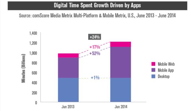
It’s a trend that seems set to continue as the numbers of 2015 are telling a very similar story. Everything points to mobile users taking over desktop users in usage.
But usage doesn’t equate to conversions. We’re interested in sales, so how do the conversions stack up in 2015?
It’s no secret that mobile conversions have long trailed those on desktop. The smaller screens and UX issues have always proved a problem for consumers.
However, despite these issues it seems as those mobile users are set to take over desktop users in conversions as well.
Japan often leads the way when it comes to mobile trends. They’re early adopters of new tech and have blazed trails for many of today’s mobile features including camera phones and 3G. It’s safe to say that mobile developments in Japan are often later replicated across the globe.
So what does the mCommerce landscape look like in Japan?
Well, for the first time in 2015 Japan saw more than 50% of their eCommerce transaction take place through mobile devices.
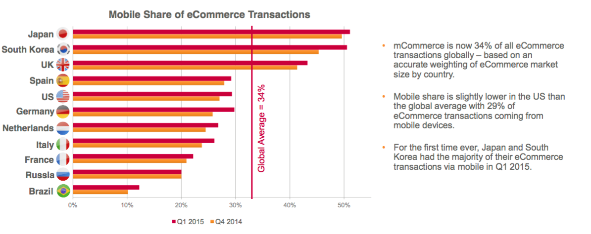
While Japan is leading the way, South Korea, and the UK aren’t far behind in their adoption of mCommerce. While other countries are slightly behind, they’re seeing massive growth and will likely catch up to Japan in the near future.
Everything points towards mCommerce being the next big thing for online retailers. You can’t afford to ignore the issue any longer. It’s not about increasing conversions today, but about future-proofing your company for tomorrow.
So what can you do to future-proof your eCommerce site?
Don’t Rely on Out-of-the-Box Responsive Design
Design is a huge factor in increasing conversions. It’s why there’s so much talk about CTA placement, color, typography, etc.
Everything needs to be just right with the look and feel of your pages. And by just right, I’m not referring to it looking kickass. In fact, sometimes designing a beautiful site can lower conversions as pointed out in this article by Dale Cudmore.
No, CRO design’s primary concern isn’t about creating a page that has the right color scheme or perfectly in proportion margins, it’s about drawing attention to key elements that persuade and convince.
If making your primary CTA smaller would make your page look better, would you reduce its size? Of course, you wouldn’t because more prospects would overlook or ignore it.
It’s for this reason that I find the favoritism for out-of-the-box responsive design so confusing.
Responsive design is nothing more than a stepping stone to proper optimization. You see, responsive design treats content like water. It allows the content to fill whichever display is used in the most logical way.
However, a logical design doesn’t equate to a logical purchase journey. Using responsive design “out-of-the-box” isn’t enough, you need to optimize on the foundation it provides to create a truly high converting mobile site.
You need to trim the fat. It’s just like creating a new landing page for desktop; you need to look at the conversion elements that are worth keeping and which are just going to clutter the small screen.
Take this example from Tria Beauty Products.
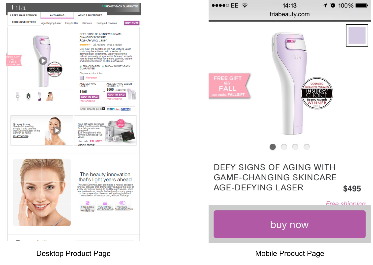
While the mobile site has kept many of the lower page elements as is (unfortunately not displayed in the screen cap above), the above the fold section has been heavily optimized.
Rather than just let the responsive design do its thing, they’ve taken the time to pick key elements to display. Here’s a quick rundown of the amendments made:
- Picture thumbnails changed to scrollable carousel
- Cut the secondary text after USP
- CTA turned into scrolling button that stays at bottom of page throughout
- Key elements such as free shipping, award seal, free gift tag, price, and CTA are all right there above the fold.
Responsive design on its own helps make your content more accessible but doesn’t address many of the conversion specific design elements. You need to build on the basic responsive approach and choose which elements it displays and how.
Speed Up Your Load Times
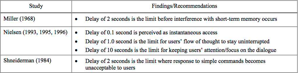
How long do you think prospects will wait for a webpage to load?
If you’ve said anything over two seconds, I’m afraid you’re overestimating your prospects.
It turns out that the tolerable wait time for information retrieval is a paltry two seconds.
But how does this effect mCommerce?
If a prospect isn’t using WiFi, how fast will your product page load? Mobile internet connections have come a long way, but they’re still far from perfect. A poor connection or finding yourself in the wrong room can limit speeds and delay page load times.
That is largely out of your control. However, you can ease the burden on the networks by optimizing your mobile site to include quicker loading elements.
As I’ve already mentioned, you need to trim the fat. Ask yourself if you need that carousel design or all those high-quality images. Does your landing page really need animations and can you get rid of those bloated social widgets?
Optimization for mobile is a completely different ballgame. You need to re-examine at all of the elements you’ve left on the page and identify the best ways to optimize them for speed.
Utilize App Like Features
User experience is one of the big downfalls of mobile shopping. Small screen sizes and longer load times are just a few of the issues mCommerce has to deal with. However, there’s also dozens of mobile-only opportunities many marketers fail to capitalize on.
Mobile optimization shouldn’t be limited to having a mobile-friendly version of your web page. In an ideal world, every eCommerce store would be able to introduce an app for their store. However, this isn’t feasible for many of the smaller eCommerce sites out there. So what can you do if you find yourself in that group of people?
Introduce app like features to your existing mCommerce site.
This is one of the best ways to increase the overall user experience. Ask yourself if you can provide any of the following.
- Use the GPS location to recommend products people in the vicinity have bought
- Text messaging a customer service representative with questions
- Exclusive mobile-only offers
- Reserve and collect service at the nearest store
A good conversion rate doesn’t just come from compelling copy and creative CTAs. At its very core, successful conversions are born from a pleasant user experience.
Ask yourself what features mobile devices have that you can use to make your online store a more fun and easy place to shop.
Cross Device Tracking
For all of your optimization efforts, there’s a good chance you’re still going to lose prospects.
While mCommerce conversions are on the rise, they’ve still got a long way to come. Smartphones, in particular, are far behind tablet and desktop conversions.
There’s a huge number of prospects who begin their purchasing journey on mobile only to finish it later on desktop. You may not worry about this, after all, a sale is a sale. However, every time a prospect leaves your site, even with the intention to return at a later date, there’s a good chance that they won’t make it back to complete that purchase.
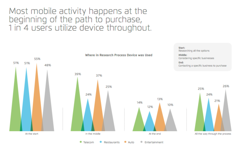
MMAGlobal.com reports that only one in four users utilizes a mobile device throughout their purchasing journey. That means you’re relying on three-quarters of your prospects to switch devices and complete their purchase.
Without a solid cross device or cart abandonment campaign, you can’t be certain that they will return. It’s one of the major contributing factors to the 68% cart abandonment rate that’s plaguing eCommerce stores around the globe that is predicted to cost online retailers trillions of dollars in lost revenue before the end of 2015.
You need to optimize your mobile funnel to cut down on the number of prospects who leave your mobile site. This is where cross device tracking can help.
Looking at the overall conversion stats for your site isn’t enough. Let’s imagine that you see a 45% drop off at stage three in your funnel.
You head to your desktop site and amend copy or change the CTAs for some A/B tests. The changes you make bring little to no overall improvement.
After digging deeper into your data, you realize that 40% of that drop-off constituted mobile users. You check the pages on mobile and realize that amending copy didn’t increase conversions because that wasn’t the problem. The problem lay in poor design which hid the primary CTA on mobile devices.
After amending the design, you see a healthy lift in conversions. Device tracking has saved your bacon.
Device tracking isn’t just a cool feature that allows you to spout random numbers that seem impressive. It allows you to understand better how the different segments of users interact with your site.
Mobile users will interact differently to desktop users, so you can’t take the same optimization approach. You need to understand their behaviors as separate entities so that you can create a better optimized funnel for their needs.
This deeper knowledge of cohort behavior is key to understanding the various flaws or problems that would be beholden with a more generalized overview.
Conclusion
Mobile use and purchasing behavior is on the rise.
Developed countries across the world are slowly showing signs of prospects shifting their preference to mobile devices. However, what’s of particular note is the happenings in developing countries.
Many African countries have leapfrogged the desktop era. Thanks to poor landline infrastructure, the African population favors mobile devices for what many others would complete on desktop. It’s a huge market with over 1 billion people, something that is bound to have a huge effect on the future of eCommerce.
Everything points towards mobile becoming the next big thing in eCommerce. It’s not about creating a beautiful site, and you’ll definitely not benefit by simply viewing mobile optimization as an add-on to your desktop efforts.
Mobile optimization needs a campaign all its own. And, like any other conversion campaign, the key to effective sites and high conversions is creating a seamless experience that focuses heavily on the user and their behavior.
Do yourself a favor and save yourself a headache in the future by taking a good, hard look at your mobile site and how to better optimize it now. Before it’s too late!
Has your business struggled with mobile optimization on your ecommerce site? Let me know in the comments below.


