So you’ve heard about the wonderful gains conversion rate optimization can offer.
A few little changes to your site and boom, before you know it your lists have exploded and sales are through the roof! If only it were that easy!
The truth is that many marketing managers are often disappointed at the success, or lack thereof, of their optimization campaigns. Despite following all of the advice online, they see little to no gains from their optimization campaigns.
Unfortunately, following online advice isn’t enough to get your campaign off the ground. The changes you make and the success they bring depends on your individual audience and their behavior. It means that following the same process as someone else out there isn’t guaranteed to produce the same results.
However, that’s not to say there’s no useful advice for the budding optimization specialist out there. There are plenty of useful tips that can help you see a decent lift in your conversions.
Below, I’ll list 10 of the most widely accepted best practices for achieving a real lift in your conversions. However, before I do, there are a few things we need to cover first.

Image credit: Deathtostock
What is CRO?
So what exactly is conversion rate optimization (CRO)?
It’s difficult to explain. An ecommerce manager will say it’s for increasing sales while a marketing manager will tell you it’s all about increasing list size. It’s one of those annoyingly diverse methods which means different things to different people.
At its core, CRO is the process of optimizing elements of your website to see a meaningful progression in your key metrics. That means it can be used to improve sales, increase list size, engagement, user experience or any number of other metrics you deem important.
It’s all about research and action. Identifying what your audience wants and amending your messaging, design and funnel to better align with their expectations and desires.
In short, CRO is about giving your prospects what they want.
However, this isn’t anywhere near as easy as it sounds. There are many pitfalls on the road to high conversions, and if you’re not paying attention, then there’s a good chance you’re going to find yourself at the bottom of one.
The biggest pitfall of them all? Believing everything you read online.
Caveat – Never Take Advice at Face Value
So you’ve been trawling the CRO websites for a little advice and have seen two separate case studies that explain how an orange CTA button increased overall conversions.
The knee-jerk reaction to this discovery is to run to your site and immediately change your CTAs to orange. Hey, if it’s good enough for two authority sites it’s bound to work for you, right?
Wrong.
You’ve made a fundamental mistake many make with CRO and taken the advice in the case study at face value. The advice the case study is giving is not that orange is the best color for buttons. What it’s saying is that CTA color can effect conversions.
Your job is not to follow the same procedure blindly as the case study, but to implement your tests in the area of CTA colors. A smart CRO would test different colors and combinations rather than just mimicking the same approach as the case study. Your audience is different to those in the case study, and you need to find what colors resonate best with them.
There’s a lot of advice out there on CRO best practices. Most of the advice is good if, and only if, you can understand the action instead of just getting blinded by the results.
Orange CTAs was the result of extensive testing into CTA colors. You need to replicate the tests, not the results of those tests.
Now that that little caveat is out of the way let’s get onto some conversion optimization best practices.
Test Everything
Testing everything is something many marketers get wrong.
You need to test every element of your website to understand properly what’s working and what isn’t. However, you shouldn’t be testing everything at the same time.
Imagine you’re running an optimization campaign where you run simultaneous tests on your headlines, CTAs, USP, and design. You let the tests run for two weeks and see an increase in conversions. Which change brought you that gain? Testing too many elements at once makes it difficult t extrapolate useful information.
It’s difficult to replicate results when you can’t pin the reason for a change. Every element you amended will have had an effect, some positive, some negative. Tracking them all in one go makes it difficult to identify the key positive changes.
Yes, you need to optimize and test every element but you need to do it individually.
Run A/B or multivariate tests on one element at a time. Once you’ve identified the keys to higher converting CTAs you can move on to your USP or whatever element is next.
Focusing on individual elements cuts the confusion and allows you to better identify the elements that increase or decrease your conversions.
Headlines
Headlines are some of the most important aspects of your copy.
According to copywriting legend David Ogilvy 80% of your audience will read your headline without clicking through to your content/letter.
That means that for every 100 people who see your headline pop up in the SERPs or notice your email subject line, only 20 will deem it worthy of their time.
So the question you need to ask is what can you do to make your headlines jump out at your prospects? Well, there’s plenty of advice out there for you to run through, however, I thought I’d touch on a few points that are often overlooked.
Solution Selling
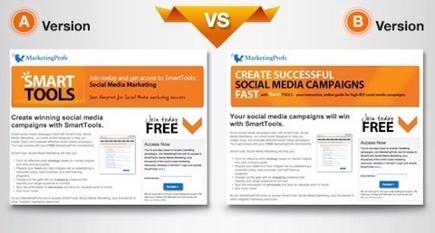
Instead of taking the generic approach and using the “How To …” or popular listicle headlines, look at how your product/content solves a problem. This is the approach MarketingProfs took which saw a 28% increase in conversions.
Use Client Testimonials In Your Headline
Often the best copy comes straight from the mouth of your prospect. Why not use their words to hook the attention of their peers? Here’s how LKRSocialMedia used this approach to increase conversions by 24%.

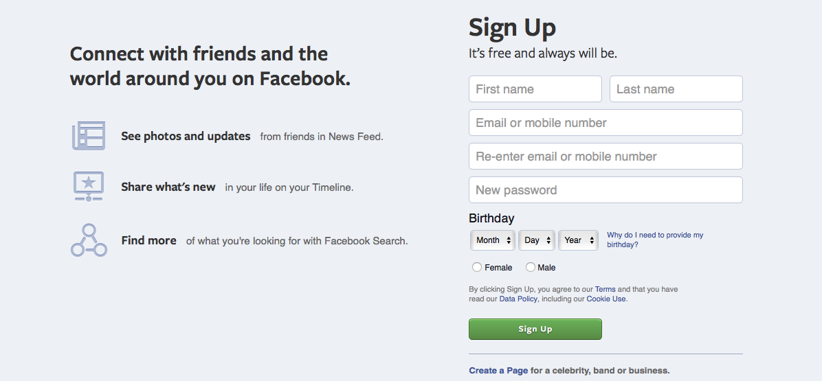
Use Sub Heads
A headline on its own can be powerful, but you can double its effect with the use of a complimentary sub head. These sub heads can be used to outline more features or simply to expand not the solution to make it more desirable. Here’s how Facebook uses sub heads on their primary sign up page.
You’ll need to heavily test your headlines to see what works best. Don’t worry if you’ve no idea where to start, thankfully there are plenty of people out there who have tested every conceivable headline formula to give you a good starting point. Here’s a handful of headline options for the team at Copyblogger.
Turn Your USP into a UVP
A USP is supposed to tell your prospects what’s unique about your business.
But does a prospect really care about your unique qualities? Nope.
What they care about is what your unique service can do for them. Don’t waste your USP by focusing on you or even worse, by using useless business speak (which is unfortunately all too common). Use it to convey – in simple, relatable terms – how your prospect will benefit. In fact, here are a few UVP best practices for you.
– Use customer-centric language
– Avoid superlatives
– Address key pain points
– Quickly convey value
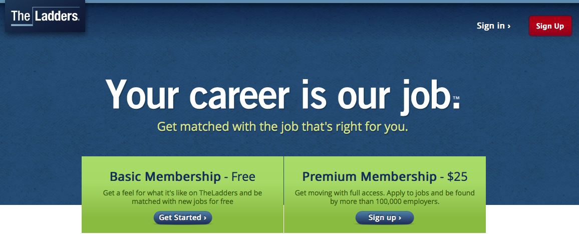
Here’s a quick example of a great UVP from The Ladders that uses simple language to quickly explain the service and touch upon a primary pain point for those looking for work.
Remember that your UVP is the first thing your prospect sees after your headline. If it’s bad, they’re going to bounce. Check out what the competition is doing and see how you can provide a unique look at the value you can provide for your audience.
Easy Navigation
One of the things I hate with ecommerce sites is a cluttered navigation menu. I’m there to shop. I don’t want to feel like Sherlock Holmes having to sleuth out the right link to take me to the product page I need.
Make things easy for your prospect to find exactly what they want by:
– Reducing the number of clicks to get to desired pages
– Use search bar auto complete
– Allow filtering of results
– Group by category and utilize drop downs
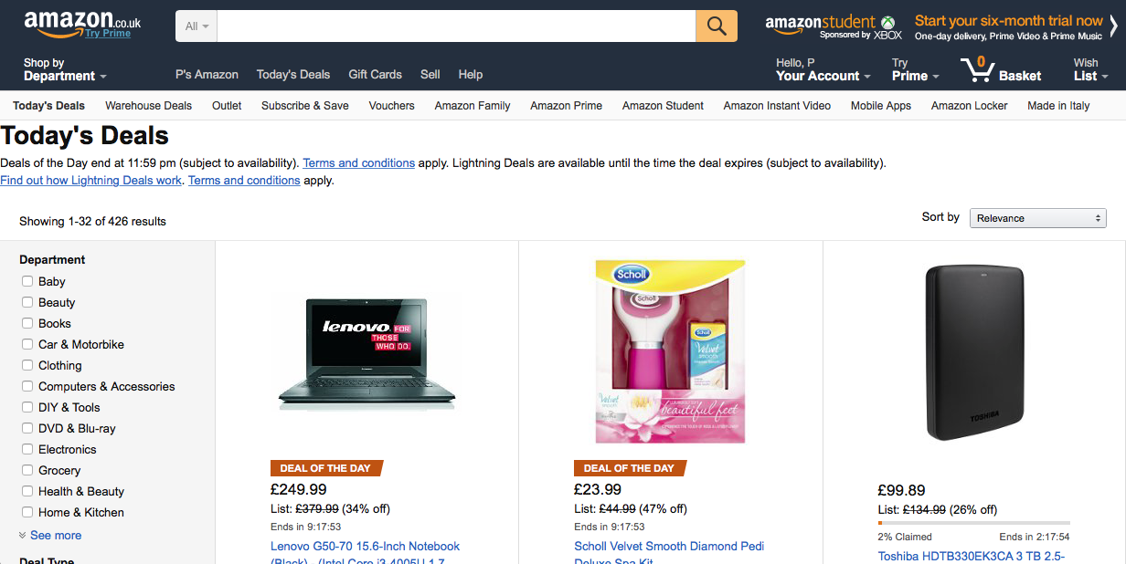
For a great example of easy navigation just head on over to Amazon, the king of ecommerce sites to see how they do it.
CTAs
Your call to action is often the final element of your landing page or sales piece and outlines the action you want your prospects to take.
Being the final element makes your CTA incredibly important. A poor CTA has the power to undo all the hard work you’ve put into the rest of your page.
Despite the importance of CTAs, I often see marketers who give them very little attention. They don’t change the default text that leads to numerous CTAs reading, “submit”, “order”, or “pay.”
Unfortunately, these words have little impact when it comes to persuasion. They are in fact more closely associated with cost. Nobody wants to think of the action it takes to get the product, and they don’t need reminding of the financial implications.
Instead of using action words that are associated with cost, turn your call to actions into call to value.
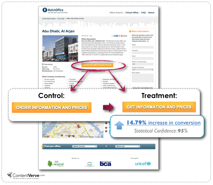
Scrap the submit text and highlight what your prospects will get in return. It’s an approach Michael Aagard took which saw an increase of 14.79% by changing a single word that turned the focus of the CTA from an action into what prospects would receive.
Reduce the Number of Form Fields
Do you need to know everything there is to know about your prospect?
Knowing their name and email is often enough. Sometimes their business or job title is relevant and maybe even age group. But will their address, phone number or favorite color help you segment your list in a meaningful way?
Nope.
Not only is it a waste of your time but the more form fields there are, the less likely you prospect is to fill them out. Shopping is supposed to be fun. It’s not a quiz where the prospect has to fill in every single detail of their life. Ask for too much and it puts people off.
Neil Patel explains the average increase in conversions is 66% when reducing form fields from 6 to 3. It’s a huge gain that has come from actually saving yourself from extra work.
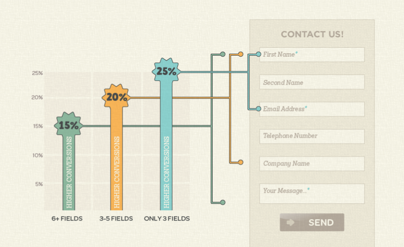
Look at the information you’re asking for in your form fields and question whether it’s worth it. If it’s not adding any meaningful segmentation options to your list, then get rid of it.
Proper use of Images
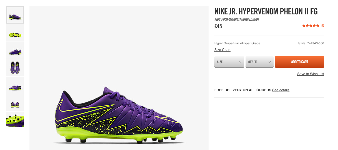
Images are a great way to increase conversions. In fact, 67% of people surveyed by MDG Advertising rated high-quality images as being “very important” to purchasing decisions.
When you’re selling a product, the guidelines are easy. Use high-quality images of the product and, if possible, add a little context by showing the product in use.
People want to know what they’re buying so show them exactly what they can expect. Any big online retailer (like the Nike example below) will have some high-resolution images for you to look at for each and every product.
However, if you’re selling an information product or even just looking to increase the engagement for a content marketing strategy, then the approach is a little more complicated.
Instead of choosing any old image that, at best, has a very tenuous link to the topic you need first and foremost to find an image that is relevant to the topic.
On top of this you should break away from the pack and never use stock photos.
Stock photos are cheesy. One of the most important elements in conversion optimization is to create a trusting bond between your brand and your prospect. No one looks at stock photos and thinks “wow, those people are just like me!”
Not only are stock photos cheesy, but they’re also not unique. Do a reverse image search and you’ll find thousands of other similar brands will have used the same photo.
Do yourself a favor and avoid stock photos. If you need people in your images, then get some real clients or employees to pose for them It adds a realistic element and helps you seem more authentic.
Urgency/Scarcity
Ever heard of FOMO (the fear of missing out)?
No one wants to miss out on a good thing. Unfortunately, the internet age has made products and experiences available to everyone, everywhere at any time. The idea that we could miss out on something for good rarely enters into the mind of your prospects.
That’s why reminding your prospects that stock is not infinite, and deals have an expiration can have a profound effect on your conversions.
Adding a limit to your products helps suspend the logical thought patterns of your prospect. Instead of questioning whether they need to a product they simply rush to buy without giving the price a second thought.
It may be a little manipulative, but it’s a process that’s been well utilized by numerous companies and has helped build the empire of the daily deal sites like Groupon. Groupon is a great example of online conversions done well.

Here we can see examples of scarcity, large CTA and a breakdown of cost savings.
List exactly how long your prospects have to buy a deal with a countdown timer or list the number of stock items you have left on the product page. This will help convince those prospects on the fence to buy right now.
Remember, It’s Never About You
Too many marketers focus their message on the actual product itself. You’ll see copy that highlights how the product itself is amazing, but that’s not what your prospect wants to read. Your prospect wants to read what it will provide for them.
Ted Levitt said it best when he said;
People don’t buy a quarter-inch drill bit, they buy a quarter-inch hole. You’ve got to study the hole, not the drill. The drill is just the solution for it.
Think about your product as the solution to a problem. However, instead of focusing on that solution, think about the benefit the solution brings to the prospect.
Focus on the customer and the benefit that they will get from purchasing or signing up with every on page element. It’s a fundamental step for creating killer copy but will make the world of difference to your conversions and overall revenue.
Conclusion
There’s a lot of advice out there which makes it seem as though you can make small changes to see big results. However, this is unfortunately not a common occurrence.
For you to run a successful conversion optimization campaign, you need to keep a steady eye on the changes you make and the conversion lifts those changes bring.
Remember not to make your campaign a carbon copy of anyone else. Find the underlying hypothesis they used and replicate that to run your own tests and, as always, make sure that the changes you implement have a strong focus on the prospect.