So you’ve taken a bold step and launched your online store. Congratulations!
The hard work is done, right? Soon you’ll be able to outsource the day to day running of your eCommerce business from a deck chair on a sunny beach in a quiet corner of the world. But wait, something’s not, right?
Despite a successful launch that brought a ton of traffic, your sales have barely increased. What’s gone wrong?
Well, how much thought did you put into the development of your eCommerce page? Did you follow any advice, or did you just launch the site and hope that the quality of the product would handle the rest?
If it’s the latter, you’re in trouble. The eCommerce space is highly competitive. A successful site is more than a handful of images next to a purchase button. There’s a lot of consideration that goes into gaining higher conversions.
Even the most minor of problems can cause prospects to exit your site. It’s your job to reduce these issues and keep prospects interested and engaged with your product pages.
Photo credit: Deathtostock
Success in eCommerce conversions essentially relies on creating a pleasant user experience that progresses logically and seamlessly through the purchasing journey. Whilst you’ll need to run thorough A/B tests and keep an eye on your cohort analysis to really nail this, we thought we’d get you off to a good start with these 10 essential elements for an effective eCommerce page.
Organized Navigation Menu
Sometimes it’s the simple changes that have the biggest effect. I can’t tell you the number of times I’ve stumbled across eCommerce sites with illogical, often downright confusing menu options.
We’ve all been there. You find a site that caters to your needs, only to find navigating it a complete nightmare. Invariably we all deal with this confusion in the same way. We don’t persevere for 20 minutes to find what we want. Instead, we head to Amazon where we can find and purchase our desired item in less than five minutes.
You need your menu to be simple and logical. If you’re not sure what an optimized, logical menu looks like, just check out how Amazon configure their “shop by department” page.
I mean, look at all of the filter and navigation options they offer.
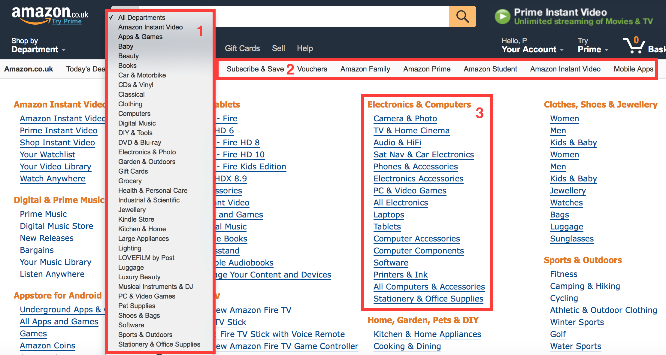
You’ve got three main options on this page.
- Filter options to limit your search terms to specific departments
- Menu options that direct you to time sensitive and specific deals such as “Today’s Deals” (unfortunately obscured but he filters above)
- A comprehensive breakdown of each category and the individual departments within those categories.
It wouldn’t take you more than thirty seconds to get to the right department or filter your search to bring up the most appropriate results.
However, it’s still not perfect. There’s one element that can help with navigation not present on Amazon: a breadcrumb menu.
When you click through a product and find that it’s not what you want, your first action is to return to the previous page. However, with many sites clicking your browser’s back button will result in a popup asking if you want to re-submit search data.
It’s a small problem but when searching for a specific product that pop-up will be seen numerous times. The more it’s seen, the more annoying it is. That is where a breadcrumb menu can help.
Check out the below screen cap from Adidas’s website.
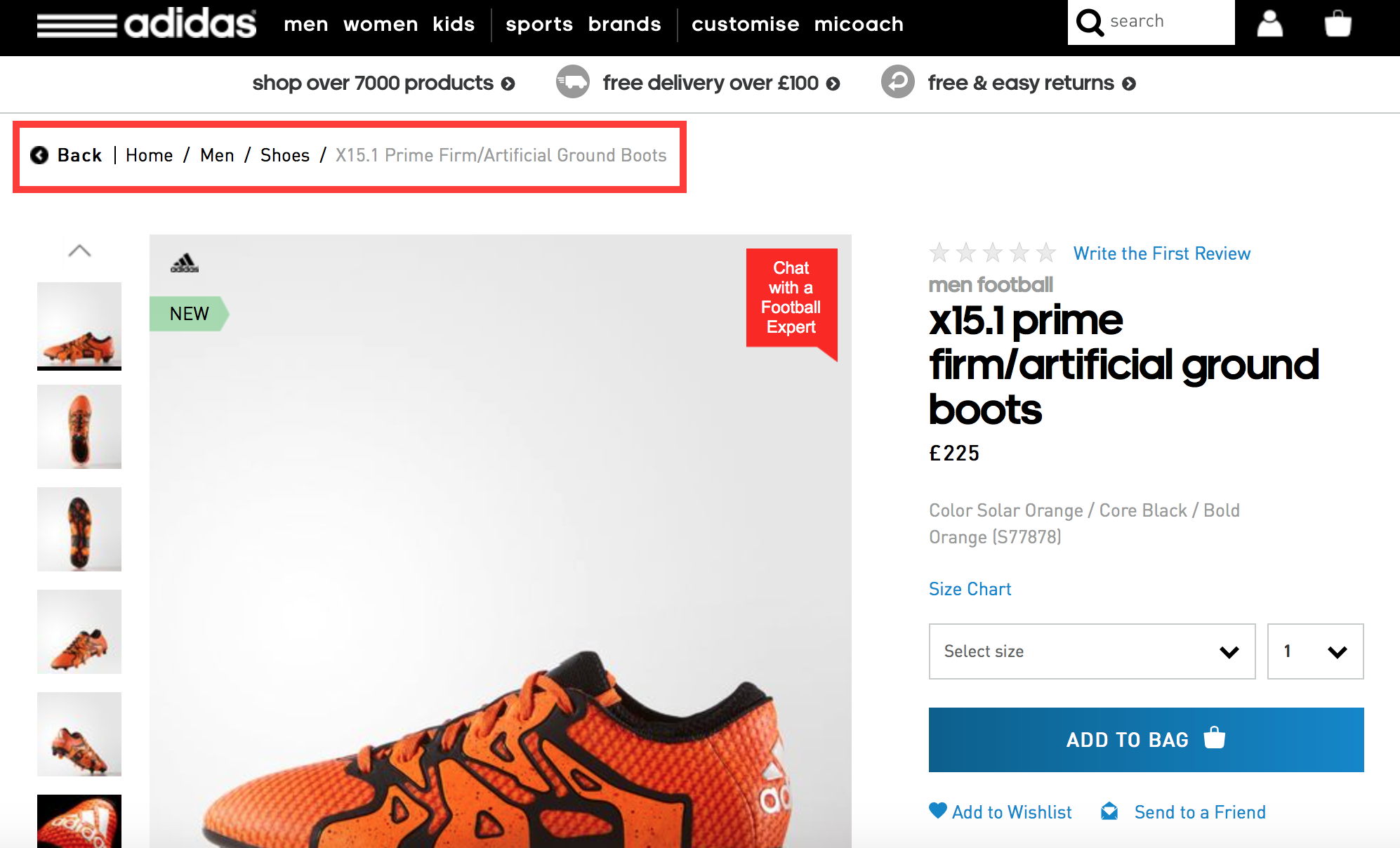
It’s a tiny element of the site which makes navigating to previous menu’s and results far easier. It;s great at helping a user understand your product hierarchy and to make navigating to similar products a hell of a lot easier.
High-Quality Product Images
It’s no secret that good product images increase conversions. But you can’t just use any old images to sell your product. Shooting your latest product on a white background and shooting it with your iPhone isn’t going to cut it.
You need high-resolution images that look professional. That should go without saying. But if you’re looking for a little extra help on what makes images work well, here’s three top tips for product images that drive conversions.
Highlight key features/design
Is there a feature of your product that makes it superior to its competitors? Is that feature prominent in your sales copy? If so, then use pictures to better illustrate how it differs from the competitor’s. Those wonderfully orange football (it’s not called soccer :P) boots (not cleats) from Adidas are a great example of this.
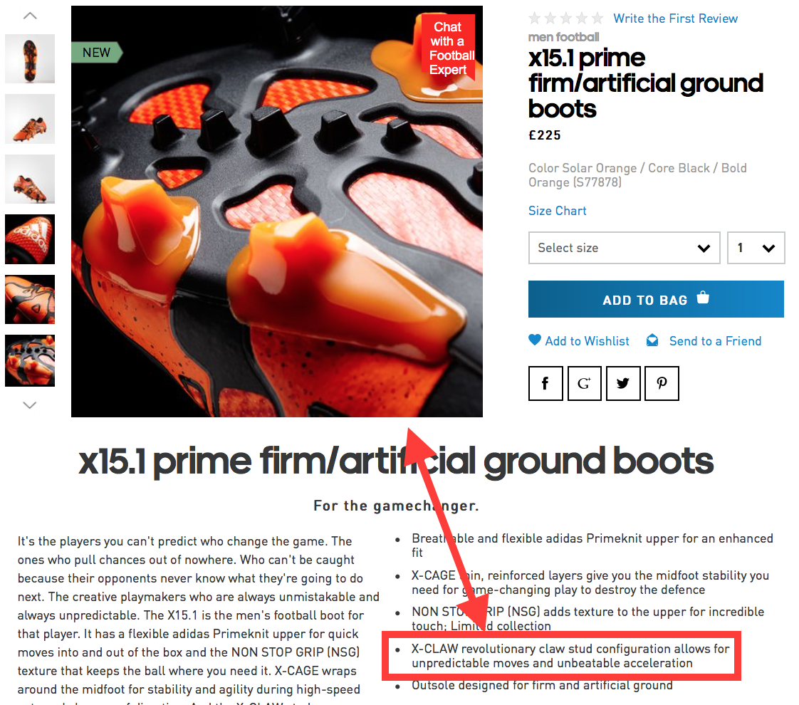
The stud design is obviously very important to the product. Rather than mention it and move on they provide a high definition close up of the feature that illustrates the feature in detail.
Give it Some Context
We all know sofas are for sitting, shoes are for your feet and food is for eating. However, context isn’t just about showing how a product is used.
Sure context can help with certain products. Take this knife sharpener I stumbled across while trying to find a replacement knife for my camping trips. To most bushcraft enthusiasts, the use is known. However, those just getting into survival/camping/bushcraft may not know what it’s all about. That’s where this image helps.
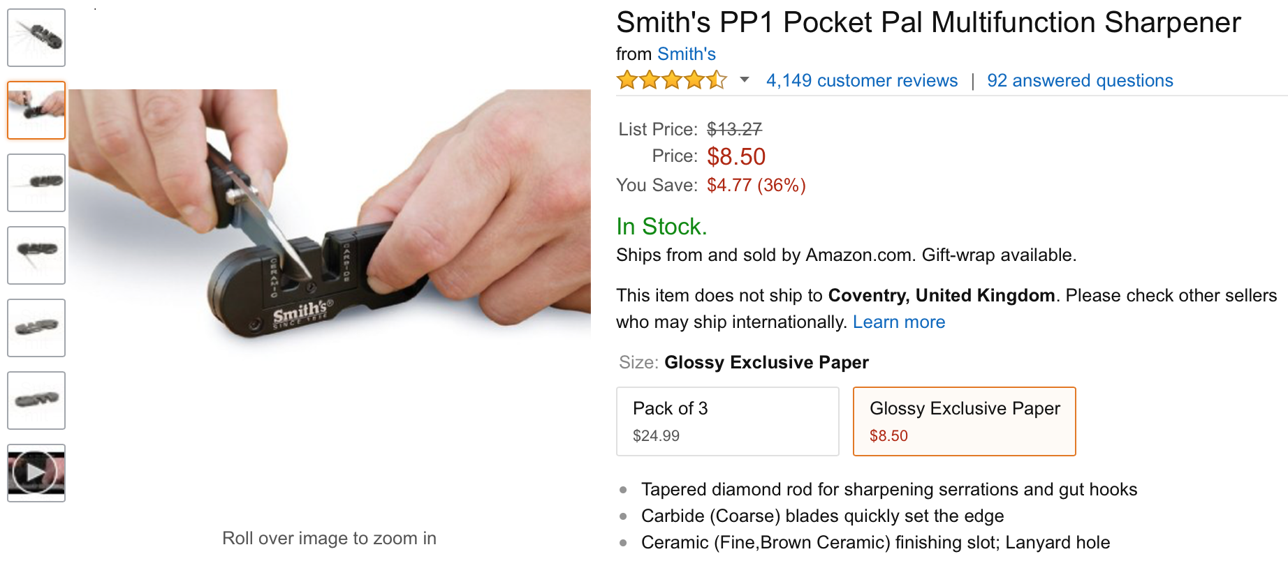
Showing it in use is great to give prospects a clearer image of use and size.
However, it’s not just about the context in use. Sometimes context can make the product seem more desirable and offer valuable cross-selling opportunities. This is a method often used by online fashion retailers like Asos.
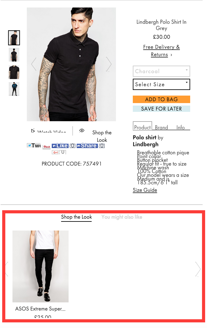
Seeing the product on a real person and not a blank background gives a better impression of the way it looks. Yet there’s also another benefit to this method. By using it in context you’ve also got the cross-selling opportunity of selling the rest of the outfit worn by the model, displayed here in the “Shop the Look” section.
Thumbnails in Navigation
So a prospect types a term into your search bar and is presented with a drop down of potential matches. It’s hardly inspiring and can be something of a chore to find the product you’re looking for.
If you’re able to, including thumbnails next to search terms is a proven method to increase conversions. Online retailer BrickHouse Security saw a 100% increase in conversions from shoppers who used the search bar after including small thumbnails of potential product matches.
Let Your Happy Customers Sell Your Products for You
No one is going to believe you when you tell them your product is the best on the market. You’re biased and stand to gain personally from their purchase. However, an honest review from an impartial third party can go a long way in driving your conversion rates. These reviews can take the form of testimonials, product reviews for even comments.
Below are a few examples of awesome social proof that really help you stand out from the crowd and build trust.

Copyblogger has done an excellent job of getting useful social proof on their purchase page for the Genesis Framework. Not only do they have testimonials from large website owners, but a glowing reference form the founder of WordPress. That’s some social proof that carries some serious weight.
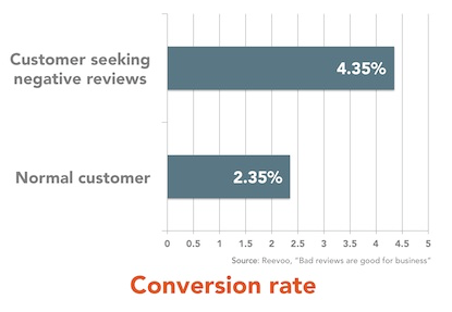
If you’re running product pages, then the best social proof is on page product reviews and comments. Allowing customers to filter by the review is also a great way to offer extra usability. Very useful when prospects who look for negative reviews turn out to convert higher than those who don’t.
Call to Actions That Highlight the Value and Stand Out From the Page
Ignore all of the advice that recommends you choose orange/red/blue or whatever for your CTAs, It’s bullshit.
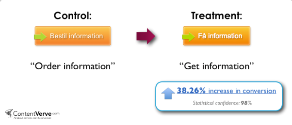
There’s two key elements to successful CTAs. First is making sure that your copy focuses on the benefit rather than the action. CTAs that use the default text “submit” are lazy and uninspiring. However, switch that out for copy that focuses on what the prospect will receive and you’ll see a higher conversion rate.
The second key element is to do with color. However, it’s not “orange is the best”.
Your CTAs need to stand out from the page. If they don’t, your prospects will miss them and not know how to proceed to the next stage in your funnel.
Use complimentary yet contrasting colors to help your CTA pop out and get noticed.
What Payment Methods Do You Accept?
There’s nothing more frustrating than adding a bunch of items to your basket, clicking through to the checkout and filling in your delivery information only to then find that a business doesn’t accept AmEx.
Sure it’s a minor issue, after all, prospects can just use another card, right? But maybe they wanted to use AmEx for card specific benefits, perhaps they wanted Paypal for the “Pay After Delivery” service.
Whatever the reason, this is just another unnecessary friction point that’s easily avoided. Offer a few options to help increase overall conversions. Be sure to display what payment methods are accepted up front, but don’t go overboard. Keep your selection to the most used options out there.
Basket Value
We’ve all done it. You start enjoying browsing an online store so much you forget about the overall cost of your items. By the time you get to your basket you nearly choke when you see your bill’s well into the hundreds of dollars.
What do you do? Do you delete a few items or is the shock so severe that you exit the site and chalk up the experience as a near miss? More often than not, your prospects will take the latter action.
It’s why keeping a visual tally of overall basket value on your site is a necessity. Ellis-Brigham does an excellent job of this as can be seen below.
The basket cost is displayed right at the top of the page, so you’re always aware of how much you’re spending.
Quantity Display/Amendment
Even the most optimized checkout pages can screw up. Poor internet connection or a prospect who’s overly fond of the refresh button can lead to some items being added to a cart numerous times.
That is why adding a quantity option to your product pages is a must.
It just makes it easier for prospects to buy multiple products (which is great for your AOV) or to reduce the number they’ve accidentally added to their basket.
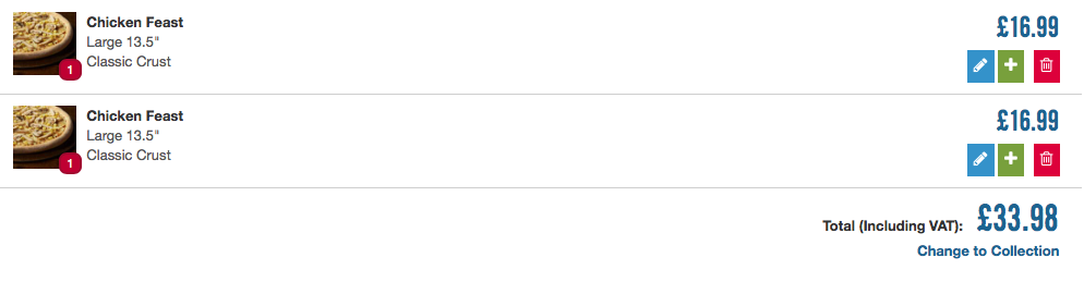
The best sites use a quantity option that allows for on-the-fly amendment. In the example above Domino’s allow you to click the + or trash button to remove or duplicate items already in your basket.
Once again, it’s just another method to improve user experience and reduce friction.
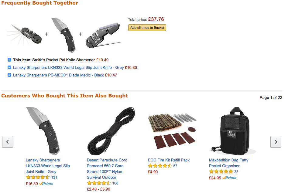
Cross-Selling Options
Increasing AOV through cross-selling is one of the best ways for a business to quickly see an increase in revenue.
Amazon is the king of cross-selling recommendations. If you’ve ever seen their “people who bought this also bought…” section you’ll know how effect cross-selling can be. In fact, Amazon estimates that around 35% of its revenue comes from their cross-selling efforts.
Good recommendations of products that assist or enhance the experience of the initial purchase not only offer more value to your customer but also should add to your overall AOV and revenue.
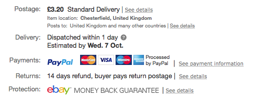
Guarantees
Last minute resistance can kill a sale.
Those last few seconds before a customer clicks “purchase” are fraught with second guesses and self-questioning. If there’s even a minor chance that they won’t ben happy with their purchase then they’re going to bounce.
However, a simply money back guarantee increases the likelihood of them ignoring their hesitations and going ahead with their purchase.
Your guarantee doesn’t have to be anything fancy, a simple promise of a full refund if you’re not happy will suffice. Danny Iny of Firepole Marketing has built an incredibly successful information product company which all started with his first course, Write Like Freddy.
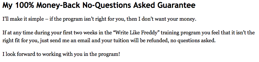
At the end of the sales page, there’s a simple promise.
It’s simple, but it does away with any hesitation you might have made it more likely for you to take a chance.
Trust Marks
Trust is a major factor in driving sales.
If you’re not Adidas, Coca Cola or some other household name then some prospects are going to wonder if you’re legit. No one wants to hand over their card details to a potentially shady character.
This is where trust seals can help you out. Trust seals are those little logos you see which say things like “secured by PayPal” or “[Company name] Secure”.
They’re basically there to let the customer know that any personal details they enter are secured by the third party and not the retailer themselves. A key step when you’re asking for someone’s financial details.
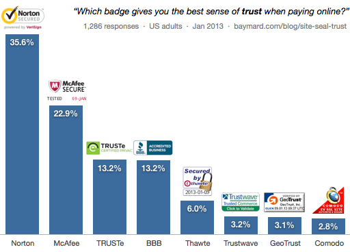
You don’t want to fall at the final hurdle because someone thinks you might not be on the up-and-up. Use trust seals to show prospects that you are legitimate and you’re not going to head to the Bahamas with their money!
Conclusion
There’s a lot to consider when it comes to establishing a successful eCommerce site. While this article lists some of the more important persuasion and trust elements, it’s by no means a guarantee for success.
Every site is different. You’ll need to play around with he various elements and run numerous tests to see how your audience resonates with each change and identify key areas to change for higher conversions.
Remember never to stop testing. That is what’s truly at the heart of a good optimization campaign.