Thinking about revamping your website?
Carousel designs are one of the latest trends in the design world. Websites using them look a lot different than the typical static designs most businesses rely on.
But design trends come and go. You might be wondering if carousel designs live up to the hype.
Are they a legitimate way to boost your conversions online?
Or just another overrated fad?
Keep reading to get the information you need to make an informed decision – one that pleases visitors and convinces a good percentage of them to become paying customers.
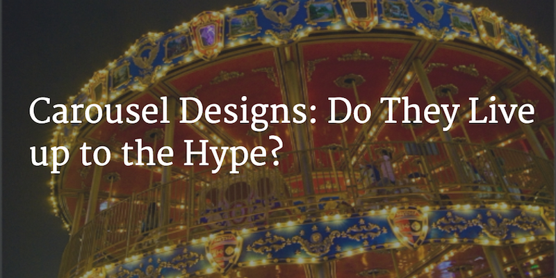
Photo Credit: GIS@Sam via Compfight cc
What Is a Carousel Design?
Let’s start at the beginning. What is a “carousel design?” How is it different from the typical business website?
The biggest difference is how carousel designs use “above the fold” space on the homepage. Instead of text or a single featured image, carousel designs display a series of images that appear in a sequence. Sometimes these images include links and accompanying text. Sometimes these images rotate automatically after a set period, but other times users get to dictate the pace.
Each image in the carousel links to different web pages, offers, or other content. The idea here: the carousel acts as portal visitors can use to take themselves to specific portions of the website relevant to their interests.
This design feature has caught on over the past few years. A wide range of businesses – everyone from mom and pop e-commerce websites to major retailers – are giving carousel designs a shot.
Benefits
Carousel designs are more visually complex than most static designs. So, keeping people’s preference for simple websites in mind, you might be wondering why businesses would ever use them.
The biggest draw of the carousel design – besides a fresh look from most business websites – is how it allows you to “recycle” valuable above the fold space. Instead of being limited to one image or paragraph of text, businesses can stuff more content into this limited area. Visitors can scroll through the carousel images (or wait for them to scroll on their own) instead of hunting through links and inner web pages to find valuable content.
This alone was enough to convince a lot of businesses to give the carousel design a try. It’s an easy way to settle disputes about which content to feature in that valuable above the fold space. If your team is arguing about how to appeal to visitors online, carousel designs let you stop fighting and give every differing opinion a fair shot.
Bottom line: much of the carousel design’s appeal comes from its striking visual differences from typical business websites and the ability to cram a lot of information into a small space. Plenty of businesses have hopped on the trend just because their competitors or industry leaders started using it.
Drawbacks
Carousel designs might be visually striking, but they’re far from perfect.
First, visitors can miss out on valuable information. If they don’t pay attention to the particular carousel feature that’s relevant to them, they end up unimpressed or confused about your business. You only get one chance to make a good impression. Expecting visitors to find the carousel images that appeal to them – or even to make their way through a carousel at all – is a big risk. Every image you add that isn’t relevant to someone’s interests hurts your ability to appeal to them.
Loss of control is another issue. Simple websites direct users through an organized flow towards a specific conversion goal. But they do it in a way, so the user has plenty of control. The user can scroll or jump around at their leisure, spending as much or little time as they need to absorb key information. Carousel designs take a lot of that away, especially if the slides rotate on their own. Users might not know what to expect when they activate specific images, and they’ll be disappointed when images don’t match up with their expectations.
Finally, you risk “watering down” your persuasive appeal. By stuffing multiple images and text content into a small area, it’s easy to overwhelm visitors. First-time visitors have simple and essential questions: what does this business do? Whom does it serve? How can it help me? It’s hard to get clear answers when they’re spread piecemeal across multiple images. Some visitors will leave without going through the trouble.
Usability Studies Paint an Ugly Picture
You might be wondering how well carousel designs have converted in the real world before trying one on your website.
Not so great.
Of the usability testing done so far, carousel designs haven’t lived up to the hype. Research from Notre Dame found that only about 1% of visitors clicked on a carousel feature. And of that 1%, 89% clicked on the first feature in the carousel!
Other research suggested that carousels’ ability to engage visitors might not be as great as web designers thought. That research found that, if a user encountered a carousel design on a website, many of them simply scrolled down past it and engaged the content there. Not exactly the best use of valuable above the fold space!
Usability studies have certainly pointed out a lot of carousel design weaknesses. But is the situation hopeless? What if you still want to at least try a carousel on your website?
What If I Still Want to Try a Carousel Design?
The verdict on carousels’ conversion potential hasn’t been goo, but that doesn’t rule out the possibility that you could create one to appeal to your audience effectively.
What if you still want to test a carousel design? Here’s how you can minimize the risk:
1. Give Each Image Context
With most business websites, it’s simple for visitors to figure out why they should navigate to different areas of the site. All you have to do is read the text links. Click “About Us” to find out more about the company. Click “Product Features” to learn more about their product. And so on.
Carousel designs get businesses into trouble when they scrap this simplicity in favor of keeping things visually interesting. By offering users multiple images to scroll through – or scrolling through them automatically – without explaining why users should click them, they leave the user finding relevant content up to chance.
Take a look how Nike does this on their website:
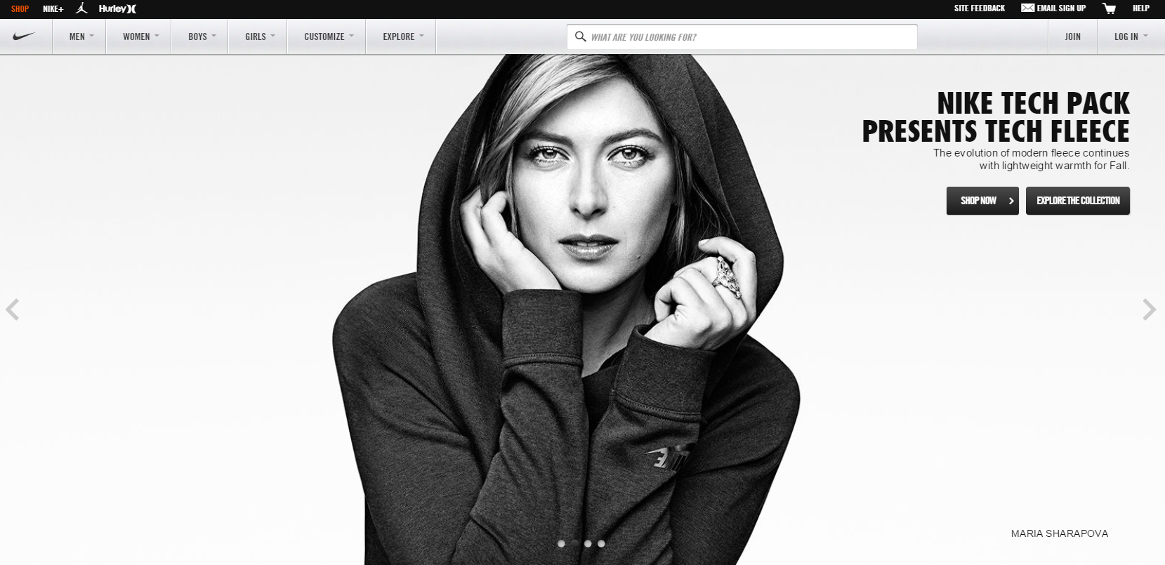
As a visitor, I know I can click on these images because they’re part of the carousel design. But there’s no explanation why I should click them. I clicked a random button and ended up on content about fleece jackets. What if I’m not interested in those? That’s a sure way to waste people’s time and keep them from ever coming back.
You can keep some of the simplicity of a static design by explaining – either visually or through text – why someone should click a particular carousel image instead of forcing them to hunt through random images and hopefully find something interesting.
Check out how GameStop does this on their homepage:
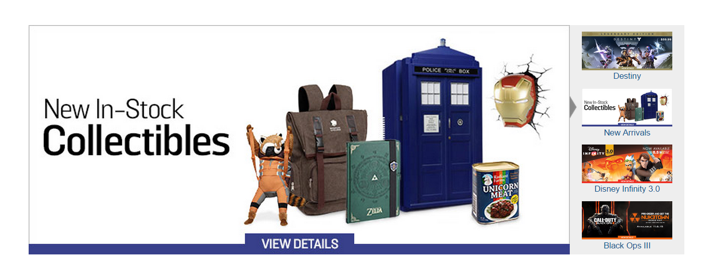
See how that works? The labels and image thumbnails set my expectations of what I’ll find on each picture (and give me a reason to go through) before I click, making for a much better user experience.
2. Show Users Their Location on the Carousel
Ever wait in line at an amusement park and see those signs telling you just how much longer you’ll have to wait before you can go on the ride?
Seeing “2 hours wait from here” might make you sigh in disappointment, but it’s better than the alternative: standing in line without ever knowing how much longer is left. The same principle goes for your carousel designs.
A lot of carousel designers got fancy by not numbering their images or giving visitors any idea of 1) how many images there are, and 2) where they are in the series. They use “…” as a link instead of a simple number. When users click on those vague links, they end up frustrated when they get into a loop without ever knowing where they are – or when they’ll make it to the end.
Take a look how Apple does this:
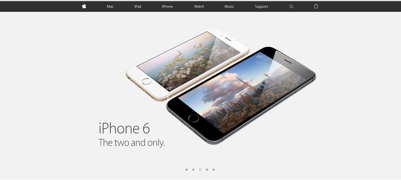
That is maddening, especially for first-time visitors who don’t know what to expect. They just want to find the information they need, not waste time clicking dots that don’t mean anything.
At the very least, show users where they are in the sequence and how many images there are. That helps them feel more in control, and it makes it easy for them to come back to particular images later on.
Ray-Ban does this well:
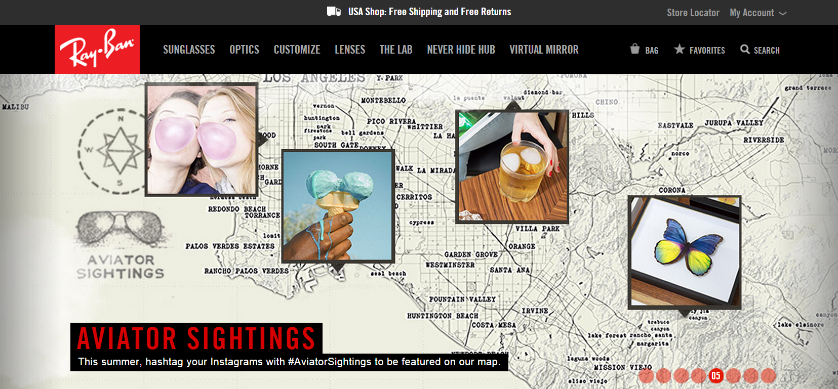
There’s no ambiguity about the user’s place in the carousel. Navigation is nice and simple.
3. Don’t Use Too Many Images
A carousel of 3 or 4 images offers a much better experience than one with 10 or 12.
Trying to force too much content into the above the fold space on your homepage overwhelms visitors. Even if they’re patient and read through everything you say, they’ll forget what they read first by the time they reach the end because we can only remember between 5 and 9 chunks of information.
Using too many images also waters down your appeal. It makes you come across as a business that’s unsure of itself, offering dozens of angles to make everyone happy. Limiting yourself to a few images makes you appear more confident in your value proposition and forces you to focus on the most important benefits you can offer.
Take a look how GoPro does this:
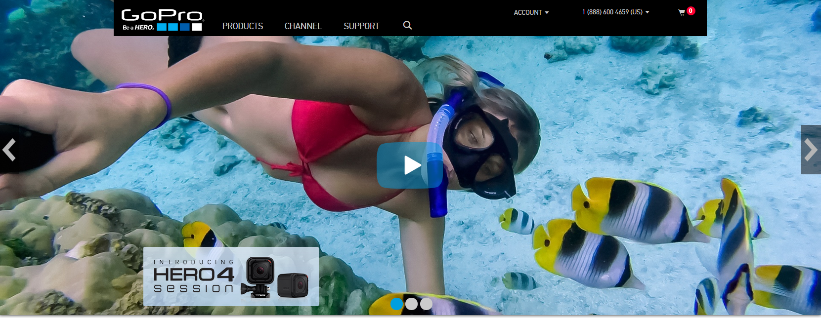
They could have gone on more about different features and why someone should do business with them. But they kept things simple by limiting themselves to three slides. That makes it easier for users to find the content that matters to them the most.
4. Leave the User in Charge
This one’s short and sweet, but it’s one of the most important factors separating a horrible carousel design from a decent one. Don’t rob users of their ability to control their website experience!
Rotating through images might look cool to you initially, but it will infuriate your visitors. What if they don’t want to move on to other content? What if they’re trying to re-read something right when it disappears? A bad experience will drive even the most interested people away – even if they would’ve rushed to buy what you’re selling on a static website.
If you insist on using – or at least testing – an image carousel, give users the ability to click through it at their pace. This sense of control is what people want to enjoy a decent user experience.
Take a look how PacSun does this:
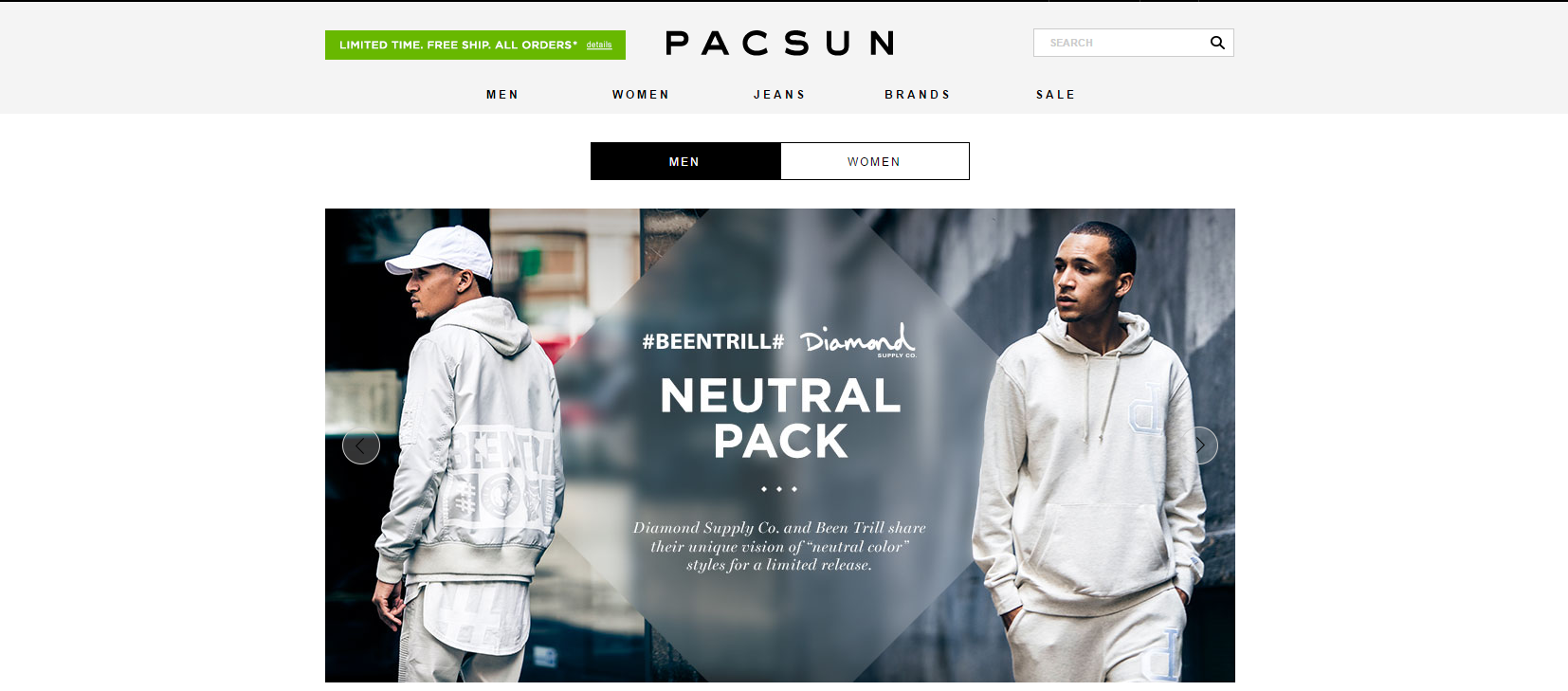
Nothing rotates automatically (though they do a terrible job of giving each image context), allowing me to browse through the images at my own pace and find out what I need.
Over to You
The carousel design looks cool, but usability research reveals it usually doesn’t perform as well as it looks. If you’re looking for a business website that converts – instead of just pleasing people with aesthetics – you’re probably better off with a focused value proposition and static design.
With that said, there are ways to ease some of the carousel design’s biggest downsides. So if you want to test the design on your website, pay attention to the considerations above to avoid upsetting visitors.
Test a carousel design if you want. But you’re probably better off split-testing different versions of a static homepage, tracking the conversions and optimizing from there.
Have you tried an image carousel on your homepage? How did it affect your conversions? Leave a comment below and let us know!