Guess what I’d like to talk about today?
Landing pages!
I know, I know, it’s one of those topics that’s been covered a hundred times already. However, I don’t want to reiterate the need for compelling CTAs, persuasive copy or even go over the concept of form field reductions again.
We all know these things, and well, you’re probably as sick of hearing of them as I am writing about them.
What I would like to focus on instead are some of the lesser covered actions you can take to increase conversions. Don’t think that because these actions get less coverage that they’re less effective, in fact, I’d argue that taking the actions outlined on every CRO website are pretty useless if not coupled with these.
 Photo credit: Deathtostock
So if you’ve already got a good knowledge on crafting kickass CTAs and killer copy, take a gander at these extra steps to take your conversions from pretty good, to absolutely awesome.
Make It Relevant
Don’t worry. I’ve not reneged on my promise to avoid the well-trodden path on the first point.
I’m not talking about making your offer relevant to your specific audience. That’s kid stuff you should already be doing. What I am referring to is ensuring that you have specific funnels for every segment and the source of that segment.
While all segments of your audience will have an interest in what you offer, they won’t interact with your copy in the same way. Those who come from social media will have a different expectation to those who are redirected from your email list not only will they interact with your copy in different ways, they’ll also be in various stages in your funnel.
Take a look at the below. I’ve outlined a very basic customer journey for the prospects who find you through both SM and organically on the SERPs.
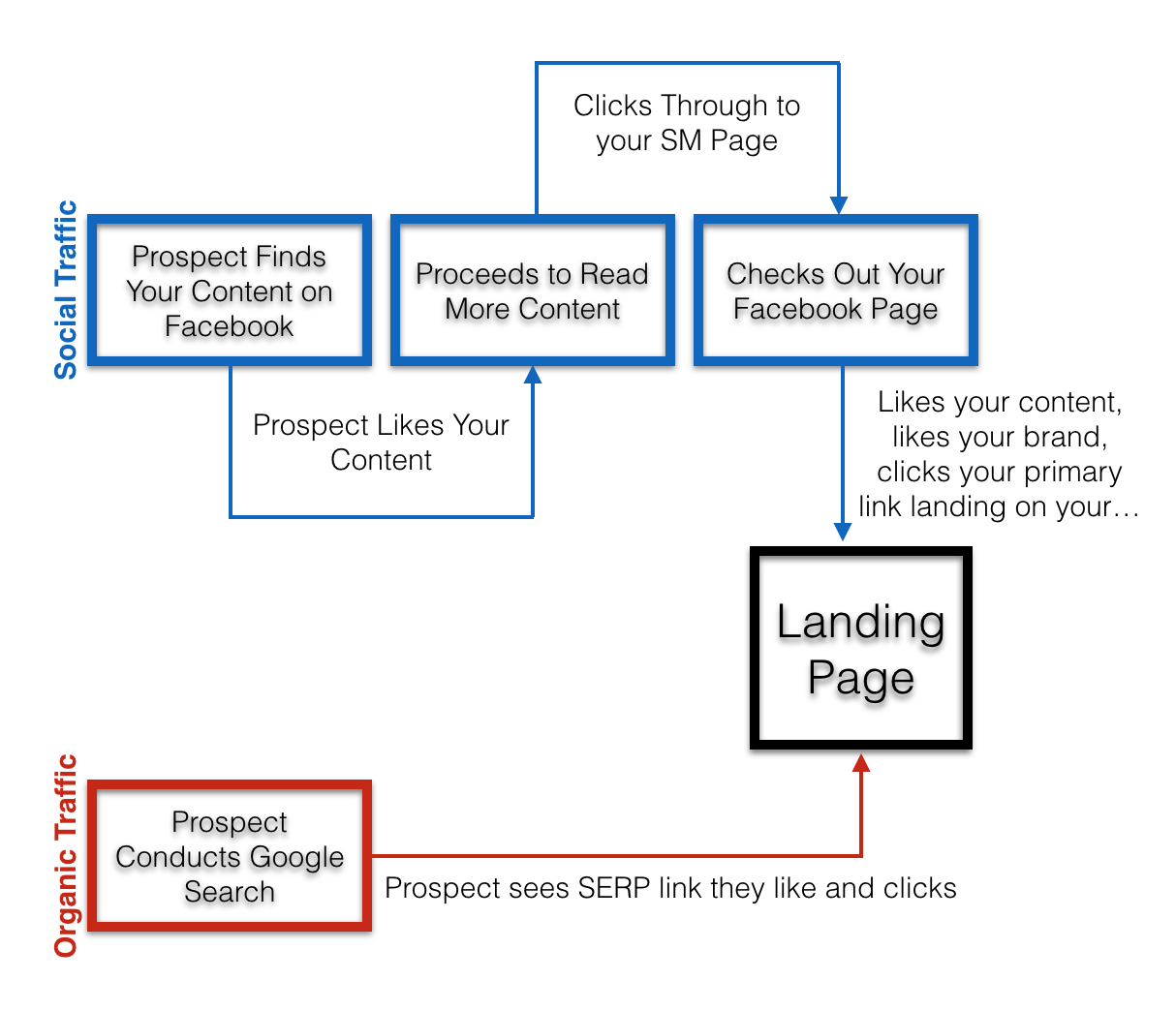
While no means a comprehensive visualization of the potential steps a prospect might take, it should give you an idea of the difference in purchasing journey between the two.
The guys who find you through social media will already be more invested in your brand as they’ve had more time to become familiar with your message and what you offer. In comparison, the organic traffic won’t have a clue who you are or what you offer.
In the above visualization you’ve already caught the attention and interest of your SM traffic so a landing page that builds desire would be a pretty good choice. However, the organic traffic can’t just jump in at this stage as you haven’t captured their attention or built their interest.
They’re at two completely different stages in your funnel and need to have landing pages that best resonate with where they are in their customer journey. It works both ways and, while providing you with a lot of extra work, it also should provide you with a healthy lift in conversion.
It’s about creating a logical, undisturbed trail from interest through to sale. No distractions, no questions.
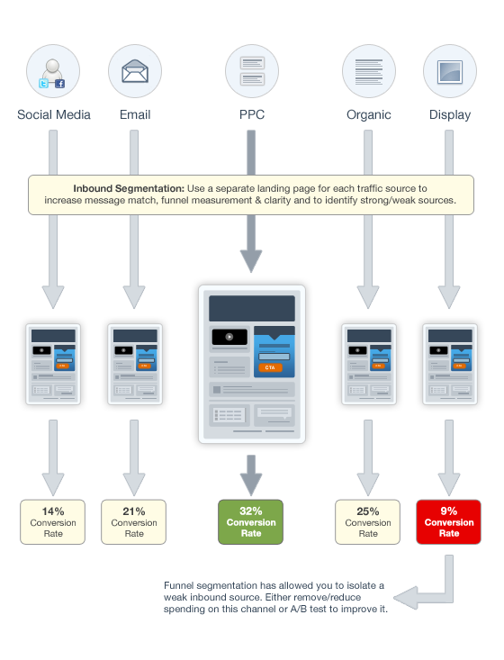
The other bonus of this method is being able to easily identify your weakest traffic referral sources and segments as outlined in this graphic from Unbounce.
There’s a reason that CROs are so focused on segments and cohorts. Their behavior and needs are different. You should know that a general approach to marketing often fails, this is just another step in creating a highly targeted and relevant message to your audience members.
A Clear Headline and UVP
Good headlines and a convincing USP/UVP should be a top priority for every marketer out there.
However, when it comes to your landing page, we’re not talking about using one of the more popular headline formulas aimed at content marketers out-of-the-box. Formulas are a great starting point, but if you want your sales page to do well, you need to know how to adapt that formula to your audience.
The best way to do this is to find the key benefit your product offers that your audience needs. The best advice I’ve ever heard on this is from Theodore Levitt when, in reference to buying a drill, said:
“People don’t want to buy a quarter-inch drill. They want a quarter-inch hole.”
If you want to pack a punch with your marketing, you’ll take this one step further. When we get down to real desires of your prospects, they don’t want the drill bit or the hole. The drill itself is the solution, and the hole is the result of using the solution. Neither is the real benefit.
What your prospects want is what those holes provide. The potential for more shelving storage, a way to display treasured family photos or the ability to use the holes to construct something larger.
Use your headline and UVP together to explain the solution and highlight the end benefit.
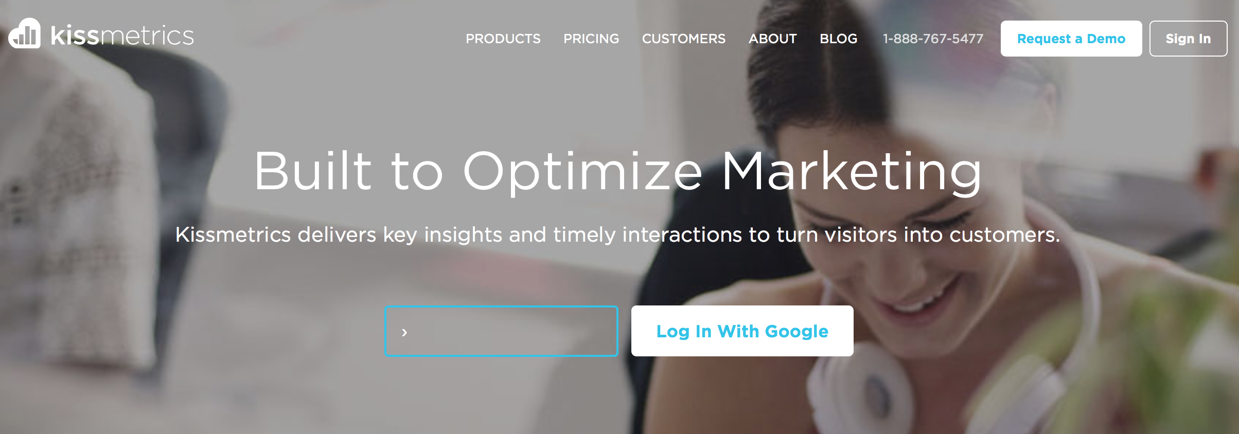
KISSMetrics is a great example of how to use a headline and UVP in collaboration to explain the service and demonstrate value.
One Page, One Purpose
Let’s not overcomplicate things here.
When someone lands on a page aimed at securing a sign-up or selling a product, that’s all that page should be doing.
You need to remove any and all distractions on the page that take attention away from the primary action or cause prospects to question their choice.
That means you need to:
- Remove links to other pages/sites
- Reduce form fields to the bare minimum
- Only have one CTA
One page, one purpose is one of the golden rules for effective landing pages. Don’t forget it!
However, don’t mistake the one CTA piece of advice to mean one button. You can use multiple buttons on the same page as long as they all have the same purchase such as securing a sign-up or adding to cart. Having numerous buttons on the page is fine as long as you don’t mix their use.
Trash the Navigation Bar
This ties in well with the previous point.
We know that leaving links that direct users away from the page are an open door to abandonment. It makes sense to get rid of them all.
So why on earth would you leave a huge bar at the top which consists of nothing else but links to other areas of your site? It makes absolutely zero sense.
Hubspot looked into the effect of navigation bars on conversions and the results are starling.
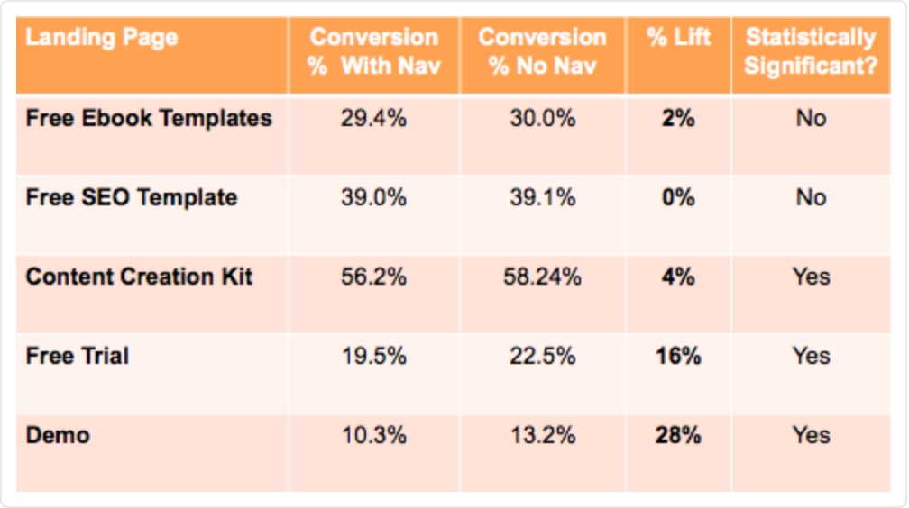
Leaving a navigation bar on your landing page is practically asking your prospects to leave. Remove it to keep attention on the product or action at hand.
Page Load Times
Take a guess at the average tolerable wait time?
Well, we know the average attention span is 8 seconds, so it’s got to be similar, right? Unfortunately the amount of time prospects will wait for a page is much, much shorter.
According to this study from the University of Nebraska, the tolerable wait time is an incredibly short two seconds.
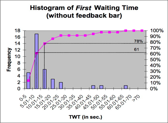
That means that if your page takes longer than two seconds tooled, you’re going to be losing prospects.
I don’t care how good your CTAs or your headlines. If your page is so slow that prospects don’t get to see them they’re completely useless.
Mobile Optimization
I’m not going to go in depth on this here as we covered it in detail recently on this blog.
For those who haven’t yet read that article here’s a brief overview.
- Mobile users are on the rise. They outnumbered desktop users for the first time in 2014 and again in 2015.
- However, their conversion rates are low. Tablet conversion rates aren’t too bad, but smartphone conversions float at just above 1%.
- Despite what everyone is saying, responsive isn’t the answer. It doesn’t offer the conversion centered approach to design you need.
- Instead you need adaptive design or even need to create a mobile specific landing page.
There. Mobile optimization in 30 seconds flat!
Ignore the Social Element
Everywhere you turn online there’s someone talking about social media integration and the importance of a solid SM presence.
I’m not saying this is bad advice at all. A lot of people out there have built incredibly successful companies off the back of well optimized social campaigns. However, it’s my opinion that social share buttons have no place on your landing page.
Remember when we talked about removing distractions? Well, what’s the purpose of your landing page? Is it to make a sale/secure a sin up or get lots of Facebook likes? If there’s something on your page that doesn’t contribute to the overall goal, it needs to go.
You only have so much space to play with which makes every single element incredibly important. You need to think strategically about how each element contributes to achieving your final goal. And, to put it bluntly, getting yourself a like on Facebook doesn’t contribute to making a sale.
Think strategically and you’ll agree that social share buttons on your landing page do little to help increase overall revenue.
Logical Thought Processes
One piece of advice I read a lot is to slap your CTA above the fold.
“Have it right there at the top of your page for the customer who’s ready to buy,” they say.
This is, quite simply, bad advice. Before you immediately discredit my claim, give me a chance to explain.
Ask yourself if this would work in a real life environment? If you walked into a shop tomorrow and were immediately pressured into buying a product at the door, what would you do?
Me? I’d turn around and walk straight back out again.
This approach flies in the face of logic. People need to be ready to buy before you can successfully ask for a sale. Pushing them to purchase before they’re ready only serves to add unnecessary friction to the equation.
Instead of following this “best practice” you should instead examine your page to identify the key areas where desire is highest and your prospect is ready to make the decision to purchase.
Marketing Experiments put the “above the fold” myth to the test and discovered that, despite what you might have heard, putting your CTA at the point where your prospect is ready to buy actually increased conversions by 20%.
Think about your CTA placement logically. If your prospect isn’t yet ready to buy, don’t ask them to. Simple as that.
Believing This is a Simple One Time Fix
So you’ve put in the hours and seen a good lift in your conversions. Time to put your feet up and enjoy the fruits of your labour, right? Well, not quite.
I’m not trying to rob you of the opportunity to celebrate, I’m the first to pop a cork after a successful campaign. But seeing a lift in your conversions doesn’t mean your job is over.
Conversion optimization is a never ending task. You’ve got to be certain that your tests weren’t skewed by an external influence or seasonal change.
Speaking of seasonal changes, you’ll likely have to amend your copy and page to better reflect the needs and behavior of your prospects year round. Purchasing behaviors in the run up to Christmas are vastly different to those in June meaning you’ll need to amend your copy to better align with that season’s behavior.
Don’t fall into the trap and mistake winning a battle for winning the war. The effectiveness of your landing pages and your site as a whole will constantly be fluctuating. If you want to consistently see high conversions then you need to consistently watch your rates and monitor customer behavior.
Conversion optimization isn’t a one time action. You need to continually stay on top of everything that’s going on with your site and your campaigns.
Conclusion
Landing pages are the bread and butter of the ecommerce world. A good landing page has the power to drastically impact your bottom line for the better.
There’s a lot of advice out there on how to get the most out of your landing pages which can make the hole process seem a lot easier than it actually is.
Don’t be a fool and think that because you’ve followed the generic advice of amending your CTAs and headlines that your job is done. There’s much more to conversion optimization than a few gimmicky copywriting hacks.
This article is a good start on what else to look for in addition to the well known advice. But as with everything in CRO you’re going to have to test every single element with your pages to see the best possible conversions.
Before I sign off here I’d love to know if you’ve got any tips for landing page optimization that are often overlooked. Or maybe you’ve found d the biggest gains are to be had by simply following the information we’ve all read a thousand times before…