Opt-in, contact, lead gen, checkout–these forms are crucial to doing business online. Because they have direct impact on your revenue and marketing ability, you want as many visitors to complete these forms as possible.
Use this list of tips to help you boost conversions for your forms and get more subscribers, leads, and customers.

1. Tell visitors what’s in it for them.
Too many forms focus on features instead of benefits. While talking about features is better than nothing, benefits are best of all because they clearly tell visitors what they get by filling out the form and why they want or need it.
For example, “instant access” and “free updates” are common features for opt-in boxes. The problem is that neither is very convincing. They’re also very vague–visitors don’t have a good idea of what they get by signing up.
To focus on the deeper benefits of the features, ask yourself, “Why do visitors want this feature?” Then take it one step further and ask, “Why do they want that particular benefit?”
Benefits-oriented copy is especially important in the headline, which gets visitors’ attention and convinces them to look through the form, and the button, which persuades them to take action.
2. Use visitor-oriented button copy that reiterates the benefits.
Nobody wants to “submit” or “confirm.” These default button words usually have very low conversion rates. The button is prime real estate in a form, and gives you more opportunity to inject personality and persuasion, so take advantage of it.
There are two ways to do this.
First, instead of using lifeless, impersonal commands, re-emphasize what the visitor gets. Try more interesting verbs that focus on what the subscriber receives. If you’re having trouble, start with “get”–this helps you focus on the benefits and has boosted conversions in many tests.
Second, use button copy that is visitor-oriented, such as “create my account.” This kind of language aligns the button with the way your visitors think, eliminating barriers to action.
3. Break up long forms into multiple pages.
Long forms are intimidating. In many cases, breaking a long form or multi-step process into multiple pages, each focused on a single step, converts better. This also gives you more opportunity to use persuasive microcopy to gently guide leads through the entire form.
For example, Crazy Egg saw a 10% increase in conversions when they switched from a two-page checkout to a three-page checkout.
On the other hand, sometimes shortening longer forms into a single page can be more effective. One-page checkout has become very popular recently, and can increase conversions as long as you truly can streamline the process, instead of just putting everything on one page. This guide from KISSmetrics outlines how to do one-step checkout the right way.
4. Try alternatives to captchas.
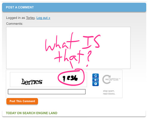
Everybody hates captchas, but you need something to keep the spambots at bay. So what do you do?
Try an alternative to captchas, such as:
- a “I am not a spambot” checkbox, visible (and checkable) only to visitors with Javascript enabled
- a honeypot, a field only spambots can fill in
- a simple math question, like “1+1=?”
Savvy spammers can get around these anti-spam methods, but if you blacklist spammers based on common trends and implement one or two of these additional methods, you can block most spam without annoying visitors.
5. Only ask for the most critical information.
As a general rule, the more fields you include in your form, the lower your conversion rate will be. You should only ask for the most critical information so visitors can quickly and easily fill out the form.
What information you ask for will vary depending on the form. Small opt-in boxes at the end of each blog post, for example, might only ask for an email address, while a dedicated subscription page might also ask for the visitor’s name.
Most contact forms should also be short. When Neil Patel removed just one field on his contact form, conversions improved by 26%. In his research on optimizing contact forms, he found that having only three fields performs better than having more fields.
Checkout forms will of necessity be longer, but you can still ask for only the most critical information by marking some fields as optional.
Of course, more fields may help you collect higher quality leads. If a longer form brings more revenue over time and the highest lifetime value per customer, it might be worth a slightly lower conversion rate.
The only way to know is to test!
6. Add testimonials to the form box or page.
Social proof works wonders, and is more important than ever. Including a strong testimonial, award, or other example of social proof with your form can help you emphasize the benefits of taking action. Testimonials also show new leads that you can help them because you’ve already helped someone else with the same problem.
Don’t forget to test to see which testimonials (or other social proof) converts the best!
7. Offer an incentive to encourage action.

A common conversion-boosting tactic for opt-in boxes, creating and offering an incentive or lead magnet increases conversions by giving subscribers something valuable in addition to free updates.
But you can use incentives for every form, not just subscription pages. Examples of incentives could be:
- free report or ebook
- bonus items
- guaranteed response time
- free trial
- exclusive membership or access to certain features
- free template or course via video or email
8. Make the offer urgent or scarce.
Urgency and scarcity prompt the visitor act now instead of waiting (and forgetting). You might have to get creative to use these techniques, but they can be very effective when done right.
Offering time-limited bonuses (“first 100 to sign up get X”), promoting sales and special offers (“get 25% off now through Black Friday”), and emphasizing availability (“our schedule fills up fast–secure your spot today!” or “hurry–only 10 left!”) are all ways of incorporating urgency and scarcity in your forms.
9. Make the form stand out.
Design plays a critical role in conversions by drawing the eye to the form and the button. So to get the most conversions from a form, two things must stand out: the form itself and the button in it.
Oli Gardner explains several ways design increases conversions for forms. Directional cues (like arrows), whitespace, color and contrast, borders, and focal points can all improve conversions for CTAs and forms of all kinds.
10. Focus on the desired action.
Treat all your forms like landing pages and remove any distractions. Social media buttons and other clickable icons detract from the desired action and lower conversions. Removing these distractions can boost conversions by focusing visitors’ attention on the one thing you want them to do.
11. Include an image that matches the form action.
When applicable, including an image can boost form conversions by showing subscribers what they’ll get by completing the form. Make sure the image is relevant to the form, and test different images and placements to find the highest-converting option. Some examples of images you could try include:
- the cover of the free report or ebook
- an icon
- a meme
12. Keep the button close to the form fields.
When the button is close to the fields, clicking it is the obvious next step. If the button is aligned strangely or is separated from the rest of the form, conversions drop because visitors aren’t sure what to do next. Make sure the form looks good and keep everything close together to guide visitors through the process as quickly and easily as possible.
13. Use the best offer.
A poor offer won’t bring in many conversions even if everything else is right. In a conversion optimization clinic for opt-in forms, Hybrid Connect demonstrates how a better offer for Example 3 could make an opt-in form much stronger.
Using market insight or analysis, find what resonates best with your audience and create an offer or incentive based on that, using your customers’ language and needs to communicate most effectively.
Offers aren’t just for opt-in forms. You could boost conversions for contact or lead gen forms with offers such as guaranteed response times or instant chats.
Be creative, research, and test to find what offers work best for your audience.
14. Test location and size of the form.
Where’s the best place to put your forms–in the sidebar? Below each blog post? At the top of each page? Do these smaller form boxes convert better than a dedicated form page?
The only way to know is to test different configurations. Forms on home and about pages and “sticky” blog posts often perform better when they’re one cohesive unit with minimal distractions, like a landing page. Depending on your audience, website design, and offer, different form box locations and sizes might drastically change your conversion rate–or not at all.
Split testing will show you what works and what doesn’t. That’s why it’s so important! Test these 13 important form elements to maximize your form conversions.
15. Add trust elements to forms.

One common reasons visitors don’t fill in a form is their anxieties about giving away information online. You can boost form conversions by calming those anxieties with trust indicators, such as:
- anti-spam statement
- privacy policy and terms of use
- security seals
- money-back guarantees
- shipping and return policies
Which trust elements you use and how you phrase them both affect conversions. Test to discover the best trust indicators and the best copy for them.
Your Turn
How have you increased form conversions? We’d love to hear what works for you–or what you need help with. Comment below and let us know!