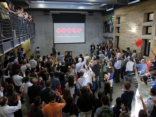
Stanford’s D.School is known as a hotbed of creative innovation, teaching professionals from all fields how to innovate efficiently in ways that will resonate with users. It’s known as a proponent of qualitative methods for making the best products.
CRO is widely viewed as a process of applying experimentation, in statistically significant test sizes, to select the best layout, elements, graphics, and copy to get your viewers to do what you want them to, and relies heavily on quantitative data.
So how can applying the D.School’s qualitiative methodology boost your quantitative conversion rate?
Deciding what to test
One of the most important parts of Conversion Rate Optimization lies in deciding what to test. By attempting to understand the context, goals, and expectations of visitors to a site, we can rule out a variety of options and get an idea of what types of changes might work, before a new element even gets sketched in a notebook.
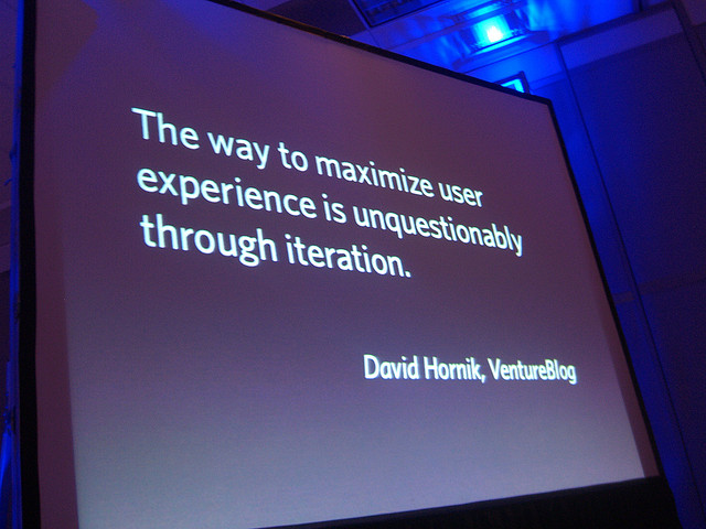
Further, by finding out why a specific aspect of a site or element works for visitors, we can leverage that to come up with, and test, many more element options that may work well for the same reasons. This makes iterative testing much more effective.

Understand and Iterate
Design thinking as taught as the D.School breaks down the innovation process into five+ sequential parts: Empathize, Define, Ideate, Prototype, Test.
The user focused D.School process uses empathy as a starting point to get in the users’ mindsets and understand their needs. The goal of the process, how specifically to target them and what they should be encouraged to do, is only then defined. Potential ways to achieve the goal, great or horrible, are thought up en masse in a positive brainstorm-style anything-goes ideation session before evaluating them through the lens of the user to select the best options to prototype. Then we test with real users, and determine how far back in the process to go in order to begin the next revision.
The ‘five+’ is because the process is iterative: after testing one can return to any of the previous parts and keep going for continuous improvement, or at least until we have a well-received product that is proven to work well for its users. In practice it should be at least a ten, maybe a twenty.
What you DON’T learn from testing a new idea
Often an A/B test consists of a current site being tested against the same site with one altered element. Often the new candidate is in the test because it’s the only idea for improvement, or because someone saw another site using it. All that is learned from these tests is which of two elements, original or new, is better.
This can be a wonderful thing and double your conversions, or it can keep you from making a bad move and reducing your conversions. But all it gives us is a winner between two elements. It will not tell you why you have a winner, or why it worked, and how you can leverage that even more to find an even better option. It will not tell you specifically what needs the visitors had, that the better option served better. We need to figure that out from other data.
Investigate users to determine their needs
It’s great to test among random diverse options that just might work well for your users, but it’s even better to test among a handful of options that you have reason to be believe will work well for your users. In order to test better ideas with each iteration, we should determine why an option worked well for our visitors, and what needs your visitors have that are served by that option.
Ask yourself, what are they doing on your site? How did they get there? Where is he sitting right now and what is he trying to accomplish? As she scans the page, what is she thinking when she glances at this element? Not sure about your answers? Good, you shouldn’t be. Ask them.
Literally call any visitors that you can (this will often be after a successful conversion) and ask them where they were when they visited, how they came upon the site, what they were hoping to find or do, and what they found. If you can bribe them, they may be willing to go through the process again and note any moments when they nearly backed out or went for another site or somehow didn’t perform the intended action.
Search for their needs on all levels, great and small
Think of Ray and Charles Eames’ Powers of Ten video. You’re looking for their needs at all levels, from ‘what are they thinking in this very second‘ that I can use to convert, to their top-of-Maslow’s-pyramid self actualization needs.
A recent test by The Sunday Times found that when a news story faded to white midway down the article for non-subscribers and was covered with a subscription ad, the single biggest factor in conversions was whether the tested version had the text “Want the Full Article and Instant Website Access?” near the fadeout, and that that copy increased conversions by 115%.
That may be because at the moment when visitors get to the end of the free part of the article and experience the momentary disappointment of having it rudely taken away, the only thing on their minds is wanting to finish the article. Giving them a clear path to that end, with the reassurance that they will get to finish, may be worth a few bucks about 2.15 times as often as without that clear path and reassurance.
Of course, that’s just a hypothesis until we actually find out what they were thinking in that moment by observing and asking, but it illustrates that you don’t have to find some deep character insights in order to play to your visitors’ psychology.
Think you have an interesting need or hypothesis? Great, call the visitors again and see if they can provide you more insight about it. If you can think of non-leading questions that still get them to say what you’re trying to verify, you’re probably barking up the right tree.
Leverage user understanding to generate A/B testing ideas
When you know your visitors’ needs, at a certain point on your site or from your industry as a whole, you can come up with a whole slew of ideas and elements to serve those needs, or even challenge best practices based on the specific needs of a particular industry or user.
Come up with elements to test. Ideate all at once, with more than one person involved, in a rapid brainstorm, reserving all judgment for later. If you intend to get the testing done by a firm, now would be a good time to get one of their people involved in order to feed in some ideas. Sketch or write as little as possible. A big piece of paper or whiteboard, or a wall with post-its, works great for seeing ideas and letting them inspire other ideas.
Ask “how-might-we.” Attempt to target specific needs that you think are interesting or may present an opportunity, and attempt to find non-web analogies for how you might make a user feel that that need is being served. Then try to translate the solutions into copy or imagery.
Constrain to help creativity: If we could make any ridiculous offer, or if we had to use three bad words, or if our visitor was blind and was going to hear the alt-text of this image, what would we want it to say?
When you have a range of options and are done brainstorming, and only then, cross off the stupid ones (they were only there to help you come up with other ideas, and to prevent you from leaving your creative mindset to cross them off). Then re-read your list of needs and see which element ideas clash with those needs. When you have a handful of ideas that work well with the needs you found, you’re ready to get qualitative.
Test your options. Repeat.
Get the A/B testing done or do it yourself. Bringing your options to an A/B testing firm, or involving them in the ideating process, will likely get you much more bang for your buck then coming in blind. In looking at the results, guess why one option worked better than another. Empathize. Redefine. Ideate. Prototype. Test. Ideate. Prototype. Test…
You are now practicing design thinking as done at the D.School, and you have repeatedly made measured improvements to your site.
Have you applied design thinking to your site? Want to show us? Comment below!
Photo Credits: Many thanks to jurvetson, noodlepie, cackhanded.