Converting Website Traffic into Quality B2B MQLs: A Guide
In B2B marketing, generating website traffic is only the first step. The real challenge is converting those visitors into Marketing Qualified Leads (MQLs) — prospects with enough interest and engagement to be nurtured into sales opportunities. Unlike general leads, MQLs are vetted based on specific criteria such as job role, company size, and engagement level, making them more likely to convert into customers.
Without a strategy to qualify and capture MQLs, businesses risk losing high-intent prospects who may leave the site without taking action. Optimizing the conversion process ensures that marketing efforts translate into tangible business results.
This guide explores key tactics for understanding the MQL journey, refining website elements for higher conversions, and leveraging data-driven testing to improve lead generation.
Understanding the Journey from Visitor to MQL
Before optimizing for MQL conversions, it’s crucial to understand how visitors to your website move through the conversion funnel. The journey from first visit to qualification typically includes the following stages:
1. Awareness: Attracting the Right Audience
Visitors arrive at a website from multiple channels—organic search, paid ads, social media, and referrals. They are exploring potential solutions but may not yet be ready to engage. Content such as blog posts, industry reports, and educational resources helps attract and inform potential leads.
2. Engagement: Encouraging Deeper Interaction
Once on the site, visitors exhibit behaviors that indicate their level of interest. Key engagement actions include:
- Downloading gated resources like whitepapers and case studies
- Attending webinars or signing up for newsletters
- Visiting pricing or product pages
Analyzing these behaviors provides insights into what content resonates most and where users may hesitate in their journey.
3. Conversion: Capturing High-Intent Leads
A conversion occurs when a visitor takes a meaningful action, such as filling out a contact form, requesting a demo, or signing up for a free trial. Strategically placing clear, compelling CTAs can significantly improve conversion rates.
4. Qualification: Identifying the Right Prospects
Not every lead is ready to be handed off to sales. MQLs must meet predefined criteria that indicate they are a good fit for the business. Companies often use lead-scoring models that assign values to different actions (e.g., a demo request might score higher than a blog subscription). Leads that meet the threshold are passed to sales for further engagement.
Leveraging User Behavior Analytics
Understanding how visitors interact with your website is key to optimizing conversions. User behavior analytics provides data-driven insights into which pages engage users, where they drop off, and what actions they take before converting into MQLs.
Businesses can refine their lead generation strategies by leveraging tools like heatmaps, Google Analytics 4 (GA4), and session recordings.
Identifying High-Performing and Underperforming Pages
Not all pages contribute equally to MQL conversions. Some attract traffic but fail to engage users, while others drive high conversion rates. Use GA4’s engagement metrics to analyze:
- Page Views & Time on Page: Pages with high traffic but low time spent may not be delivering relevant content.
- Bounce Rate & Exit Rate: If visitors frequently leave a page without taking action, it may need better messaging or a stronger CTA.
- Conversion Paths: Identify which pages and sequences lead to the most MQLs and replicate successful elements across other pages.
Understanding User Click & Scroll Behavior with Heatmaps
Heatmaps visually represent where users click, scroll, and engage the most on a webpage. Using heatmap tools can help you optimize:
- CTA Placement: If users aren’t clicking on CTAs, consider testing their positioning or design.
- Form Engagement: If visitors start filling out a form but don’t complete it, reducing the number of required fields or adding progress indicators may help.
- Content Effectiveness: If users don’t scroll far enough to see important content, repositioning key information higher on the page can improve engagement.
Tracking User Flow and Drop-Off Points
GA4’s User Flow reports provide a step-by-step view of how visitors navigate your website. By analyzing common drop-off points, businesses can:
- Streamline the user journey by reducing friction (e.g., simplifying navigation or improving page load times).
- Enhance content engagement by adding internal links or suggesting related resources.
- Improve form usability by identifying where users abandon sign-ups or downloads.
By continuously analyzing user behavior and making data-backed adjustments, businesses can create a smoother, more intuitive path to conversion—ultimately increasing the number of high-quality MQLs.
Optimizing Website Elements for Conversions
Your website plays a crucial role in guiding visitors toward becoming MQLs. Optimizing key elements ensures a seamless user experience and encourages more conversions.
1. Strengthening CTAs and Forms
- Clear, Action-Oriented CTAs: Use benefit-driven messaging (e.g., “Start Your Free Trial” instead of “Learn More”).
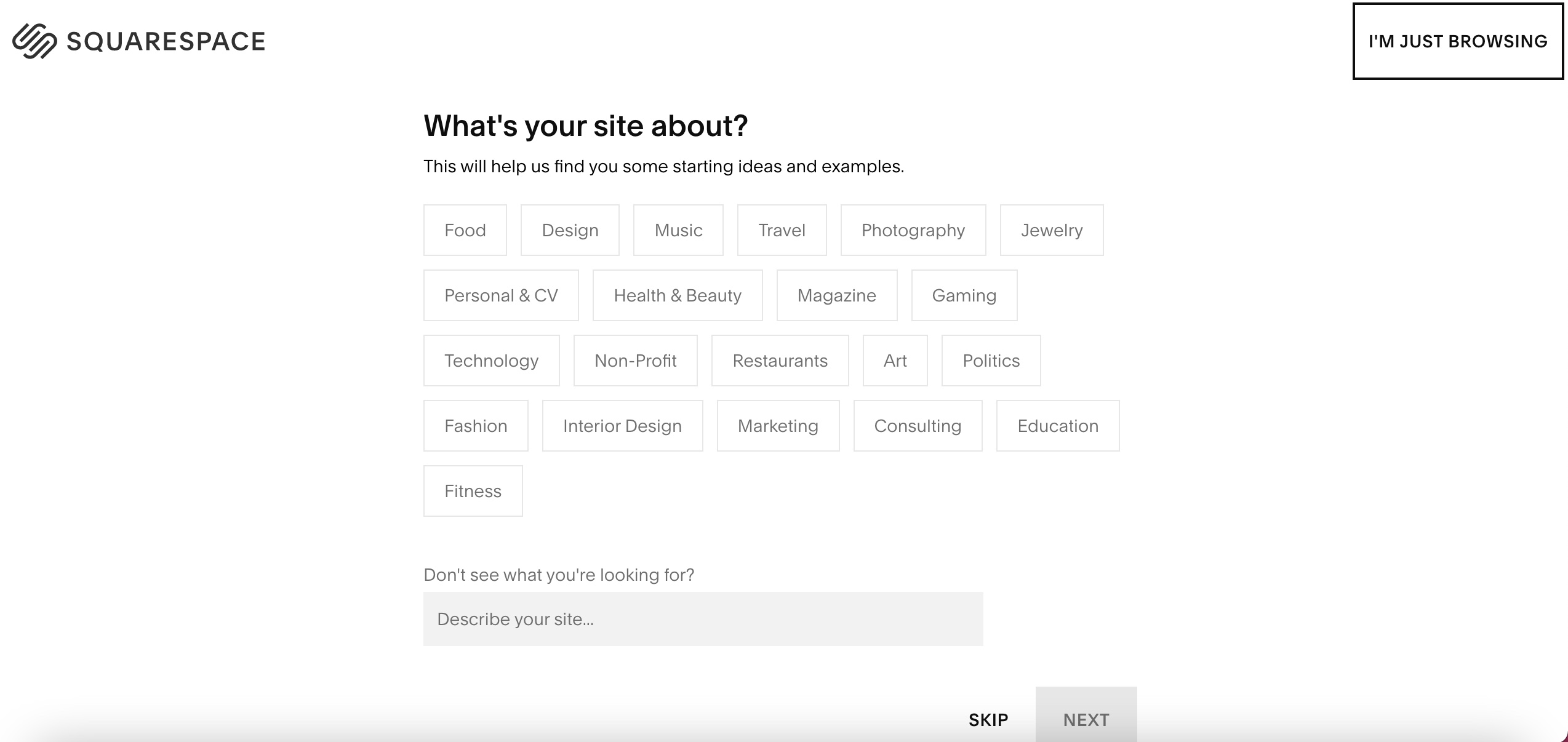
- Minimalist Forms: Reduce required fields to only essential information to lower abandonment rates.
- Multi-Step Forms: Collect basic details first, then ask for more information in follow-up steps.
- Personalized CTAs: Use dynamic content to tailor messaging based on user behavior and interests.
2. Creating High-Value, Targeted Content
Offering valuable content tailored to different audience segments increases the likelihood of conversions. Strategies include:
- Gated Content: Provide whitepapers, case studies, and reports in exchange for contact details.
- Interactive Webinars: Use live Q&A sessions to engage prospects and position your company as an industry expert.
- Industry-Specific Content: Develop guides and solutions tailored to the pain points of your target audience.
3. Optimizing Landing Pages for Higher Conversion Rates
- Fast Load Times & Mobile Responsiveness: Slow pages lead to high bounce rates.
- Distraction-Free Design: Remove unnecessary navigation to keep users focused on the CTA.
- A/B Testing Headlines & Visuals: Experiment with different layouts to identify the most effective elements.
- Social Proof & Trust Signals: Display testimonials, case studies, and customer logos to build credibility.
By refining these website elements, businesses can create a more compelling experience that encourages visitors to take action and qualify as MQLs.
Testing and Analyzing Conversion Strategies
Even with a well-optimized website, improving MQL conversions requires continuous testing and data analysis. By leveraging tools like A/B testing, heatmaps, and Google Analytics 4 (GA4), businesses can identify what’s working and where there’s room for improvement.
A/B Testing for Data-Driven Improvements
A/B testing allows marketers to compare two variations of a webpage, form, or CTA to determine which performs better. Elements to test include:
- CTA Button Colors & Text
- Landing Page Headlines
- Form Length & Fields
- Gated vs. Ungated Content
Using Heatmaps & Session Recordings
Heatmaps and session recording tools like Hotjar or Crazy Egg provide insights into how users interact with a site. These tools help marketers:
- Identify areas where users drop off or stop scrolling.
- Evaluate the performance of CTAs and their position.
- Understand whether users struggle with navigation or form completion.
Leveraging GA4 Data for Smarter Decisions
Google Analytics 4 offers advanced tracking capabilities to measure lead conversion performance. Key metrics to monitor include:
- User Flow & Drop-Off Points: Understanding where visitors leave the site helps pinpoint weak areas.
- Event Tracking: Monitor clicks on CTAs, form submissions, and content engagement.
- Audience Segmentation: Analyzing how different segments interact with the site can inform targeted marketing strategies.
Regularly reviewing and iterating on conversion strategies ensures that lead-generation efforts stay effective and aligned with audience behavior.
Next Steps for High-Quality B2B MQLs
Converting website traffic into high-quality MQLs requires a strategic approach that combines user behavior analysis, website optimization, and ongoing testing. By mapping out the visitor journey, refining website elements like CTAs and landing pages, and leveraging data-driven tools for continuous improvement, businesses can maximize their MQL conversion rates.
If you feel like this process is a little overwhelming, you aren’t alone. FunnelEnvy is here to help B2B marketers make the most of GA4’s capabilities. Our GA4 Audit expertise helps you unlock the full potential of GA4 in just 21 days. The offer includes:
- 150-point audit
- 21-day delivery guarantee
- Precise plans & instructions
You don’t have to tackle this alone. Contact our expert team today to get started and begin seeing results in as little as 21 days.