What should you test next?
Do you start with your CTA placement and button color or would you be better served to optimize your headlines? It’s a difficult decision to make and one that marketing managers often struggle with. Unfortunately, it’s a confusion that frequently leads to one result. Copying the methodology of a well known CRO or case study.
Sure this can sometimes bring a good lift in conversions, but more often than not copying another business’s test isn’t going to win you many new customers even when following their instructions to the letter.
So what’s the deal? Why would a test that’s worked so well for one person utterly fail when implemented on another site?
Well, it’s all down to one reason.
That test – the one you’re copying – was intended for an audience different to your own. Your audience is unique and will interact with your site in completely different ways.

Photo credit: Death to Stock
Instead of following the crowd and replicating tests that others have run, you need to understand what tests are going to have the biggest impact on your audience.
Don’t just throw everything at the wall to see what sticks. Identify your audience’s biggest problem areas and research how best to fix them.
This is something we’re all well acquainted with; the real question is how do you find your audience’s sticking points and identify the best tests to solve them?
Gather Quantitative Data
Your first job in hunting down good test ideas is to examine your analytics account and identify the biggest problem areas of your site.
Pages with big problems will have high exit rates. They’re the pages that don’t convince prospects to continue their purchasing journey and instead turn them off your brand for good.
So that’s where we want to start our search. You’ll want to open your analytic’s account and navigate to Behavior > Site Content > Exit Pages.
This report displays the pages that were last in a user’s session. Basically, the last page people viewed before they decided that your site wasn’t right for them.
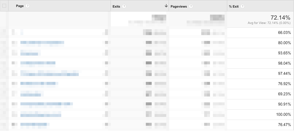
The first two columns (blurred out here) have no real use. They give the total number of both exits and total page views. We’re primarily interested in the final column, the percentage of exiting customers.
The average exit rate at the top is your benchmark. In the above example, the average exit rate is a pretty high 72.14%.
Use the average exit rate to help separate the pages into two different lists.
- Listing pages with an exit rate higher than average
- Listing pages with an exit rate lower than average
List one comprises your problem pages. These lower performing pages will be the areas where you’ll want to first focus your optimization efforts.
List two is full of your higher performing pages. You’ll want to study these to see what it is that helps them work so well.
What you want to do now is cross reference your lists. You’re looking for elements in list two that could be incorporate into the pages from list one. If you can spot any patterns or potential fixes, you’ve found a great place to start some A/B tests.
The same process should be applied to the landing page report (just above exit pages in the navigation menu). Once again, you can ignore a lot of the information on your this report. We’re only interested in the percentage of goal conversion rates.
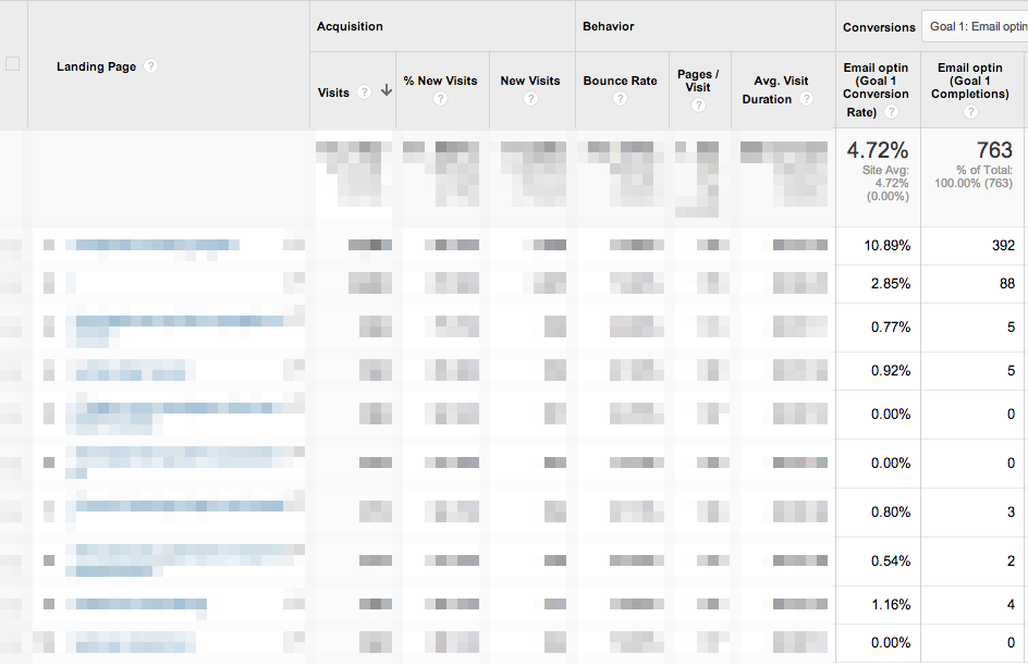
Go through the same motions again and create two lists of above and below average.
Be sure that you compare your two lists before taking any action. Ask yourself what is it that all high converting/low exit pages have in common? Can it be applied to your poor performers? If so, how?
A lot of the information you’ll need to improve your conversion rates is already right in front of you. You just need to take the time to identify the right information and think about how it can be adapted across your site.
Survey Your Audience
If the above hasn’t worked or you’re struggling to identify potential in your lists, you’ll want to jump straight to qualitative data collection.
You’ve already got your list of poor performing pages; now it’s time to find out exactly what you can do to improve them. For this, there’s no better method than simply asking your audience the right questions.
You’ll often hear CROs talking about surveying their audience in order to better optimize their site. It’s a great method that really works, but instead of preaching the same information over again I want to look at an often overlooked survey tool, Qualaroo.
Qualaroo is a great tool for reaching your prospects in the moment and finding out exactly what’s stopping them from converting. They’re those little boxes that pop up the corner of your browser and look like the below.
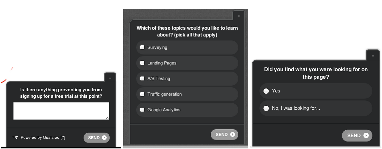
These questions reach people as a problem arises. It might not sound like a big deal, but it ensures that the responses they provide are directly related to the sticking points they’re experiencing. This means that you’re getting more accurate information than a retargeting or abandonment campaign as prospects aren’t recalling the problem at a later time.
Use the information prospects provide through Qualaroo forms in the same way you would a regular survey. The bonus with this is that it’s often directly linked to a certain page that will help you better implement the changes.
You can build on your regular survey campaign, and Qualaroo results by implementing a complaints/praise ticketing system. This opens another avenue for customers to offer feedback on what they like and dislike about your site.
Listen to what your customers have to say as it could be the difference between
On Site Search
Search results are pretty incredible things. Knowing what people are searching for can provide a great insight into user behavior and desires.
Take Google Trends for example. It’s n incredible service that documents the search volume for various terms that are typed into Google. Sounds fun, but is it really useful?
The results aren’t just fun little looks into what people are searching for. They provide key insights into the behaviors and needs of Google users. It’s a tool that content marketers use to great effect to find currently trending content that’s likely to bring in high levels of traffic.
But what’s that got to do with on site optimization?
Well, wouldn’t you like to have a similar breakdown of what users are searching for on your site? If you use a service like Findberry or Google Site Search the analytics data can provide exactly that.
Let’s examine a potential situation. You implement the search box, and your analytics tell you there’s two primary products your users are searching for.
This increased search level identifies the products as user favorites. However, it also tells you that users can’t easily find them on your home page or category breakdowns.
A good A/B test idea might be to include product descriptions and direct links on your homepage for the most highly searched products. Or potentially even adding them to a more frequently visited category. Both steps reduce the stages in your funnel and should, in theory, increase conversions.
You can use search boxes in a number of ways to identify good testing ideas. However, you should also take note of the language users are using as this could help craft copy that better resonates with their needs.
Heat Maps
Heat maps are one of the best methods for collecting qualitative data.
If you use one of the better services like Crazy Egg you’re provided with a multitude of useful reports. Here’s how their various reports can help you find A/B test ideas.
Click Maps – See where users are clicking, and where they’re not.
Click maps are great for a number of reasons. You can use click maps to show if people are clicking on non-links or overlooking useful links. A/B tests might include design, layout or copy changes to bring more attention to actual clicks that progress their journey.
Pronto made a number of startling discoveries on the behavior of their users which led to a full site re-design and a 24% lift in leads gathered!

Scroll Maps – See how far down a page users scroll and that areas get most attention
Scroll maps are great because they show you exactly which area of your site is the hottest piece of digital real estate. A/B test ideas include design changes to better position key persuasion elements.
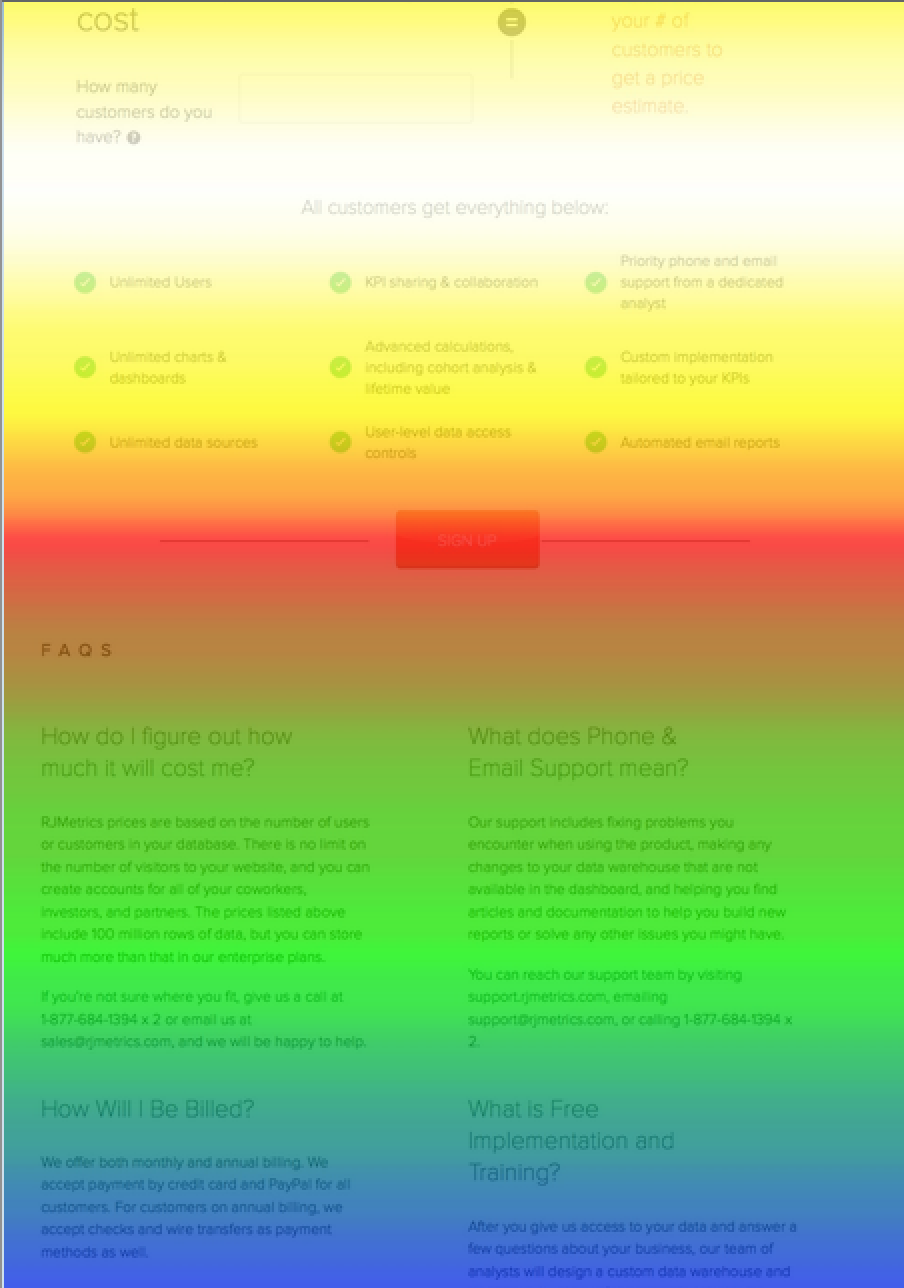
RJ Metrics managed to increase landing page conversions by 74.9% after identifying the best placement for their CTA.
Segmentation Clicks – Find out how different segments interact with your site
Social traffic interacts differently with your site compared to organic traffic. Within those segments are even finer segments. Facebook users have different behaviors than Google+.
Some will click on link A while others will click on link B.
Knowing which segments prefer which link, CTA or headline can help better target your messaging to appeal to a specific segment. If you find that design variant A brings more clicks with Twitter users, then you might want to set up a separate landing page based on that design specifically for them.
A/B tests include changing design and copy elements to better resonate with individual segments. Maybe even implement different landing pages for different segments.
Heat maps round out the qualitative data set you’ll need to understand user behavior and interaction habits. Start experimenting with a free service such as SumoMe before making the leap to a comprehensive service like Crazy Egg.
You Need to Spend as Much Time Identifying Good tests as Actually Running Them!
A/B testing is the lynchpin that holds all conversion optimization campaigns together.
If you just jump in and start testing everything you’re going to see little to no return. Instead, you need to spend about as much time finding good test ideas as actually implementing them.
Of course identifying the test itself won’t ensure success. For the best results possible you need to identify your best test ideas, create a hypothesis for the test, implement, analyze and repeat.
Start learning from the people who interact and use your site. Don’t implement your tests based on a hunch or the opinion of a team member, always remember that effective tests are based on solid data and a thorough methodology.