Revamp Your B2B Landing Page: 5 Things to Consider

Today, we’re going to talk about what might be the most important page on your website. No, it’s not your home page, or your contact page, or that snazzy blog post that got lots of clicks. It’s your landing page. 

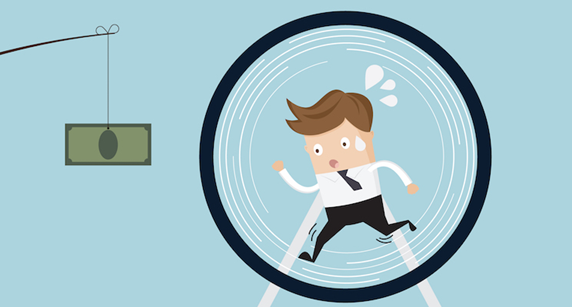
Landing pages are the pages that leads land on right before they convert. This is the page that should sell your product or service best. If you don’t get your landing page right, your sales are going to be undercut. 

If your current landing page isn’t getting it done, then it’s time for a refresh! 

5 things to consider when revamping your B2B landing page

Below are some of the most critical things to keep in mind when revamping your B2B landing page for maximum effectiveness.

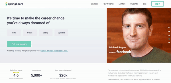
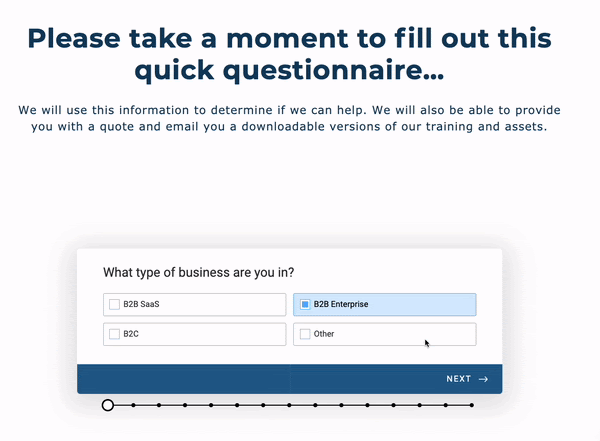
1. Have a clear value proposition

First things first, you need to have a clear value proposition. As soon as your lead starts scanning the page, they should be getting an idea of what your product can do for them. 

This is especially important when you’re offering an unfamiliar product or service. Everyone already knows the value of a cloud storage service, but not everyone will understand why they need NAS drives in their office at first glance. 

That said, familiarity doesn’t translate to a value proposition. If you’re selling in a popular market, then your value proposition is going to be what differentiates you. If everyone already knows what Slack, Zoom, Skype, and email are, then what unique selling point do you have to offer, and what’s the fastest way to showcase it on your landing page?

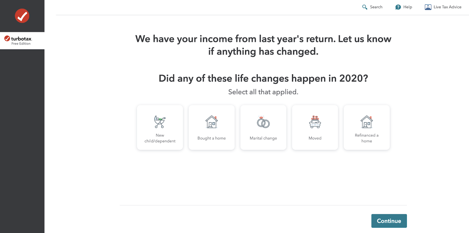
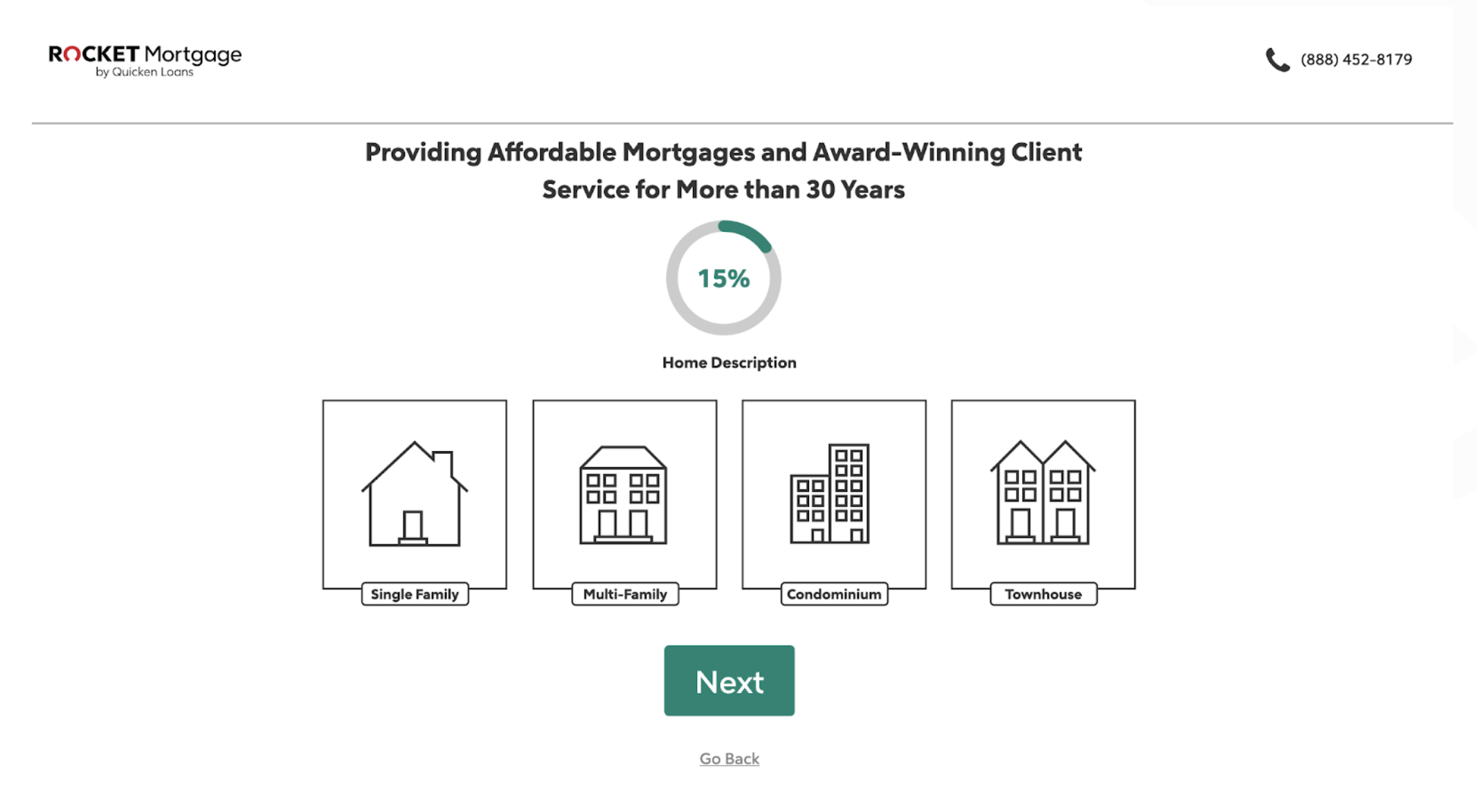
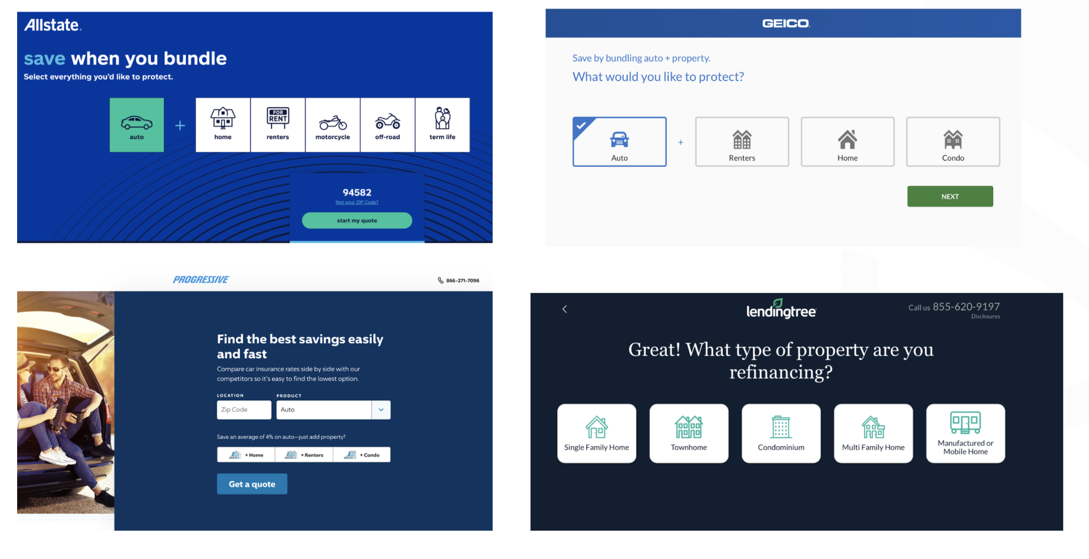
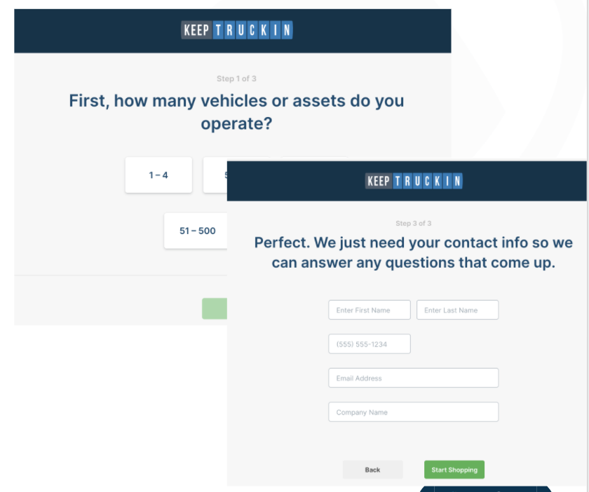
2. Make sure the journey from your marketing campaign to your landing page is cohesive

Next, you need to view your B2B landing page as your user’s end point in a marketing campaign journey. From the first time someone hears about your product to the moment they’re about to make a purchase, they are on a journey with your brand. 

Visuals are a great way to tie this journey together. Using colors, images, logos, and keywords throughout your marketing campaign to your landing page will help solidify the landing page’s purpose for your leads. Conversely, changing up your visual narrative and tone on the landing page can dissociate the customer’s previous experiences from your landing page, breaking the customer journey at the last moment. Essentially, it’s crucial to stay cohesive with your language, messaging, visuals and call to action. 

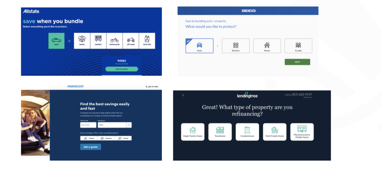
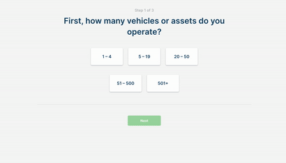
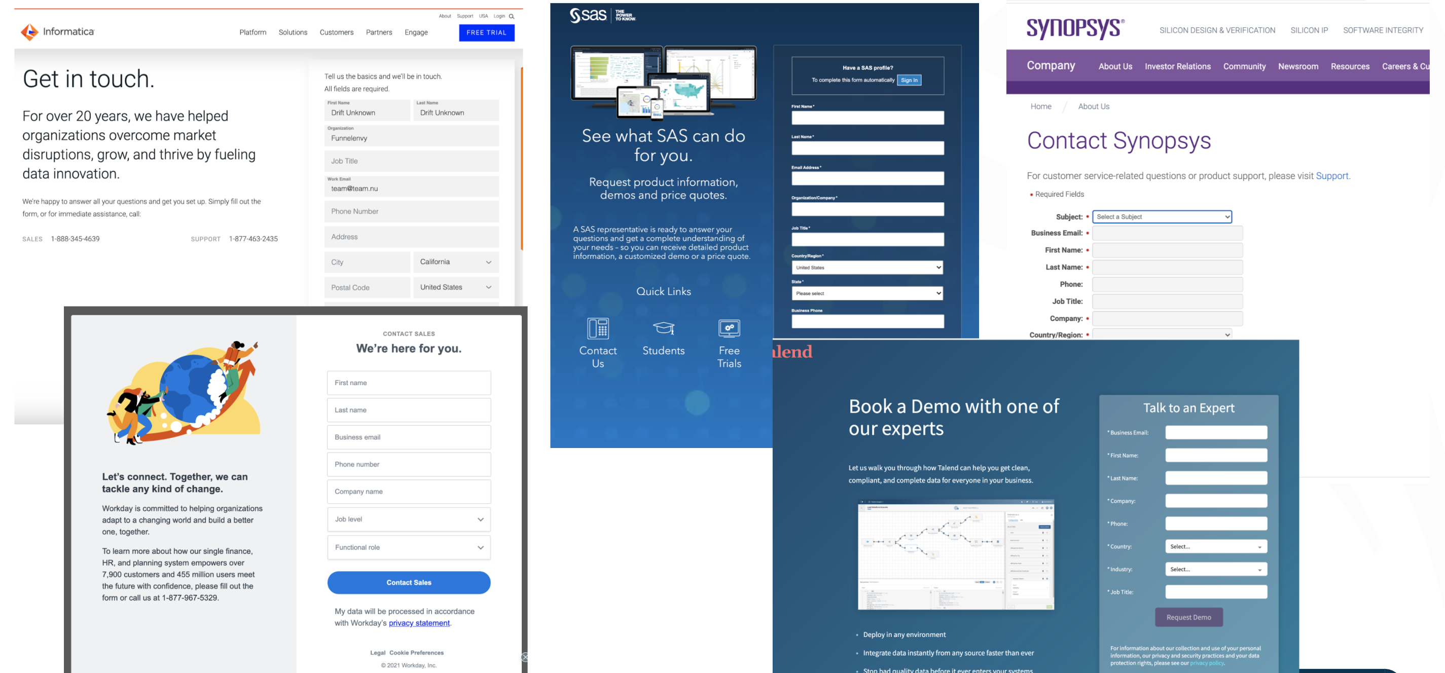
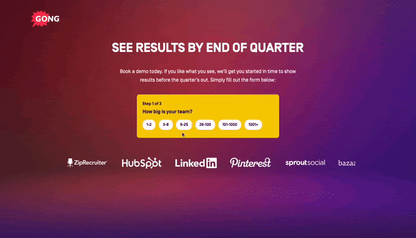
3. Have an obvious CTA front and center, and reduce navigation elements

Another key component of a cohesive B2B landing page is a clear call to action (CTA). CTAs are proven methods of pushing engagement, despite how naggy they may seem on the surface. 

Not only do they work, but they help leads make their decision, too. If someone visits your landing page and either A) Doesn’t know what the page is for, or B) Can’t find the CTA, then they’re probably going to scroll around and then click away. 

Don’t let this happen to you! Whether your CTA is a “Buy Now!” button, a sign-up form, or a choice between payment plans, make sure it’s the first or second thing that your visitors see. 

4. Showcase your testimonials and partnerships on your landing page

For our last two tips, we’re going to tie everything together with actionable steps. The first of which is to establish trust quickly. 

In B2C, entry trust (i.e., before the customer becomes a repeat customer) comes from reviews and word of mouth. Consumers want to hear that a product is great from their peers before they hear you say it. 

B2B works much the same way, except that your customers’ peers are going to be other businesses. This means you’re going to want to rely on testimonials and partnerships rather than reviews. 

Having familiar logos on your landing page as well as kind words will quickly ingratiate you with your leads. If they recognize brands that you’ve partnered with or see their needs and issues reflected in your positive testimonials, they’ll trust your product before they’ve made it to the checkout page.

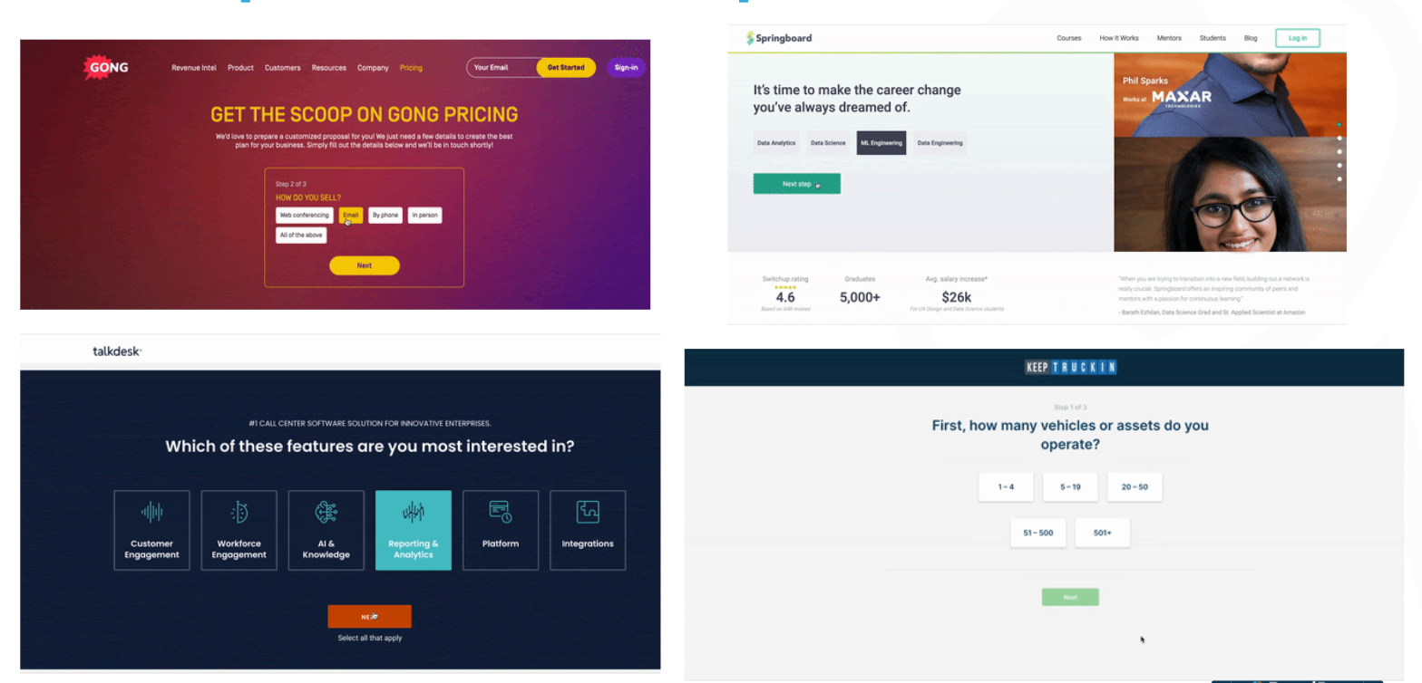
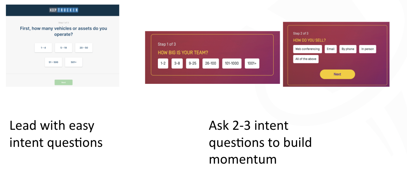
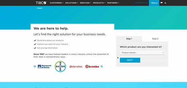
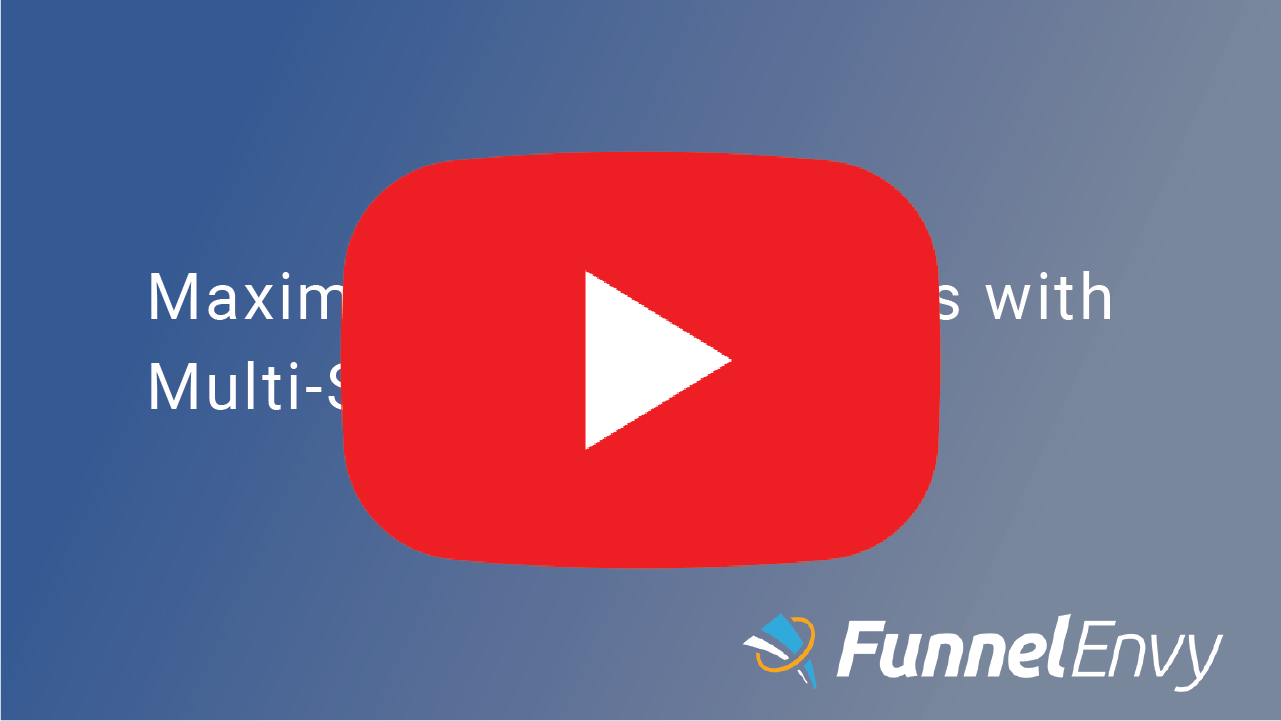
5. Create a video to engage with the visitor

Our second actionable tip is to place a video on your landing page. It might sound crazy, especially if you’ve never invested in video content before. But in the same way that blog content drives leads, video content drives sales. In fact, it often does it better. 

A landing page video should be a concise pitch of your product, about 2-3 minutes at the most. You should quickly explain what your product does, what problem it solves, how its features solve that problem, and if you have time, include a story from someone who has had success with your product. 

In case you haven’t put it together, that’s your entire landing page in one engaging pitch. Except for your CTA, which should be sitting right next to the video.

Boost your B2B landing page performance with FunnelEnvy

While the five revamping tips listed above are a great way to get started, it’s far from everything you need to craft an engaging B2B landing page. And if you don’t have a lot of experience in this area, it can be tough to know how to even implement the above suggestions. 

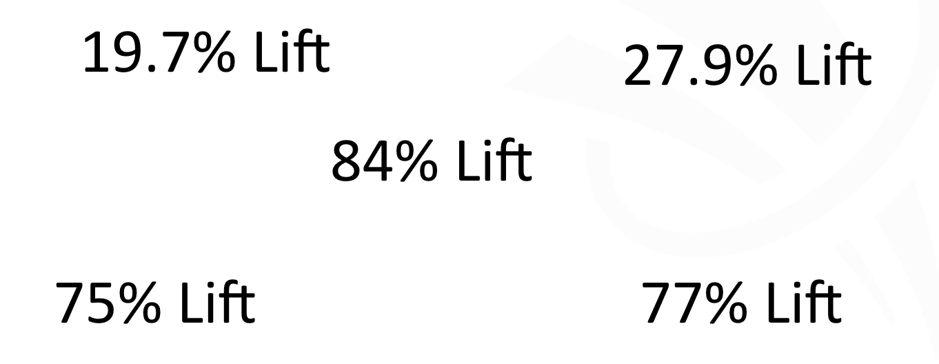
To supplement your experience, you can partner with FunnelEnvy. In case you couldn’t tell, we’re lead-generating experts, and we have a solid grasp on how to turn your landing page into a conversion machine. We offer services like Lead Gen Experiences, which will help you turn your traffic investment into a moneymaker, and Account Match, which will identify the most high-value accounts for your business and help you target them. 

Reach out to the FunnelEnvy team today and start growing your business like never before.

How To Improve Your Site Experience In A User-Centric World (And Still Generate Leads)

The algorithmic world of web optimization is rapidly moving towards a user-centric paradigm. To keep up, brands will need to prioritize their site experience like never before. 

In this post, we’re going to cover why site experience is key to your success and give you some actionable tips you can use to improve your site experience today. 

Let’s get into it!

Your site experience is key to generating leads

Website experience, or UX, encompasses everything your users encounter when they visit your website. It’s the visuals, the ease with which they can uncover information, and the process they go through to make a purchase. 

In a world that is becoming more user-centric, focusing on user privacy and moving away from keyword-based SEO, lead generation is going to become increasingly entangled with the performance of your website. The better your site experience, the more leads you’ll generate. And, with that in mind, here are our top ways to improve your site experience…

5 ways to improve your site experience

1. A great site experience starts with pages that load quickly

The first thing that anyone is going to notice when they visit your website is how quickly it loads. Or, ideally, they won’t notice this at all.

The goal for any website should be for any page on your site to load in less than three seconds on an average WiFi download speed. If your website takes longer than this to load, you have some work to do. When it comes to mobile, things need to be even faster. Less than two seconds is ideal for reducing your bounce rate. 

One of the first things you should do to reduce a web page’s load time is to compress all of the images on your website. There are free resources online (like TinyPNG) that will quickly compress images for you. 

Plus, white space is also important. Not only is it important to a pleasing design, but blank space loads faster than content-filled space. 

And, finally, ensure that the most important and visible elements of your webpage load first. Typically, buttons and navigation bars should appear first, then your text, then images and media. 

2. Simple and efficient registration and sign-up forms are crucial

Another crucial component of a great site experience is simple registration and sign-up forms. These are the forms on your website that visitors use to sign up for your newsletter, subscribe to your service, and register an account on your website. 

If these forms aren’t easy to use, then visitors aren’t going to use them. When you ask your visitors to complete a task, you aren’t just asking for their attention span, but also their mental effort. Seamlessness is key. 

A simple form process uses as few fields as possible, doesn’t needlessly violate the person’s privacy, and keeps everything on one page if possible. The more information a visitor has to give and the more pages that have to load for them to give, the more likely they are to bounce.

3. Have clear CTAs –– and not too many of them!

Everyone working in the marketing industry knows that CTAs dramatically increase engagement. Direct CTAs, such as “Order this product today!” as well as indirect CTAs like colorful buttons both count. They give a webpage purpose, guide visitors down a path, and most importantly, close sales!

Despite the overt marketing at work here, visitors like CTAs. They’re on your website because they are curious about your business. CTAs make their journey simple. Click here for this information, go here to buy this, and subscribe in these three steps. 

On the other hand, you can overdo your CTAs. Try to keep it to just one CTA per page, and don’t have every CTA be aimed at landing a sale. Maybe have a CTA to your newsletter on your blog instead of a CTA for a product you sell. Or, work on personalized CTAs (or smart CTAs) tailored to different audiences and their specific needs. 

And use clever design and logical flow when placing your CTAs. You don’t need a big red arrow telling visitors to look at your CTA if you place the CTA where they’re already looking. 

4. Follow conventions creatively over creatively ignoring them

A common pitfall that businesses run into is the idea that everything they do needs to be unique to them. So they overcompensate when doing something simple (like crafting a great site experience) and try to stand out by breaking convention.

This more often than not will scare visitors off. Design conventions exist for a reason –– because they work! And because conventions are popular practice, they’re what users expect when they visit your website. 

Moving the navigation bar to the bottom of the screen adjusting all of your text to the right, and having images of your product flash around the screen will help you stand out –– but probably not in the way that you hope for. 

Instead of trying to be quirky, stick to tried-and-true web design conventions. Then, put your personality into them! Follow traditional functional practices while adding unique and personalized aesthetics to your website. 

A pleasing color scheme and clever animation in an otherwise standard website will take you much farther than an obtuse (albeit original) site experience.

5. Save your writing for the blog

Our last tip is pretty simple. Save your writing for your blog! Articles and content marketing perform great there, but they’re not going to perform as well on your landing pages. 

Instead, try to replace text content on your home and landing pages with graphics, blurbs, and bullet-point lists. Video content performs particularly well on landing pages (not so much on your home page). Use text in short sentences to give clarity, flow, and concise information. For everything else, stick to visuals!

Eager to keep learning about how to improve your site experience?

The tips listed above are just a few of the ways that you can improve your site experience. To become a lead generating pro, you can check out the rest of the posts on the FunnelEnvy blog.

And if you’re ready to take your marketing and site performance to the next level, reach out to the FunnelEnvy team for expert advice, guidance, and optimization. 

By |2021-06-04T00:02:20-07:00June 2nd, 2021|Uncategorized, Conversion Rate Optimization, Analytics, Strategy, B2B, Experimentation|Comments Off on How To Improve Your Site Experience In A User-Centric World (And Still Generate Leads)

Multi-Step Interactive Experiences (Going Beyond the Form)

Transcript

Hi everyone. My name is James Niehaus from FunnelEnvy. And today I want to talk to you about multi-step interactive experiences and going beyond the form. So this is the third video in a series that we focus specifically on a technique we call multi-step interactive experiences. In the first two videos we talked about how to use this on B2B forms to really drive massive improvements in conversion rates. And today I want to talk about how to use the same technique on other parts of your site.

We Will Cover

  • A quick recap on multi-step interactive experiences
  • Why they work
  • How they can work on other parts of your site
  • 5 popular ways to leverage interactive experiences on your site

Full Recap of Multi-Step Interactive Forms

If you have not watched the introduction and multi-step advance use cases videos, watch these in these given links.

Examples of Multi-Step Form Flows

Here are just some examples of past client interactive experiences. So this should be self-explanatory, but as you see here, all we’re doing is taking your typical static B2B form, breaking it up into interactive steps, and leading with intent questions that make it easier for the user to raise their hand, provide you information, commit to the process and convert at higher rates. And we say convert at higher rates, we do mean higher rates. So here are just some examples of recent conversion lifts we’ve seen on client forms just by moving the static forms to multi-step experiences. So as you see here, it’s definitely pretty powerful and effective. And this is also a reason why we kind of then explored using this technique on other parts of the site.

multistep form examples

Some Key Takeaways from previous videos

With a multi-step form experience, you usually want to ideally lead with intent questions that’s more about what’s in it for them. What features do they care about? How big is their company? What are they looking to do? What’s their role? But the whole idea here is that asking them easy to answer intent questions, helps guide them down the path towards finding a better outcome or helping you better guide them down to the right solution. So that’s the first takeaway.

The second takeaway is also ideally asking them a couple of those questions first because what you want to do is make it easy for them to get started, continue, and create that momentum and commitment to completing that process. And that’s how we get the higher conversion rates.

And then the nice part about this technique is that you then layer on additional strategies, and this is where it gets even more powerful. So on the left, you see an example where we actually start personalizing step two and step three of the form experiences based on what they provided as an answer in step one. So this is where it can get a little more targeted and personalized. Or on the right is a good example where you can use their information to then potentially route them to a different funnel or flow. An example there, they’re using company name, based on the email address, to decide whether they should send them to a scheduler as you see there, or to just give them the rest of the regular form. So this is where you can potentially provide custom experiences based on company size or target account or their role or what they’re looking to do. But this allows you to then go from a one size fits all static experience, to providing smarter, routed experiences that align with your personalization and ABM strategies.

More Powerful w/ ABM + Personalization

Personalize the rest of the form by their inputs

Multi-Step Works Beyond Forms

Multi-Step isn’t just for forms. They can work on most parts of your website. I mainly want to focus on five key areas of the site, or techniques.

Step #1 Homepage: funnel them to a multi-step form flow on the entry

So starting this all off, starting the funnel on the home page. So for most B2B sites, the homepage is typically a static billboard that tries to communicate one message to a broad and diverse set of visitors. So recognizing that you’re probably not going to align exactly to what that user’s intent is, the idea here is that you actually use the homepage real estate to engage the visitor. And in this case, engagement means trying to get them to raise their hand, express intent, and get started with you, and go down a certain conversion funnel right at the homepage. So whether you start interacting then with them, with engaging questions on the left, you see examples there. Or, if they click on a certain action, present out that type of experience. But the whole idea here is that, rather than guess at what their intent is, or how they want to get started, give them some options to make it easy for them to kind of start exploring. And ideally, without even knowing, go start kicking off that conversion funnel from the home page.

Step #2 Homepage: guide and route users to the right content by intent

Use the homepage strategy, and instead of taking them to a form flow, guide and route those users based on their intent, to a better page or a better flow.

So that here is we’re trying to help them by skipping steps and helping them land on the right page so you can cut down on the cycles to get them to where they want to go. So this is more about routing and navigation. But again, the whole benefit of these techniques is that we’re engaging them from the get-go. We’re not forcing them to kind of decide themselves, try to find the right information, and leave it up to chance that they find the right place to go. And this same strategy makes a lot of sense on product pages.

This is an example of one of our clients, where on the left you see their traditional static page. As you see there, it’s your typical solution type page where you provide a lot of content. And give them their choice but through a lot of text and diagrams.

Step #3 Product Page: help them find the right solution

On the right, it’s taking that same content and packaging it up into interactive questions to make it easier for them to kind of, again, find what they’re looking for, raise their hand, express their intent or interest, and you help navigate them to the option that makes the most sense. So we saw some very positive engagement and conversion metrics when we did this technique on product pages like in this example here. But the whole idea here is you’re trying to provide that educated, guided hand that helps them find better what they’re looking for based on what they told you. So in this case you’re being helpful, helping them complete their job better, and in a more timely fashion. And of course, this makes sense on your product and pricing pages. So when you have packages and plans, most B2B sites have your typical good, better, best, here are three or four plans, whether it be based on company size or number of seats needed, or whether it be based on certain features, that’s your typical layout that we’re all used to.

On the product pages, a nice technique is to really use the strategy to help them find the right solution.

Step #4 Plans/Pricing Page: help them find the right package

The plans and pricing page is also another great place to use it to help them find the right pricing package or combination.

So we’re not saying you have to move away from that, but in these examples here they still show those tables of plans, but in both examples here they give options where, if you want to specify your interests or what you’re looking to do, or maybe talk through a questionnaire about who you are and what you’re looking for, they can then narrow down the plan packages to fit what you provided them as far as intent or profile. So the whole idea here is that, when you have a little more complex set of packages and pricing plans, rather than have them guess or maybe choose incorrectly, or maybe just waste their time combing through all of this, you give them an easier path of which they just simply specify what is their key intent, profile questions, and use that information to help narrow and guide them down to the right package or pricing plan that works for them.

Again, you know your product more than anyone else. You’ve seen the success of your products and packages on a variety of clients across your industries. This is all about using that intelligence to better guide new visitors, who first come to your site, come to your pricing page, and help them find a solution that fits their needs and best matches their profile. Because you want them to be successful, and this is your chance to guide them down that path in a more direct way. And both sides will win in the end.

Step #5 Quizzes/Calculators: help them get insights

    And lastly, we shouldn’t forget the fact that, for most B2B sites, they do have interactive experiences typically in things like your ROI calculators, your organizational assessments, your company benchmark, and your various quizzes, right? So by all means, these are great options and techniques. We encourage you to keep using them. So in the end we’re just fans of anything that provides that interactivity. We’ve seen, from years and years of testing, that whenever you can give the visitor a chance to interact, raise their hand, you make it easier for them to get started, you reduce the complexity of that visit by allowing them to be guided down the right path. And you actually end up having more control over where they go through their journey, which is what we really want to do. Ideally, if we had a choice, we’d want to guide each visitor on the right journey for them.

    Since we can’t really predict who they are and what they want, we think interactive experience are the best way to meet in the middle and provide them a set of choices that allow them to kind of really narrow down to their best options based on what their profile is and based on what their intent is. So it’s really a win-win for both sides.

    Key Takeaways

    1. Multi-Step experiences, especially on the forms, work great as a great conversion tactic
    2. It works even better when combined with your ABM/Personalization strategies. So this is a great example where your conversion techniques and your strategic techniques should really work well together because they really compliment each other very well.
    3. They really work well in a couple of key places, like your homepage, your product pages, your pricing and packaging pages, as well as your traditional quizzes and calculators.
    4. Here are 5 ways to get started:
      1. Homepage: Start them in a conversion funnel
      2. Homepage: Route them to the right page by intent
      3. Product Pages: Find the right solution(s)
      4. Pricing/Plan: Find the right package
      5. Quizzes/Calculators: Provide custom insights

    So really want to say here, we want to advocate for it, try it out, explore this on your site, you really won’t regret it. This is, again, better experiences for all.

    And then lastly, as I said, if you haven’t had a chance yet, go visit our site. We have a couple of other videos that talk a little more in-depth about the strategy, especially as it relates to forms and personalization, and ABM. So check it out if you haven’t had the chance yet.

    1. Introduction to Multi-step Interactive Forms
    2. Multi-step Interactive Forms (Advanced Use Cases)

    If you have questions, just drop me an email. And if you want to see our own interactive quiz, you can hit our website. And that quiz will actually help you evaluate whether you’re the right fit for working with us. So check it out and hopefully we can talk soon. With that, take care.

    Maximize Site Revenue with Multi-Step Forms

    Transcript

    Hi, everyone. My name is James Niehaus from FunnelEnvy. Today I want to talk to you about multi-step forms, why our clients love them, and how they can maximize your side revenues.

    So why our clients love them because.

    • They work. We typically can see 20, 30 – 50% improvement in form conversions, so meaningful results.
    • We can often enhance and compliment your existing ABM and personalization programs. So it really adds to the value.
    • It works great on form but also works pretty well across most of your site. We’ll talk about some examples of that in this presentation.

    But how do you make such user-friendly forms?

    We all hate forums. Whether it’s a mortgage form, a tax form, or a B2B lead form, right? So the industry recognizes this. And some industries have actually adapted and evolved.

    So, leading the way, mortgage. So, now we complete a mortgage application online. It’s going to be an interactive multi-step experience. Same thing with taxes, an interactive multi-step experience, to guide you down the path.

    Multi-step forms for B2B

    B2C loves multi-step, whether it’s to guide people down a better path, or especially on lead gen, to help convert at higher rates. But B2B is slow to adopt. So we still typically see static forms on B2B, typically because of operational hurdles. It’s just easier to embed a form. But, if you’re willing to make the effort and like our clients, past and present, and see examples of their multi-step experiences, you can see firsthand that all we’re doing here is taking their simple static forms, breaking them up into multiple steps, making it easier to digest, asking easy and 10 questions at the beginning to get them started. And in the end, it improves engagement and significantly improves conversion rates.

    Key Results

    So things we’ve seen from some past and current clients are significant lifts. These are not small lifts. These are significant lifts that can really maximize and change your funnels for maximizing revenue.

    multi step form results

    And some key things to keep in mind with multi-step forms, we want to make it easy. So if you think about doing it for yourself, think about in your funnel, what are easy and 10 questions to ask to get them started? Also, you want to make sure you ask a couple of questions, so you want to get the ball rolling, create that momentum, and get them committed to completing that conversion process with and completing the rest of the form. So here you don’t want to ask for first name, last name, email, to get started, you typically want to ask for, how large is your team? What is your role? What is your product interest? But things that are more intent-focused so they can get started without hitting hurdles.

    And again, these were great with your advanced programs like personalization and ABM. So on the left, you see an example where we personalizing the rest of the form experience based on the answers on step one. Or on the right, think about maybe we skip the form, based on their being part of a target account. So based on their company name on the email, you can show them, say, a scheduler instead of say, of the rest of the form, or maybe attempt to a Drift Bot. But the idea here is based on their inputs or based on their industry company size, or even if they’re part of your target account, you can personalize from experience that step experience, or even give them different routes and experiences to better convert them.

    And like I mentioned, it works great on forms, it also works really well across the site. So we’ve run this on home pages, on product pages and solution pages, and pricing pages. And typically what we see, is significant improvement engagement, and also uptakes and conversion rate.

    So we definitely recommend you explore this, try this out on your site, and check, see whatever it works for you on your forms and beyond.

    3 Takeaways with Multi-Step Forms

    1. They work. And can often generate a 30-50% lift in form conversions.
    2. They can enhance your ABM and personalization programs
    3. The technique is effective across the site, not just on forms.

    If you are as excited as we are about getting started with multi-step forms, visit our blog funnelenvy.com/blog, jump into our quiz and see if you’re a good fit to work with us today.

    Up Next

    Learn Muti-step interactive experiences (going beyond the form)

    Introduction to Multi-Step Interactive Forms

    Transcript

    Hey everyone. My name is James Niehaus. And today in this video, I’m going to walk you through what are multi-step interactive forms. So at FunnelEnvy, we use this all the time with our clients, and we’ve seen some great wins. And we thought today we would actually share with you what we’ve learned from those efforts, and hopefully encourage you to do the same on your side.

    1. What are multi-step interactive forms?
    2. Results we’ve been seeing with our clients.
    3. Some best practices we’ve learned from doing this with our clients.
    4. Some techniques and lessons learned that you can use and adapt to make it easier for you to get started.
      Keeptruckin Multi-Step

    We all hate forms. Right? So whether it’s a mortgage application or whether it’s a tax form, it’s something we prefer not to do. And the providers know this, and that’s why it’s very hard for you today to complete a mortgage application online without going through a multi-step experience as we see here. Or as we all know with taxes, TurboTax and others have made that the standard experience, step-by-step guided questions.

    That is Why We All Prefer This…

    multi step forms

    Why? It’s common sense.

    • It’s less intimidating, easier to get started. Even though we know there are more fields,
    • it’s an easier way to start and get the process going.
    • We feel less perceived commitment.
    • And lastly and most importantly, ideally we do it right, as an end-user we think we’re being guided down a better path, which will, as we know, save us time and give us better results.

    So there are all positives and why we’ve seen this kind of being the prominent way, at least in B2C, where complex forms are being presented. So they’ve been doing this for like 15, 20 years. LendingTree is one of the pioneers of this. They found out early on that, in a competitive space, this gave them an advantage. Can provide you a better user experience, make it easier for you to fill out a form, and become a lead. And now, fast forward to today, you really can’t complete a mortgage lead or auto insurance quote without going through some similar experience. So it is now the standard for B2C.

    But for B2B, unfortunately, it still seems to be the 1990s, where it’s still no static forms, no interactivity, and it’s pretty much the standard for most of the industry. This is unfortunate, but it’s slowly changing. So if you see here, there are some examples out there.

    So like Drift and Intercom and others like them who provide us chatbots. That’s helping. So if you can get [inaudible 00:03:02] one of their bots, you can usually get a nice playbook experience of decision tree experiences. So it’s a good start, but as we all know, the majority of website visitors still want to interact with your website, not a chatbot.

    interactive form experience of the industry

    And we’ve seen some people provide multi-step forms, like Salesforce here with their trials. It’s a good start, but there’s obviously more that can be done. But for B2B, there are some additional hurdles that are typical of most of our clients. So for example, if you’re in the B2B space, typically you’re going to have one of these four vendors.

    form embedded vendors

    And they’re providing your email, your forms, your landing pages, and your workflow. So they make it really easy to by things like let’s copy and paste our embedded form, put it on your website, or we’ll host your landing page, and you’re done. That’s pretty easy. But of course, the default experience is a single, static form.

    A second hurdle we often see is that you do need web developer resources to do this. Most DemandGen teams are resource-constrained. And don’t have access to a developer for the 2-3 days required to implement

    And the third hurdle is, it’s not a priority. Typically the website is not the focus, it’s about getting traffic to the website. So they’re chasing the latest AdTech and Martech to make it easier to target, intent, ABM, and get more people to the site. So I figured this is what people are most interested in hearing about, which is: what are the actual results?

    So these numbers are actually real numbers we’ve had with recent clients in the past year running multi-step interactive forms on their site. So again, these are meaningful lifts on forms like demos and pricing and get started forms. So your core sales forms. So that’s a huge win for many of our clients. And for the most part, for the majority of our clients we tried this on, it’s worked. Typically double-digits or higher. I think, and only one example I can recall, we ran this where it didn’t necessarily win across the board, but it’s still won for the returning segment for around 20 plus percent. So even if we don’t get a clear win across the board, we still see important lifts for key segments. So this is why we want to stress that we think this is probably the most viable tech tactic you can apply to your website to really maximize your revenue and your pipeline for the website.

    multi step form results

    And here’s some just examples of the actual client experiences.

    So as you see here, again, simple, straightforward experiences that make it easier for their visitors to start and complete a form experience.

    And with that said, let’s talk about some of the best practices we’ve seen working with our clients in this area. Now, the first thing you want to consider is, if at all possible, you want to lead this experience, that first question or two, with intent questions. Right? So you want to ask them things that they care about first before you ask them for their name and their email. Right? You want to get them excited and want them to get started and make it easy for them to get started. So intent questions, how large is your organization? What industry are you in? What features do you care about? What’s your role? What are some of your integrations?

    The second learning is you want to create momentum. So we want to ideally provide two or three questions that get that intent ball rolling. So here’s an example from one of our clients. But again, the whole goal here is you want to make it easier for them to get started, you want to create that momentum so that they feel committed to the process. So therefore it’s easier for them to convert and complete that final piece of the form that’s going to be the personal information that we need to collect to run the business.

    Now the third piece I’m going to call out also is it’s good to also set the proper expectations. So when you provide that form, that multi-step experience, call out the number of steps involved. And when possible, call out what you plan to do with that information. So you can help them make a better choice. Is this going to be passed by your sales team to make a more effective quote or a demo or discovery session? But let them know that this information is not going to be dropped to the floor, it’s going to be used to help provide them a better outcome or experience, which is what they want. That guided treatment. Now, those are some simple best practices. And hopefully, they make sense.

    Lessons learned along the way from doing this with our clients.

    • Pick the right form. Ideally, where the outcome could vary based on their inputs:
      -Best working forms -pricing, get started, talk to sales, choosing the right demo or trial, ROI calculators.
    • Don’t be afraid to ask for more information if the question(s) aligns with user intent. like about your team size, about your feature of interest. It will be easier for them to get started.
    • It will work for more than just forms. Now that’s a broader topic, so I’m going to save that for another video, that you can access on our site shortly after this one. But those are some lessons learned

    How to Get Started

    • Identify the right form
    • Figure out the design first
    • Work with a web development resource to build the interactive form (typically a few days to a week effort)
    • If you are adding fields work with your marketing automation team to capture the new fields
    • Run the experience as a test and remember to look at performance by your top segments
    • Run 1-2 iterations over time to fine-tune the question sequence, visuals, or layout
    • Expand to other forms on your site.

    Don’t overlook this, but you want to expand this to other forms on your site in other areas. So again, I’ll have more about this topic in another video about where else can this work for you on your website. But that’s hopefully enough to have you get started. And then with that said, as I mentioned, come back to the website, I’ll be posting a couple of other videos about, one, how this can be used in other places beyond the form.

    Learn More on Multi-Step Experiences

    Here are the two more articles to learn about multi-step interactive forms

    Go to our website, funnelenvy.com/blog, and you’ll be able to check out the content and hopefully enjoy this and other content that’s similar. And with that said, thank you for your time. If you have questions, just drop me an email. And if you want to see our own interactive quiz, you can hit our website. And that quiz will actually help you evaluate whether you’re the right fit for working with us. So check it out and hopefully we can talk soon. With that, take care.

    How Marketing Teams Should Optimize Website for Conversions that Align with B2B Sales

    You might have heard before that marketing and sales can sometimes experience the business version of a sibling rivalry, but it’s not quite what you think.

    Within business-to-business (B2B) organizations, marketing’s focus is on generating leads, while sales focuses on getting those leads to close. A disconnect happens when your marketing team (with good intentions) focuses on volume over quality, therefore resulting in passing over a high volume of leads to sales that just won’t close.

    In this article, we’ll walk through a framework for how to categorize leads that come in through your website, how to build website messaging and landing pages that are consistent and relevant for each type of category, and how to optimize for intent as you go.

    A General Framework for Categorizing Website Leads

    It might seem obvious that your marketing team should focus on quality over quantity, or ideally both at the same time, but in practice the two can get a bit muddled.

    We recommend generally categorizing leads into three different buckets:

    • High volume, high intent. These leads should be sent to sales and prioritized.
    • High quality, Low intent. These leads should be sent to a nurture funnel where they continue to be educated and engaged.
    • Low quality. These should get filtered out altogether, or directed to a different offer.

    Ultimately, we’re talking about being more efficient with  qualification by allowing your website to do a lot of the work for you.

    This includes building consistent messaging for each lead category, building and presenting relevant landing pages for those people, and optimizing for intent as you go.

    Create Messaging that’s Consistent and Relevant

    In order to qualify each website visitor as a member of one of the lead categories above, you’ll need to be able to automatically consider two things before displaying website content:

    • How that person got to your website. The messaging on the page they visit should be consistent with the email, ad, social posts, blog post content, or search result that preceded it.
    • Their business demographic. Use marketing automation, CRM and / or 3rd party data to ensure that messaging is also relevant to their business size or industry. Focus on the industries and business sizes that have an expected value for your sales teams, and send all others into the low quality bucket.

    One effective way to do so is to display case studies from relevant industry competitors, if you have them available. 

    For example, if someone from Wells Fargo visits your fintech website, they’ll likely respond more positively to a landing page with logos or success stories from Chase or Bank of America then from Investopedia or Stripe. If that’s not in the cards for you, focus on business size first. Before showing a Wells Fargo visitor logos from a fintech startup, show a success story from Macy’s, Delta, or another enterprise business.

    This example from Shopify that’s optimized to attract businesses in e-commerce fashion. The logos and success stories listed on the page include e-commerce fashion brands, like AdoreMe, Cee Cee’s Closet and Coco and Breezy, immediately signaling to other fashion e-commerce companies that Shopify’s solution might be a good fit for them.

    This example from Shopify that’s optimized to attract businesses in e-commerce fashion.

    FunnelEnvy offers reverse IP, or account matching, and real time data integration to help marketers surface insights that allow them to display industry-specific webpages like these.

    We also help companies display pages based on other types of data, like funnel stage, company size, and more.

    This example from a large call center showcases how experimenting with personalized offers on their website by buyer segment led to an increase in qualified leads. 

    This example from a large call center showcases how experimenting with personalized offers on their website by buyer segment led to an increase in qualified leads.

    In fact, MQLs increased by 10X between March and June of 2020.

    Graph showing MQLs increased by 10X

    Landing pages that set the right expectations

    Your landing pages essentially start the sales process by presenting your products to people for the first time. For them to be effective, they need to accomplish two things:

    • Mimic your sales people. This should be true for every lead category. Once a person converts through your website and makes it to the stage where they speak to sales, they shouldn’t receive an entirely different message than what led them to convert in the first place.
    • Clearly communicate what each site visitor should expect next. This will change depending on the lead category. If your site visitor is categorized as “high quality, high intent” and on their way to talking to a sales person, tell them that. If they’re getting redirected to a different offer or getting more information sent to their inbox, tell them that instead. 

    One common mistake we see companies make is sending leads to a discovery meeting with a sales development representative (SDR) after they register for a demo. They’re expecting to see the product, when in fact, they end up in a frustrating meeting where they’re asked a lot of questions, afterwards which the real demo is scheduled depending on how they’ve qualified.

    One way to rectify this is to make the discovery process part of the inbound flow, like we do at FunnelEnvy.

    Our quick questionnaire helps us to categorize site visitors that convert so that we can set expectations for what will happen next, once they’ve completed the form.

    Take a moment to fill out this questionnaire

    Here’s another example that qualifies leads using company size and sales strategy:

    Example that qualifies leads using company size and sales strategy

    Optimizing for intent as you go

    You’ve created messaging for each lead category and set up your landing pages so that the right expectations are set. Now it’s time to take it a step further by putting in place a mechanism to filter out low-quality leads or show them a different offer.

    If a website visitor that’s not a highly valuable lead for your sales team comes along, you’ll want to be able to identify them with data that reveals their business size, industry, title, or any other identifying signal that makes a difference for you.

    If someone comes along that doesn’t fall into any of the buckets you’ve identified as high value, consider sending them to your self-service solution (if one exists) or including a message upfront that right now, you’re just not the right fit for one another.

    While it might seem scary to direct some leads away from sales, it can actually improve your sales team’s productivity and have a positive impact on revenue.

    Working with FunnelEnvy, one startup increased their monthly marketing qualified leads (MQLs) by 30%, and grew revenue from closed or won deals by 250% the following quarter. Here’s what that success looks look over time:

    One startup increased their monthly marketing qualified leads (MQLs) by 30%

    This success came from optimizing their website to align with their B2B sales strategy, and by only surfacing high quality leads to their sales teams that were ready to buy.

    Bonus: treat your high quality leads like gold

    Those leads that are high quality and have the appropriate purchase intent should be treated like gold. 

    To ensure that your sales team is successful, make sure there’s an established service-level agreement (SLA) on when and how sales is following up on those leads. For example, Marketo’s sales team commits to a 24-hour SLA.

    If a tight 24-hour turnaround isn’t in the cards for you, automate your follow-up process with marketing automation or your customer resource management (CRM) software.

    End the infamous sibling rivalry

    The infamous sibling rivalry amongst marketing and sales isn’t actually a sibling rivalry at all — in fact, it only exists when these teams try to help one another in the wrong way.

    Your website can do most of the heavy lifting to close this gap and help to qualify leads that are sent to sales automatically. 

    If you’re looking for a custom solution to help personalize your website content for leads of different types, FunnelEnvy can help — contact us.

    Real-Time Personalization with Marketo and FunnelEnvy

    For many organizations, Marketo serves as the real-time customer database for marketing. Unfortunately, for most organizations today this rich intelligence living in Marketo is not being leveraged to drive personalized user experiences across your site which is one of the most valuable opportunities with this data.

    The good news is that when it comes to personalizing with Marketo, you don’t have to be limited to just personalizing your emails and Marketo forms. You can actually use all that valuable customer centric Marketo data to drive your website personalization programs.

    Why might you want to do this? Instead of showing everyone the same lead capture experience, you could show prospects who have already filled it out more product content. Or show existing customers opportunities to expand. Maybe even segment your experiences and customer journey by company size or industry.

    With FunnelEnvy’s Marketo integration you can use your rich Marketo data in real-time to deliver personalized experiences across your site.

    Setting up the Marketo Integration in FunnelEnvy

    Within the FunnelEnvy user interface you can activate and configure the Marketo integration. FunnelEnvy fetches Smart Lists periodically from Marketo and automatically keeps these updated with Marketo. Configuring the integration also lets you setup offsite goals triggered by Marketo webhooks such as Marketing Qualified Leads (MQLs).

    The Data Filtering interface lets you choose which fields to import, and exclude PII or other data based on your compliance policies.

    Typically these four steps are done by the Marketing Ops team that manages the Marketo instance:

    1. Activate the Marketo data source.
    2. Authorize FunnelEnvy to access Marketo
    3. (Optional) Configuring Data Filtering
    4. Selecting Smart Lists to Import

    Step 1: Find and activate Marketo under the Integrations settings. You should see it as an activated Data Source.


    Step 2: Authorize FunnelEnvy to access the Marketo REST API with API keys.

    Step 3: Optionally configure data filtering rules. When fetching lists FunnelEnvy will only import lead attributes that are selected.

    Step 4: Select Smart Lists for Import. Assuming your API credentials in Step 2 were correct, you should see a list of Smart Lists available for import. Note that it may take up to an hour for this list to reflect any recently added Smart Lists.

    Once you’ve configured the Smart Lists for import you’re done! FunnelEnvy will refresh the lists every few hours, retrieving leads and refreshing the local copy of Marketo data, which is then available immediately for audiences, predictive campaigns and offline Marketo-triggered goals.

    More details on setting up the integration can be found in our knowledge base article.

    Using Marketo for Site Personalization in FunnelEnvy 

    Once you’ve configured the Marketo Data source you open up a number of valuable personalization use cases. Below are three ways you can use FunnelEnvy and Marketo together to better target, personalize, and measure your personalization initiatives.

    Target Experiences and Offers using Lead Attributes and  Smart Lists

    Stop serving a static one size fits all website experience to all your visitors. Want to personalize your site experience only for prospects, or to specific accounts, or members of specific campaigns? 

    With FunnelEnvy you can create very rich audiences that can be built off Marketo data and that can also be used as part of more advanced audience segments that combine Marketo data with firmographics and/or real-time user behavior as well.

    In the condition builder interface you have access to all of the Marketo lead fields that were imported, and can define logical conditions based on them.

    These conditions can also be combined with other data sources. In the audience screenshot below we’re combining a Marketo condition with a user’s behavior (but this could also be Demandbase, Clearbit or any of the sources we support). 

    And just like any of the FunnelEnvy audiences, these can be used for targeting within predictive campaigns or A/B Tests:

    This flexibility allows you to setup a dynamic “always on” personalization strategy that targets the right user segments in real-time based on that visitor’s stage and their relationship with you.

    Personalize Experiences at a 1:1 Level with Marketo Data

    While targeting is a powerful first step in executing your personalization strategy, the more powerful opportunity is to use all that rich user data to predict the best experience to serve each visitor. 

    Choosing in real-time which experience to serve each user based on their full user profile truly allows for 1:1 marketing. That is where the personalization magic really happens.

    FunnelEnvy uses machine learning to predict which experience will likely convert best based on all the data we see for that user, including their Marketo data and based on the history of how similar users converted over time.

    And unlike A/B tests where a specific experience is randomly assigned, or rules based personalization where you fix a specific experience to an audience, FunnelEnvy allows you to take advantage of all the data you have on that user and serve the experience mostly likely to convert for that user.

    This allows you to avoid the manual analytics effort of trying to identify and capitalize on all the possible experience and segment combinations that perform best. As a marketer you can stay focused on the message and offer and allow the algorithms to optimize the segment/experience matches.

    As the report below shows, we are scoring/weighing the effectiveness of every attribute we see for every user by experience.

    Here, Marketo audience data along with all the other behavioral and firmographics data is used to predict the best possible outcome for each and every user and experience combination.

    This allows us to use all the data to our advantage and serve the right experience that will most likely result in revenue. 

    The best part is that there’s no additional setup required here. Once we have the Marketo data within our profiles we’ll use it as long as the decision mode on your campaign is set to “Predictive”.

    Measure and Attribute Personalization Campaigns by Revenue (not Form Fills)

    With personalization, one of the bigger challenges is being able to measure the program’s contribution to revenue and business outcomes. 

    It can be done, but often requires integrating data sets or pulling reports from multiple systems and generating manual reports after the fact.

    WIth FunnelEnvy, once you set up your important online, MQL, and any other revenue goals you then start tracking and attributing success to each personalized experience. Below is an example where we created a MQL goal based on a Marketo List and assigned a specific MQL value to it.

    To setup this, ensure that the Marketo Data Source is activated and configured and create a new individual goal. Under “API Triggering” you’ll should see an option for Marketo. Once selected, this is the URL that your Marketo instance will hit via a webhook to trigger the goal conversion. More details on setting up these webhooks is available in our knowledge base article.

    Once that’s done the Marketo goal will shows in real-time in our campaign reporting dashboards.

    It now becomes much easier to tell the story of how specific tests or personalized experiences are driving down funnel goals like MQLs, SQLs, opportunities, and deals won in addition to top level goals like trial signups, demo requests, or engagement.

    This makes it much easier to attribute the positive impact personalization has on the organization’s revenue outcomes. Now instead of talking about form completes you can talk the language of sales which is revenue.

    Getting Started

    As you can see, integrating Marketo into your personalization program is very straightforward and can unlock some very valuable use cases and capabilities. The best part with this approach is that there is no custom development or IT involvement to get this up and running. You can setup the integration and be live with your first campaign on the same day.

    If you’re not yet using FunnelEnvy but are interested in personalizing your website to Marketo Leads and Contacts we’d love to hear from you! You can contact us here: https://www.funnelenvy.com/contact/

    The Importance of Context with Marketing Experiments

    By now most marketers are familiar with the process of experimentation, identify a hypothesis, design a test that splits the population across one or more variants and select a winning variation based on a success metric. This “winner” has a heavy responsibility – we’re assuming that it confers the improvement in revenue and conversion that we measured during the experiment.

    The experiments that you run have to result in better decisions, and ultimately ROI. Further down we’ll look at a situations where an external validity threat in the form of a separate campaign would have invalidated the results of a traditional A/B test. In addition, I’ll show how we were able to adjust and even exploit this external factor using a predictive optimization approach which resulted in a Customer Lifetime Value (LTV) increase of almost 70%.

    (more…)

    By |2020-01-28T08:41:14-08:00January 28th, 2020|Conversion Rate Optimization, B2B, Experimentation|0 Comments

    Why B2B Marketers Should Stop A/B Testing

    B2B marketers currently face three main challenges with website experimentation as it is currently practiced:

    1.    It does not optimize the KPIs that matter well. – Experimentation does not easily accommodate down-funnel outcomes (revenue pipeline, LTV) or the complexity of B2B traffic and customer journey.
    1.    It is resource-intensive to do right. – Ensuring that you are generating long-term and meaningful business impact from experimentation requires more than just the ability to build and start tests.
    1.    It takes a long time to get results. – Traffic limitations, achieving statistical significance and a linear testing process makes getting results from experimentation a long process.

     I.  KPIs That Matter

    The most important outcome to optimize for is revenue.  Ideally, that is the goal we are evaluating experiments against.

    In practice, many B2B demand generation marketers are not using revenue as their primary KPI (because it is shared with the sales team), so it is often qualified leads, pipeline opportunities or marketing influenced revenue instead.  In a SaaS business it should be recurring revenue (LTV).

    If you cannot measure it, then you cannot optimize it.  Most testing tools were built for B2C and have real problems measuring anything that happens after a lead is created and further down the funnel, off-website or over a longer period of time.

    Many companies spend a great deal of resources on optimizing onsite conversions but make too many assumptions about what happens down funnel.  Just because you generate 20% more website form fills does not mean that you are going to see 20% more deals, revenue or LTV.

    You can get visibility into down funnel impact through attribution, but in my experience, it tends to be cumbersome and the analysis is done post-hoc (once the experiment is completed), as opposed to being integrated into the testing process.

    If you cannot optimize for the KPIs that matter, the effort that the team puts into setting up and managing tests will likely not yield your B2B company true ROI.

    II.  Achieving Long-term Impact from Experimentation is Hard and Resource-intensive

    At a minimum, to be able to simply launch and interpret basic experiments, a testing team should have skills in UX, front-end development and analytics – and as it turns out, that is not even enough.

    Testing platforms have greatly increased access for anyone to start experiments.  However, what most people do not realize is that the majority of ‘winning’ experiments are effectively worthless (80% per Qubit Research) and have no sustainable business impact. The minority that do make an impact tend to be relatively small in magnitude.

    It is not uncommon for marketers to string together a series of “winning” experiments (positive, statistically significant change reported by the testing tool) and yet see no long-term impact to the overall conversion rate.  This can happen through testing errors or by simply changing business and traffic conditions.

    As a result, companies with mature optimization programs will typically also need to invest heavily in statisticians and data scientists to validate and assess the long-term impact of test results.

    Rules-based personalization requires even more resources to manage experimentation across multiple segments.  It is quite tedious for marketers to set up and manage audience definitions and ensure they stay relevant as data sources and traffic conditions change.

    We have worked with large B2C sites with over 50 members on their optimization team.  In a high volume transactional site with homogeneous traffic, the investment can be justified.  For the B2B CMO, that is a much harder pill to swallow.

    III. Experimentation Takes a Long Time

    In addition to being resource intensive, getting B2B results (aka revenue) from website testing takes a long time.

    In general, B2B websites have less traffic than their B2C counterparts.  Traffic does have a significant impact on the speed of your testing, however, for our purposes that is not something I am going to dwell on, as it is relatively well travelled ground.

    Of course, you do things to increase traffic, but many of us sell B2B products in specific niches that are not going to have the broad reach of a consumer ecommerce site.

    What is more interesting, is why we think traffic is important and the impact that has on the time to get results from testing.

    You can wait weeks for significance on an onsite goal (which as I have discussed, has questionable value).  The effect that this has on our ability to generate long term outcomes, however, is profound. By nature, A/B testing is a sequential, iterative process, which should be followed deliberately to drive learnings and results.

    The consequence of all of this is that you have to wait for tests to be complete and for results to be analyzed and discussed before you have substantive evidence to inform the next hypothesis.  Of course, tests are often run in parallel, but for any given set of hypotheses it is essentially a sequential effort that requires learnings be applied linearly.


    This inherently linear nature of testing, combined with the time it takes to produce statistically significant results and the low experiment win rate, makes actually getting meaningful results from a B2B testing program a long process.

    It is also worth noting that with audience-based personalization you will be dividing traffic across segments and experiments.  This means that you will have even less traffic for each individual experiment and it will take even longer for those experiments to reach significance.

    Conclusion

    Achieving “10X” improvements in today’s very crowded B2B marketplace requires shifts in approach, process and technology.  Our ability to get closer to customers is going to depend on better experiences that you can deliver to them, which makes the rapid application of validated learnings that much more important.

    “Experimentation 1.0” approaches gave human marketers the important ability to test, measure and learn, but the application of these in a B2B context raises some significant obstacles to realizing ROI.

    As marketers, we should not settle for secondary indicators of success or delivering subpar experiences.  Optimizing for a download or form fill and just assuming that is going to translate into revenue is not enough anymore.  Understand your complex traffic and customer journey realities to design better experiences that maximize meaningful results, instead of trying to squeeze more out of testing button colors or hero images.

    Finally, B2B marketers should no longer wait for B2C oriented experimentation platforms to adopt B2B feature sets.  “Experimentation 2.0” will overcome our human limitations to let us realize radically better results with much lower investment.

    New platforms that prioritize relevant data and take advantage of machine learning at scale will alleviate the limitations of A/B testing and rules-based personalization.  Solutions built on these can augment and inform the marketers’ creative ability to engage and convert customers at a scale that manual experimentation cannot approach

    By |2020-01-16T11:52:51-08:00January 16th, 2020|Uncategorized, Experimentation|0 Comments

    How Not Picking an Experiment Winner Led to a 227% Increase in Revenue

    By now most marketers are familiar with the process of experimentation, identify a hypothesis, design a test that splits the population across one or more variants and select a winning variation based on a success metric. This “winner” has a heavy responsibility – we’re assuming that it confers the improvement in revenue and conversion that we measured during the experiment.

    Is this always the case? As marketers we’re often told to look at the scientific community as the gold standard for rigorous experimental methodology. But it’s informative to take a look at where even medical testing has come up short.

    For years women have been chronically underrepresented in medical trials, which disproportionately favors males in the testing population. This selection bias in medical testing extends back to pre-clinical stages – the majority of drug development research being done on male-only lab animals.

    And this testing bias has had real-world consequences. A 2001 report found that 80% of the FDA-approved drugs pulled from the market for “unacceptable health risks” were found to be more harmful to women than to men. In 2013 the FDA announced revised dosing recommendations of the sleep aid Ambien, after finding that women were susceptible to risks resulting from slower metabolism of the medication.

    This is a specific example of the problem of external validity in experimentation which poses a risk even if a randomized experiment is conducted appropriately and it’s possible to infer cause and effect conclusions (internal validity.) If the sampled population does not represent the broader population, then those conclusions are likely to be compromised.

    Although they’re unlikely to pose a life-or-death scenario, external validity threats are very real risks to marketing experimentation. That triple digit improvement you saw within the test likely won’t produce the expected return when implemented. Ensuring test validity can be a challenging and resource intensive process, fortunately however it’s possible to decouple your return from many of these external threats entirely.

    The experiments that you run have to result in better decisions, and ultimately ROI. Further down we’ll look at a situation where an external validity threat in the form of a separate campaign would have invalidated the results of a traditional A/B test. In addition, I’ll show how we were able to adjust and even exploit this external factor using a predictive optimization approach which resulted in a Customer Lifetime Value (LTV) increase of almost 70%.

    (more…)

    Go to Top