It can be overwhelming, can’t it?
When you do business online, there’s a sea of data at your fingertips. Swimming into it is easier now than it’s ever been before. But maybe you feel like you’re in over your head.
All that data is nice…
But what do you do with it?
Where can you find actionable insights to boost your conversions?
Heat maps can help you get a handle on these types of questions. You can use them to “fill in the gaps” where standard analytics data leave off—to figure out why users are behaving the way they do.
If you’re tired of making assumptions about your users’ behavior—and if you’re ready to see where they are (and aren’t) paying attention—keep reading.
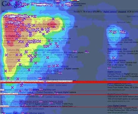
Photo credit: labnol via Compfight cc
Analytics Tools Offer Heaps of Data, But They Can be Overwhelming
Operating online gives you access to sophisticated analytics tools… and the data they generate. This offers huge advantages over brick and mortar businesses; a few cheap (or free) tools are all it takes to develop an intimate, quantitative understanding of your target customers.
And analytics tools are much more sophisticated than they used to be, offering a slew of data points as varied as visitors’ geographic locations, estimated income, political affiliation, and the average time they spend on your website.
It’s easier than ever to find out who is engaging with your website and how they’re doing it. But analytics tools are still a work in progress. There’s a blind spot that needs to be addressed: where your website users are paying attention.
The Dangers of Relying on Standard Analytics Tools Alone
Failing to understand where users are paying attention can lead you to make plenty of costly assumptions.
Here’s how:
Say you’re driving PPC traffic to a landing page, and the conversion goal is to get visitors to sign up to a free trial of your software product.
Your analytics data reveals your page isn’t converting nearly as well as you hoped. So your natural instinct is to start tweaking different elements (headlines, bullet points, call to action, etc.) to hopefully get a better response. Maybe you even decide to scrap the page and start over from scratch.
Relying on traditional tools alone forces you to guess which elements are working well and which aren’t. You could end up spending dozens of hours reworking a page—when all it might’ve taken to get the conversions you wanted was to move a call to action button or something equally simple.
Educated guessing, backed up with meticulous testing, will eventually improve your conversions…
But it can be a slow process. Wouldn’t it be easier to identify problem spots right away and fix them first?
That’s where heat maps come in.
Heat Maps: Turning Quantitative Data into Visual Insights
Heat maps are analytics tools that give you a visual representation of users’ activity on your website. A typical heat map looks something like this:
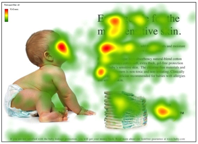
Image credit: The Daily Egg
The brighter the areas on the heat map screen, the more active that particular part of the web page.
Some heat maps measure the where users place their cursors and press the mouse button (mouse-tracking heat maps). Others (eye-tracking heat maps) use cameras to gather information about where users look. Some heat maps can even show where people hover on your web pages (though those don’t work on mobile devices).
The common theme: heat maps measure where on your web pages users are (and aren’t) paying attention.
Heat maps offer a unique blend of quantitative and qualitative data. By using visitor activity data and representing it visually, they provide fresh insights about which parts of your web pages are working, which aren’t, and why.
Instead of making assumptions, you can see exactly on the page where people are paying attention—and where they’re ignoring your content.
Dennis Publishing was looking to increase their ad revenue on their website Carbuyer.co.uk. Using insights from eye-tracking heat maps, they shifted their Google ads to the other side of their website.
The result?
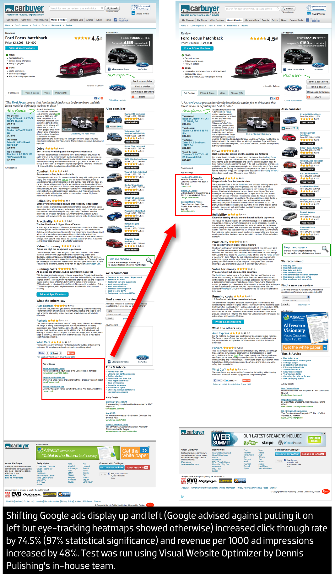
Image credit: Visual Website Optimizer
Getting Started with Heat Maps
Understanding where people are paying attention on your web pages is powerful information. If your conversions low, it can help explain why… and what you can do about it.
In the words of James Turner:
Never before has the world been flooded with so much data. Everyone is collecting, analyzing, and mashing up Big Data, from the federal government to the smallest mom-and-pop small business. The biggest challenge now is to make sense of that data, and sometimes a powerful visualization is just the thing.
Heat maps offer an aggregate view of how users are responding to your pages without overwhelming you with mountains of data. Because heat maps represent activity visually, it’s easier to spot patterns—even if you aren’t analytically minded.
This new perspective can help you find the optimal location for an email sign-up form, call to action, or other critical conversion element. If activity is heavy about halfway down the page on the left-hand side, that’s the perfect spot to encourage people to convert.
Heat maps (with the exception of eye-tracking heat maps) also give you a way to gather information about your users without their knowledge. Because users don’t know their activity is being monitored, they act how they normally would if you weren’t tracking them. There’s no need to spend a lot of money on focus groups.
There are plenty of heat map tools are available; most are inexpensive and easy to implement. When you’re just getting started, you’ll probably better off focusing on a few key pages (landing pages, sales pages, etc.) instead of trying to optimize your entire website all at once. Then you can branch off once you get a hang of how to use the tool.
Your Turn
Over the past few years, there’s been an explosion in the quantity and sophistication level of data available to online marketers. And there are no signs of things slowing down.
Developing analytical skills is crucial to deciphering this data and pulling out actionable insights to improve your conversions. But layering heat maps on top of this data can help you find out where users are spending a precious commodity: their attention.
Instead of making assumptions, use visitors’ activity to guide your conversion optimization priorities. Data doesn’t have to be overwhelming. Empower yourself with the simplicity of visual representations. Give heat maps a try today.
Have you ever used heat maps on your website? Did you find out anything that surprised you? Leave a comment below and let us know.