Calls to action turn visitors into leads and leads into buyers.
They’re essential regardless of your niche.
Your target customers won’t know what to do next unless you spell it out for them in a simple, compelling way. They’re just too busy to figure it out on our own.
You’ve probably spent some time figuring out what makes a call to action effective.
Maybe you’ve spent hours thinking about what they should say and how to display them on your website…
But what happens when you’re ready to test them?
If you’re looking to improve calls to action that aren’t performing well, it can be tough to know where to start. Maybe you don’t have any ideas what to test. Or too many ideas.

Photo Credit: Deathtostock
Call to Action Case Studies
Fortunately, quite a few businesses have paved the way with call to action testing and documented the results. You can lean on their results to pull out valuable insights into customer psychology and inspire testing ideas of your own.
Here are seven revealing call to action case studies – along with key takeaways from each – to give you fresh ideas how to boost conversions in your own business:
7. Friendbuy
Friendbuy is a company that helps marketers drive referrals and acquire more customers by deploying widgets onto their websites. Part of their sales process included a real-time product demo. Friendbuy was looking to increase the percentage of their website visitors who interacted with that demo.
Here was their original call to action for the demo:

And here were the two call to action variations they tested:
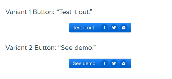
Image credit: Hubspot
The results?
The second variation (“see demo” button) increased the click-through rate over the original call to action by 211%! The demo CTR went from 1.44% all the way up to 4.49%.
Key Takeaways
- The original call to action was complicated and vague – too long and confusing to hold a visitor’s attention.
- The first variation did better because it simplified the language, but the “test it out” phrase probably went over a lot of visitors’ heads. After all, it didn’t spell out what the visitor was supposed to test. Also, some visitors might’ve assumed “testing” something required some type of commitment.
- The second variation finds the sweet spot of being simple and relevant. It’s clear what the user is supposed to do (click the button) and what they’ll get from it (seeing a demo of Friendbuy).
6. Payment Page
Michael Aagaard, the CRO consultant behind ContentVerve, discussed testing the call to action on one of his clients’ payment pages.
Looking to increase conversions, Aagaard changed just a single word in the call to action and tracked the results:
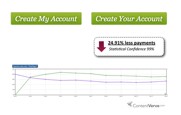
Image credit: Unbounce
What happened?
Aagaard discovered that his testing hypothesis – using second singular “you” would boost conversions – didn’t hold water. Conversions on the payment page dropped almost 25%… all from changing a single word!
Key Takeaways
- Failed tests can force you to question longstanding assumptions and be just as valuable (if not more valuable) than successful tests. You can use unexpected results to create new hypotheses to use in future testing.
- Reassess your priorities: a test is a “win” as long as it gives you insight into what makes your target customers tick.
- One word can make a huge difference – especially when your CTA is already short.
- Focus on the value: both of Aagaard’s variants focused on the value the visitor would receive by taking the requested action. It’s not enough to simply ask for action without answering what’s in it for the visitor.
5. 37signals
This is an older call to action test, but a revealing one.
Jason Fried, the co-founder of the software company 37signals, discussed his quest to optimize conversions by testing different calls to action on the Highrise homepage.
The 37signals team tried different permutations of “Free Trial” and “Sign-up for a Free Trial” without much success. Then they struck gold:
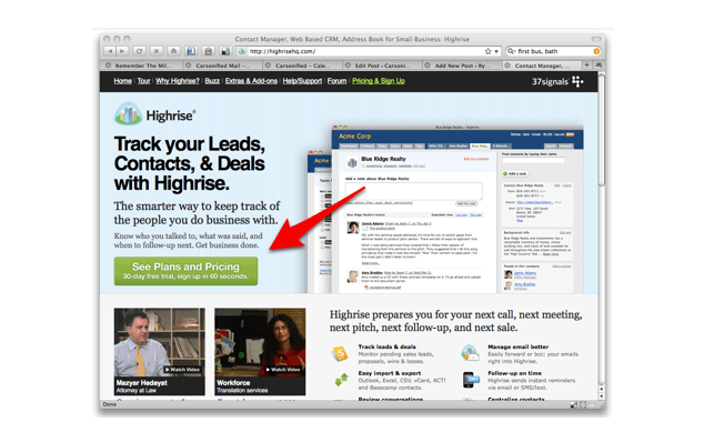
Image credit: Quicksprout
This new call to action – “see plans and pricing” – increased sign-ups on the website by 200%.
Key Takeaways
- Don’t bank on “free”: the unsuccessful versions of 37signals used the words “free,” which is believed to be pretty much magical to customers’ eyes and ears. But just because something doesn’t cost money doesn’t mean it doesn’t cost time, commitment, or something else. Free calls to action tend to perform well, but don’t be afraid to experiment with something different.
- Commitments are scary (trials, demos, etc.): Fried thought one reason why the previous variants weren’t converting was because people thought they were automatically signing up for something they’d struggle to get out of. Trials and demos are great ways to fill your leads pipeline, but only if they’re done in a way that reassures the user there’s no commitment involved.
- Break down the sales process into micro commitments as much as you can. Someone might not be willing to start a trial or see a demo yet, but maybe you could convince them to at least visit your pricing page.
4. Nature Air
Another oldie, but a goodie.
Nature Air, a Costa Rican airline, was worried about their decreasing online sales. The recession had put a serious damper on people’s willingness to travel for vacations.
Usability testing helped Nature Air turn the situation around. An important component of this usability testing: changing the position of their calls to action.
Nature Air ran A/B test on all of its 17 landing pages. For each test, the treatment made the call to action more prominent by moving it within the main content area instead of after it.

Image credit: Blastam
Just changing the location of the call to action had an incredible effect on conversions. Nature Air’s click-throughs went from 2.78% to almost 19%: a 591% increase!
Key Takeaways
- The importance of positioning: sometimes it isn’t what you’re saying that’s the problem. It’s where you’re saying it.
- Positioning is a great start point if you’re new to call to action testing. Without changing the copy, you can simply shift where you urge visitors to act. This can have a huge impact on your conversions.
- Make it easy for your customer to act: that’s why so many people recommend above the fold placement. You can have an awesome offer, but it’s useless if no one is finding it and following through
3. WriteWork
Another of Michael Aagaard’s clients was WriteWork, a website hosting academic essays. The website shows essay excerpts to all visitors, and calls to action encouraged users to create an account to access full articles.
Aagaard tested two variations of the call to action to see which would convert best:
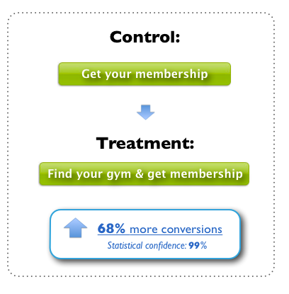
Image credit: Unbounce
The second variant (“Read Full Essay Now”) increased conversions by 68%.
Key Takeaways
- Specificity: the more price you can be about what someone will get from taking action, the greater the likelihood of conversion. “Instant access” is nice, but it’s somewhat unclear. “Read Full Essay Now” gives the visitor a much better idea of what they’re getting from the deal – all using the same number of words.
- Combining relevance and value: the initial call to action (“Get Instant Access Now”) did a nice job of motivating visitors to click because it laid out what the visitor would get from doing so (instant access). The promised value was there, but that value wasn’t immediately relevant to a visitor on one of WriteWork’s landing pages. This led Aagaard to conclude that relevance and value made for the best combination for high-converting call to actions. A good principle to keep in mind.
2. Artsy Editor
Artsy Editor is a premium WordPress editor that helps bloggers format, scale images, and upload different types of media. They decided to test the call to action on their homepage to see if they could get more conversions.
Their biggest priority: getting more visitors to their demo and pricing pages. Artsy Editor ended up testing a few versions: one with a single call to action button and the other with two, as well as different combinations of phrases on those buttons.
Variation one looked like this:
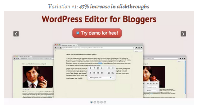
This variation (with a single demo button) improved click-through to the demo page 5% and pricing page by 47%.
Variation two looked like this:
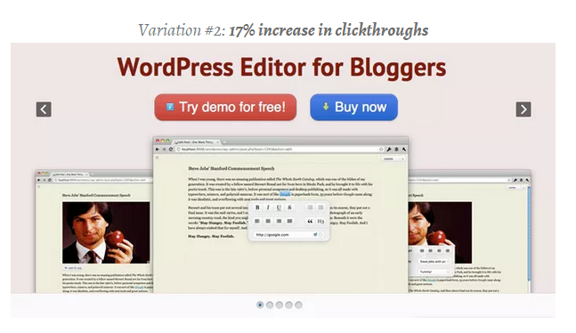
This variation resulted in a 7% increase in click-through for the demo page and 17% improvement in click-through for the pricing page.
Variation three looked like this:
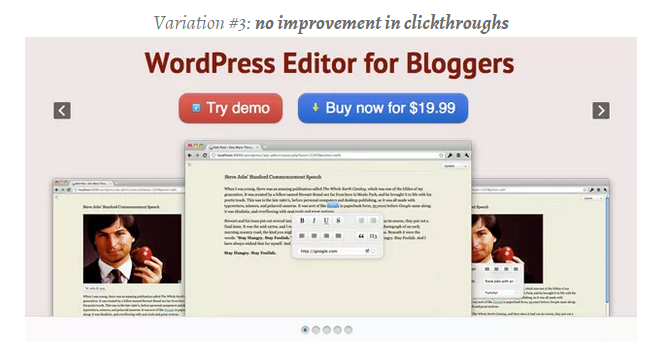
Image credits: VWO
There weren’t any improvements to clickthroughs with the third variation.
Key Takeaways
- Depending on what you’re offering, multiple call to action buttons could work. The reasoning of giving visitors a single goal is sound. But it might be at least worth testing multiple call to action buttons and analyze the impact on your conversions.
- Your primary conversion goal depends on: 1) what you’re selling, and 2) your website visitors’ previous browsing history. If most of your visitors are first-time visitors (like Artsy Editor’s) it might be much easier to get them to navigate to a pricing or demo page instead of going straight for the sale.
1. Monetate
Monetate, a marketing company that helps retailers increase their revenue, had heard a lot about the potential impact of call to action button colors and wanted to see it for themselves.
They tested orange call to action buttons – a perennial favorite and supposedly high-converter – against blue buttons for one of their client’s product detail pages:

Image credit: Monetate
The blue button actually came out on top: 9% more effective than the orange version.
Key Takeaways
- Don’t be afraid to question marketing dogma. General principles are always great places to start, but with as simple as it is to run tests, it’s almost always worth doing them just to see the results yourself. What works for “most businesses online” might not apply to you.
- Color can have a significant impact on conversions. Just like the positioning of your call to action, this is a great starting point if you’re intimidated by the thought of testing different variations of copy.
The First Steps in the Right Direction
Optimizing your calls to action will make a huge difference in your business whether you’re well established or just starting out.
There are a ton of possibilities to consider – so many that it can feel overwhelming…
But it doesn’t have to be.
Armed with the insights from these case studies, you can save time and create high-converting calls to action much faster than if you were starting from scratch. Then you can move forward tweaking them once they’re already effective, optimizing your website to make the most of every visitor.
Have you tested your calls to action before? Is so, did anything you found surprise you? Leave a comment and let us know!